In the first week of Project 3, I created some mind maps of my initial ideas and gathered some visual research, and began some basic wire-framing. Building on that, this week I have expanded my visual research and developed my experience further, by giving it more structure with a clear user flow and tier options.

Initially, I was uncertain whether my experience would be focused around one activity such as zip-lining or multiple activities presented in a package day out style. Below I refined my idea and explained exactly what I wanted it to be, with some rough ideas for page layouts presented in wire frames.

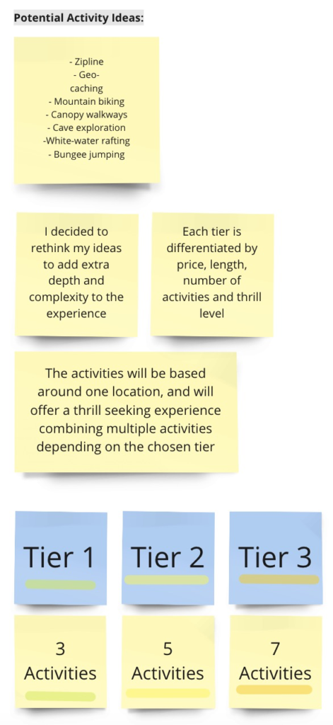
I started to think about different tier and pricing options, and example activities that could be included in each. After tutor and tutorial feedback, I have decided to limit the number of activities to 5 and tiers to 2, to keep the choice simple and less overwhelming for users.

I next created a simple user flow diagram for the site alongside a sitemap/page & content list, which helped to have a clear understanding of the exact scope of the site and which pages to start wire framing.
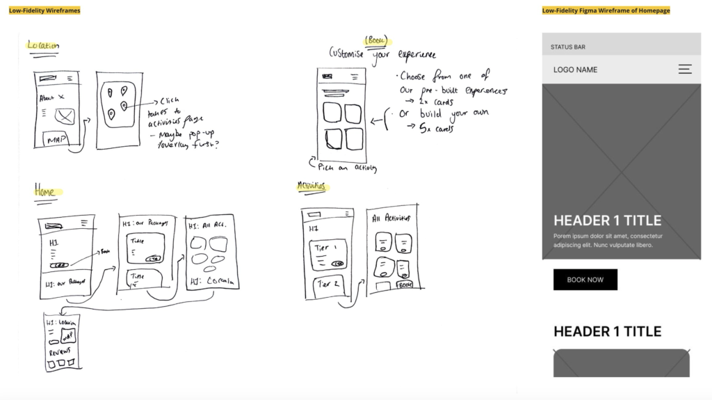
With a more concrete page and content structure in mind, I drew wire frames for each main navigation page and some of the content that would be displayed when scrolling. After this, I created a low-fidelity wire frame for the homepage in Figma.
Next, I intend to continue low-fidelity wire framing in Figma while starting to consider the design style and system of the website by researching fonts and colours that could work with the brand.