In response to the main points of friction discovered during my user testing, I will be redesigning several elements of the AXS booking flow to be easier to use and understand.
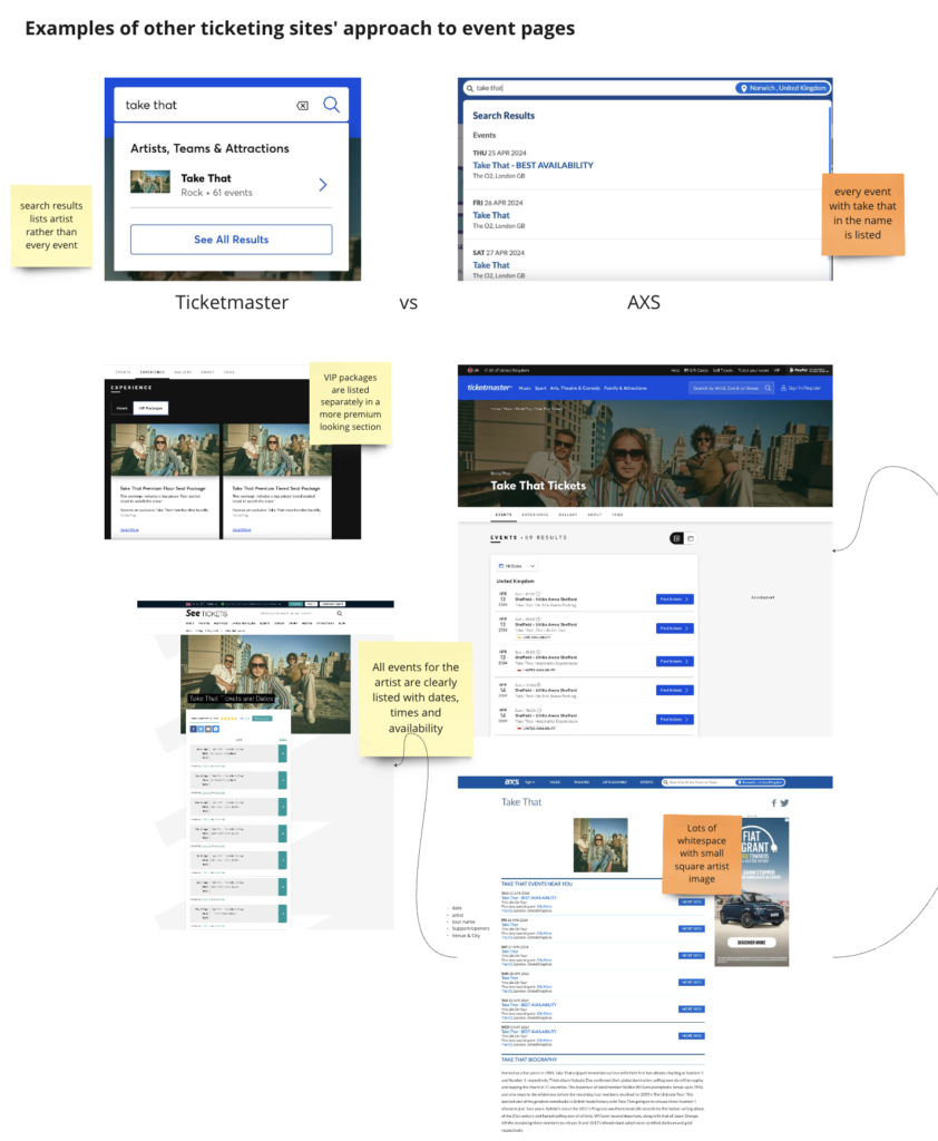
I researched a few examples of how other ticketing websites structure their user flow, looking at Ticketmaster and See Tickets specifically. When comparing them to AXS, I decided to focus on streamlining the part of the process where users in my testing frequently got confused.
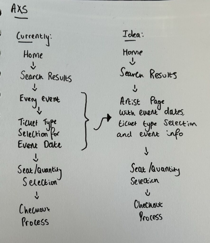
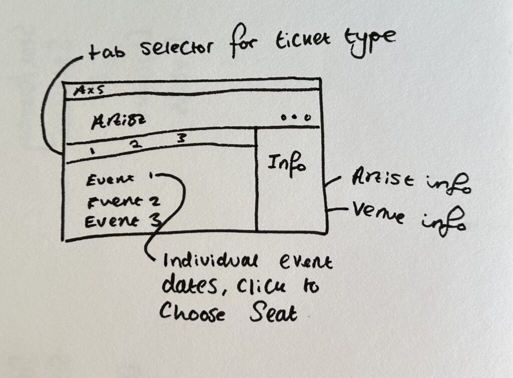
With a low-fidelity sketch of my idea, I created a higher fidelity version in Figma, roughly laying out the elements I want to include on the page in a frame. This was helpful to get an idea for the approximate proportions of each part of the user interface. I want the side panel to be large enough to provide useful information, but not too wide that it confuses the hierarchy with the main part of the page, the event lists.
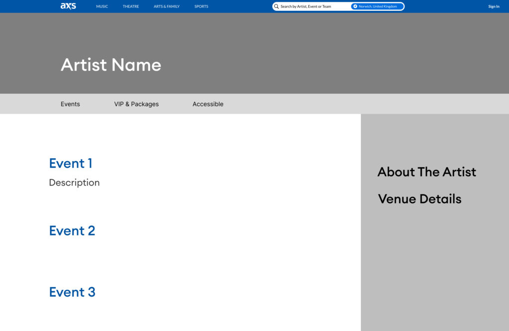
Next week, I want to finish designing this page and ideally make it functional using Figma’s prototyping tools.