
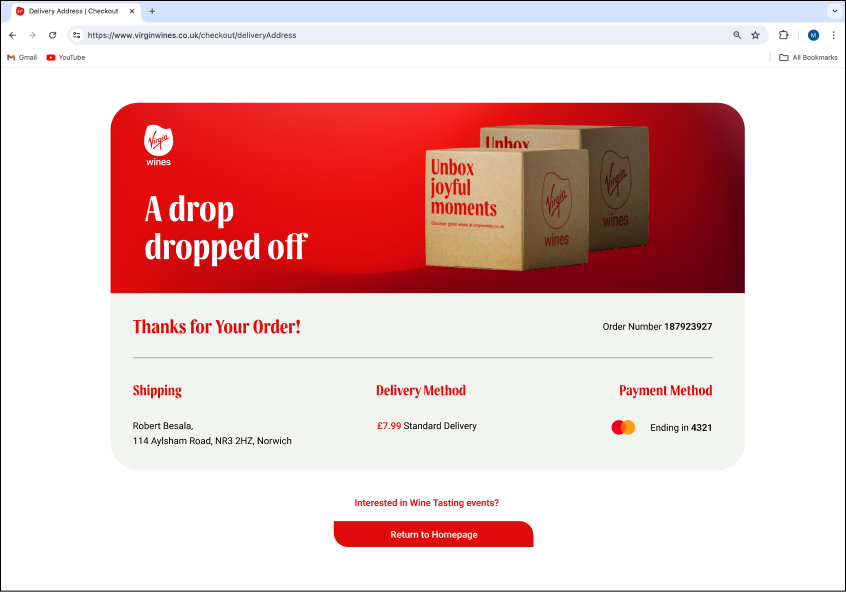
During task assignment, I have putted myself forward to work on the checkout page, finding it fascinating from both a UX and functionality perspective. My goal was to create a functional checkout process, reduce the number of steps, and make the user journey as quick and efficient as possible.
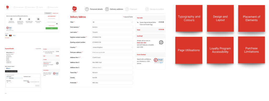
To improve the Virgin Wines website, several key issues need addressing. Firstly, the lack of a clear typography hierarchy and mismatched header colors disrupt content organization and visual coherence. The current flat design causes buttons to blend into the layout, reducing their visibility, while clustering elements like “Help,” “Award Recognition,” and “Security Mark” clutters the space. The login page misses opportunities to highlight the benefits of shopping with Virgin Wines, such as upselling and advertising. Additionally, the Virgin Atlantic loyalty program option is present but lacks quick access for more information, missing potential to attract new members and upsell. Users are also required to enter both delivery and billing addresses manually; providing pre-filled forms would enhance convenience.
The requirement to purchase a minimum of six bottles can be restrictive, particularly for single customers who prefer individual purchases. User interviews revealed a preference for local stores perceived as less expensive and a general caution about sharing credit card details online, with a preference for express payment options like PayPal and Apple Pay. Users often buy cost-effective essentials on Amazon and fashion from ASOS and Boohoo but miss out on live events and wine tastings due to busy schedules. Implementing a simplified three-step checkout process can reduce frustration, increase conversion rates, speed up transactions, and reduce errors, especially during high-traffic periods. A cleaner, more spacious design will provide a sense of space and efficiency, while improved accessibility features, such as searching by postcode and using the billing address, will enhance user convenience and satisfaction.
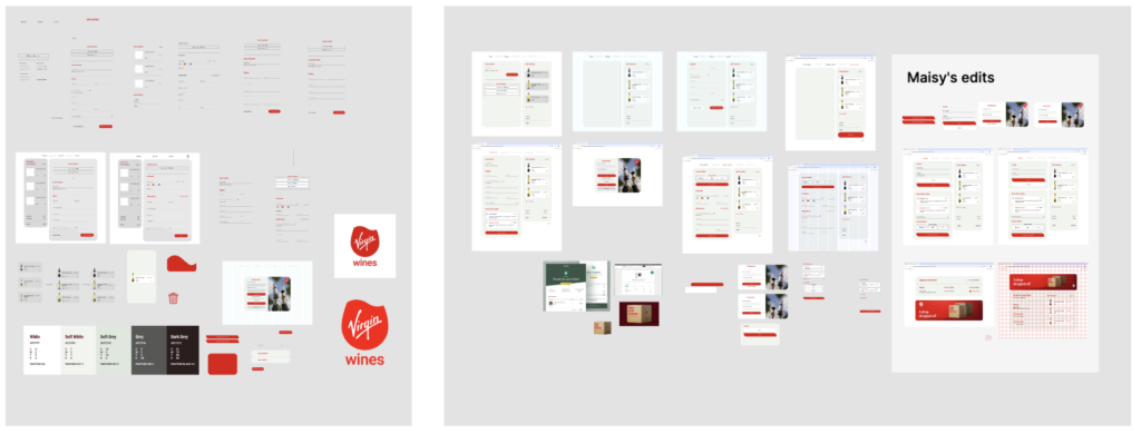
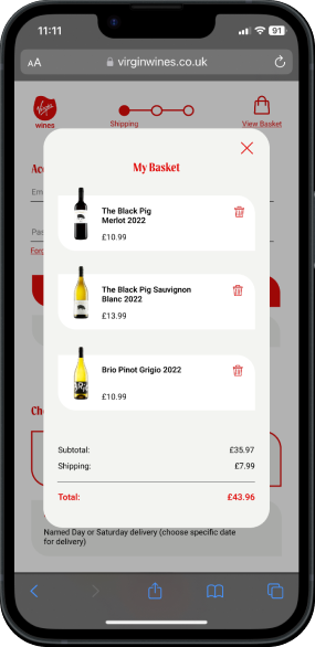
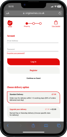
We applied the same principles to enhance the mobile version, aiming for a better mobile experience. A three-step checkout process is particularly beneficial for mobile users, as it adapts well to smaller screens and aligns with the typically shorter attention spans on mobile devices, catering to the increasing trend of mobile commerce. Our focus was on maintaining simplicity and speed to keep the checkout process as straightforward as possible. We ensured the design was optimized for mobile performance across various platforms to prevent potential customers from abandoning their carts. By minimising the number of steps and asking only for essential information, as well as pre-filling fields where possible and offering express checkout options, we aimed to create a seamless and efficient mobile shopping experience.


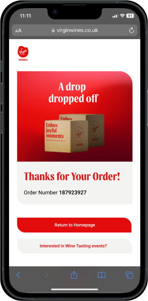
I thoroughly enjoyed the process, benefiting from the collaboration with others. This project proved to be a valuable UX exercise, as our role is to address pain points, minimize dropouts, and ensure a smooth and transparent process.
Leave a Reply