
Cafe Racer Visual Style
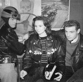
In the 1950s and 60s, Britain experienced a cultural revolution marked by rebellion and rock ‘n roll counterculture. This vibrant atmosphere was mirrored in the colourful styles of cafe racers, breaking away from the drab utilitarian colours of postwar austerity. The ton-up boys, adorned in black leather jackets, showcased a bold contrast with the brightly painted fuel tanks of their motorcycles, boasting hues like cherry red, electric blue, and metallic gold.
The influence of national motorsport pride was evident, with Triumphs and Nortons proudly displaying the iconic British Racing Green alongside white and gold accents. Chrome and polished metal finishes added glossy accents, invoking a sense of speed and mechanical power that defined the cafe racer aesthetic.
As mod culture took centre stage, op-art black and white checks, contrasting blocked colours, and Pop Art prints infiltrated fashion. The 1960s ushered in a psychedelic palette, featuring rich blues, purples, and oranges inspired by counterculture art and music. Notably, branding genius Alan Fletcher modernized logos for classic British brands such as Cunard and the V&A Museum.
The visual revolution extended beyond fashion, with iconic figures like The Beatles, The Who, and the Rolling Stones contributing to a visual language still celebrated today. Colour, in all its bold and rebellious glory, became integral to expressing the independence and rock-inspired spirit of Britain’s cafe racer youth.
Colour Analysis
An essential aspect to consider is the examination of colour. Despite encountering challenges in navigating through extensive information to identify accurate colours from historical images, a significant portion of the available visuals is presented in black and white. Additionally, caution must be exercised when relying on alternative sources, as their reliability may be limited.
Following a diligent process of trial and error in seeking precise colour representations, it became evident that an overly meticulous approach was taken. Through discussions with both lecturers and the audience, a consensus emerged that the authenticity of colour portrayal is less crucial than capturing the essence of the era. Whether it evokes nostalgia through black-and-white imagery or encapsulates the distinctive “vibe” of the period’s advertising, these considerations are paramount.
Nevertheless, presented below are some iconic British colours from the 1950s for reference.
Black
The colour of leather jackets and many production motorcycles at the time. Represented a tough, rebellious look.
White
Common tank colour on bikes like the Triumph Bonneville. Gave a bold contrast paired with black frames.
Black/White
Racing stripe connotations. Ace cafe logo, the birthplace of cafe racing.
Silver/Chrome
Evoked speed and mechanical power from polished metal components.
British Racing Green
Traditional British racing colour is seen on vintage bike tanks and fairings.
Gold
Used on early vinyl racing jackets. Connoted winning and championship status.
Red
Energetic colour seen on cafe racer gas tanks, badges, and details. A lot of advertisements at the time used Red as the main colour.
Blue
Navy leather jackets and vivid fairing colours capitalised on Britain’s racing blue.
Historical Racing Influences
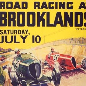
To understand the roots of this vibrant culture, we must journey back to the early 20th century. The Brooklands Racing Circuit, established in 1907, was one of the world’s first purpose-built racetracks. The Brooklands Automobile Racing Club proudly adopted British racing green and white as their club colours, painting them on members’ cars. Similarly, the Gordon Bennett Cup, founded in 1900, mandated that British cars be adorned in British racing green to represent the nation.
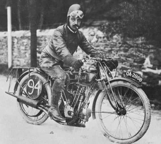
The Isle of Man TT, an iconic motorcycle race that began in 1907, also played a role in shaping the colourful narrative. The racing colours of green and yellow from the Automobile Club of Great Britain and Ireland became synonymous with this thrilling event.
The automotive industry further contributed to the colour palette, with Bentley Motors adopting British racing green in 1919, a colour that dominated races like Le Mans in the 1920s. Jaguar Cars, in the 1950s-60s, showcased a unique shade of British racing green with silver accents on models like the D-Type. Aston Martin Racing continued the tradition with vibrant lime green colours into the modern era, while McLaren Automotive paid homage to its 1960s racing legacy with heritage papaya orange and green colours on models like the Senna.
Colour inspirations

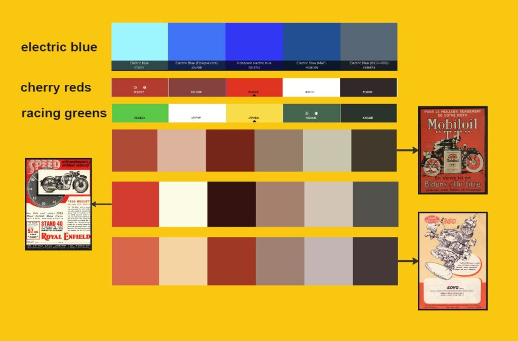
In my earlier discussion, I acknowledged the inherent challenge in sourcing colours due to the prevalence of black-and-white photographs from the historical period under consideration. However, amid this constraint, valuable resources such as old advertisements, newspapers, and branding materials have proven instrumental in reconstructing a visual palette.
Presented above is a curated mood board, meticulously compiled from these authentic relics of the past. This collection encapsulates the essence of the era, invoking a sense of joy and resonance for me as a designer. While I acknowledge the conventional wisdom against designing solely for personal preferences, the current context, characterized by a certain degree of colour uncertainty on my part, warrants a measured departure.
Given my deep affinity for the cafe racer scene and the meticulous research invested in identifying historically accurate colours, I am confident in deeming these selections as both suitable and accurate. This deliberate approach aligns with my commitment to ensuring a faithful representation of the time period, while also incorporating a personal connection to the subject matter.
A Strategic Shift
In a subsequent phase of this project, a pivotal development has emerged that holds direct relevance to the current discussion. It has become evident that the initial website I was working on lacked a certain intangible quality often referred to as “soul.” Recognizing the importance of infusing a distinct sense of feel and excitement for users, I have opted to introduce a secondary site. This site is deliberately oriented towards a creative pursuit, prioritizing the user experience over pure functionality.
This decision to create an alternative site with a heightened emphasis on the emotive aspect is not arbitrary. In the forthcoming stages, an A/B testing protocol will be implemented to objectively evaluate the effectiveness of this approach compared to the primary site developed based on preceding research. This strategic shift is deemed necessary to address the perceived gap and ensure a more holistic exploration of design possibilities.
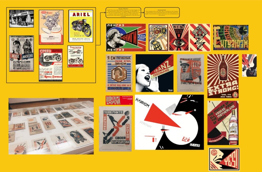
The image above is a mood board carefully curated to encapsulate the inspiration driving this pivot. Featuring a selection of advertisements alongside elements reminiscent of Russian constructivism, this compilation serves as a visual guide. The British advertisements under scrutiny bear a striking resemblance to the aesthetics of old Russian constructivism, and it is this unique fusion that the secondary site aims to capture.
In essence, the pivot involves a deliberate departure from a solely functionality-centric approach to one that places paramount importance on evoking a specific emotional response from users. Drawing inspiration from the resonance found in Russian constructivism and analogous British advertising, the new direction seeks to elicit a distinct feeling, a connection that transcends mere functionality. This creative endeavour aligns with a broader commitment to fostering an engaging and memorable user experience.
Font Choice: A Brief Note
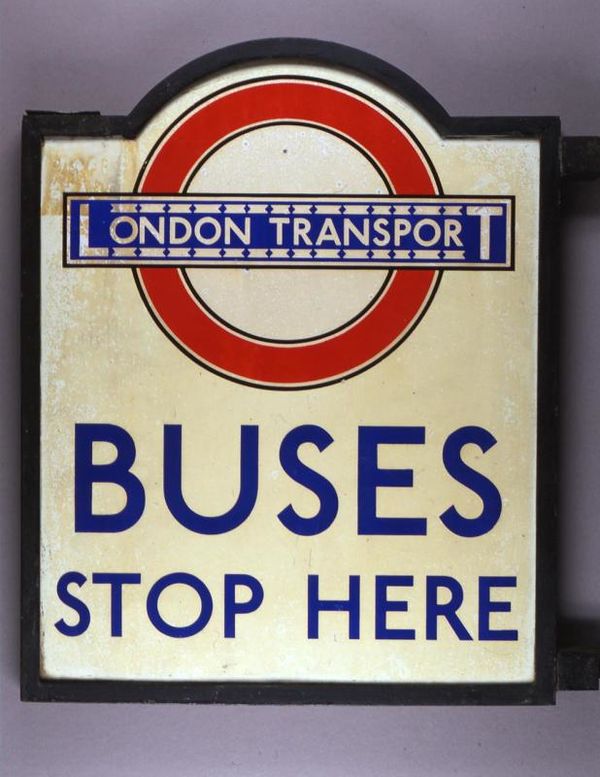
In selecting the font for this exploration, I opted for a typeface that pays homage to the clean lines and simplicity of Edward Johnston’s iconic lettering. This choice aims to evoke the timeless elegance of 1950s design while providing a visually cohesive experience. The selected font serves as a bridge between the tactile charm of letterpress printing and the digital medium through which we share this journey.
Leave a Reply