As I was digesting the news that the only thing Virgin Wines didn’t like was the work I did (lol), I had to start thinking about what a new events page would look like. The first question was, what was the most important thing about the events page? Well, for me, it was the fact that their current site misrepresents the tasting, and on the page I’ll design for them, I wanted this information to be clear. Well, how do I make events obvious?
Hold on a minute, I’m getting a message. It’s from Callum. “Do you want to come to RuneFest this year?”.
I haven’t played RuneScape in a while, but it was a tempting offer, and I should probably check out their site to see how many tickets are and if I want to go.
It was fortunate that I did because the moment I saw it, I knew what I had to do.
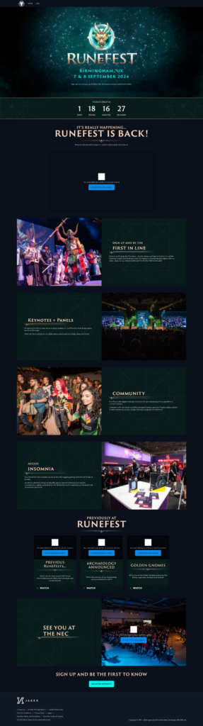
With just 4 pictures, I’m able to understand what to expect at this event. The timer was a great addition, which I wanted to include as well to create more hype for the events.
So the main takeaways from RuneFest were a running countdown timer, clear pictures to represent itself, and all information displayed on cards.
I had learned my lesson previously by not experimenting, so I really wanted to make this page my own. Below is the initial wireframe for the page.#
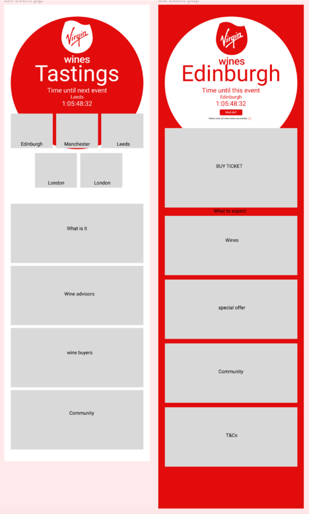
As they liked the interactivity of the About Us page so much, I wanted to include a small interaction element on the events. This comes in the form of page transitions. The PLP has a red circle which represents the top of a wine glass filled with wine, which changes into an empty one on the next page. This was subtle, and a little abstract, but if I could get the page animations right, I believed this was a good call. This is less UX and more advertising as well, but it was clear Virgin Wines preferred calling them tastings over events, but this is misleading. What if we take back the word “tastings” and really make it their own? So I present to you, Virgin Wines. Tastings.
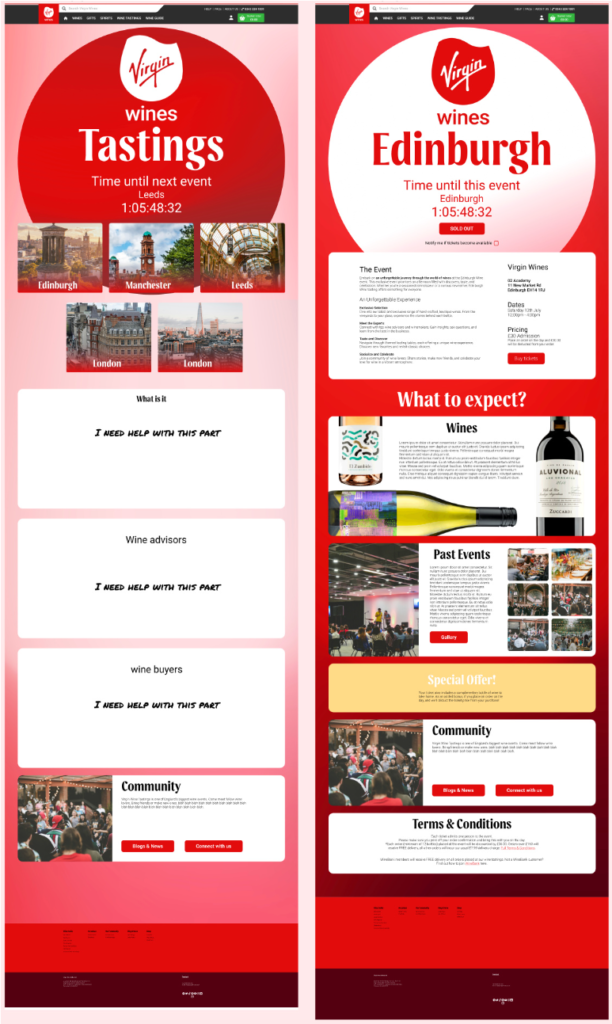
Above is the mid-fidelity design I came up with. I incorporated the gradients we were given, which worked particularly well as it aligned much more with both our checkout and about us page (at that moment in time). The cards were a big hit with the group. The cards helped communicate much more clearly and digestibly. And the way the top information is presented creates a buzz for Virgin Wines tastings. The only problem is breakpoints. Virgin Wines have communicated with us how many breakpoints they had: 6. Because of the modular style and layout of the cards and information, my design is able to go that distance, but it isn’t something I planned on designing as we had committed to a style yet, and I was also at this point passing over to two amazing designers, Max and Mara. Because of this, I went into this design with the intention of creating a framework for them to build-off of. Everything worked with auto-layout and components. If they wanted to add a new info card, they could without having to move everything else. The text and buttons were all editable using local variables and text styles. As I was starting to become busy with other tasks and their current tasks had finished up, this made the most sense from a team perspective. I will talk more about prototyping and components later in a future post.
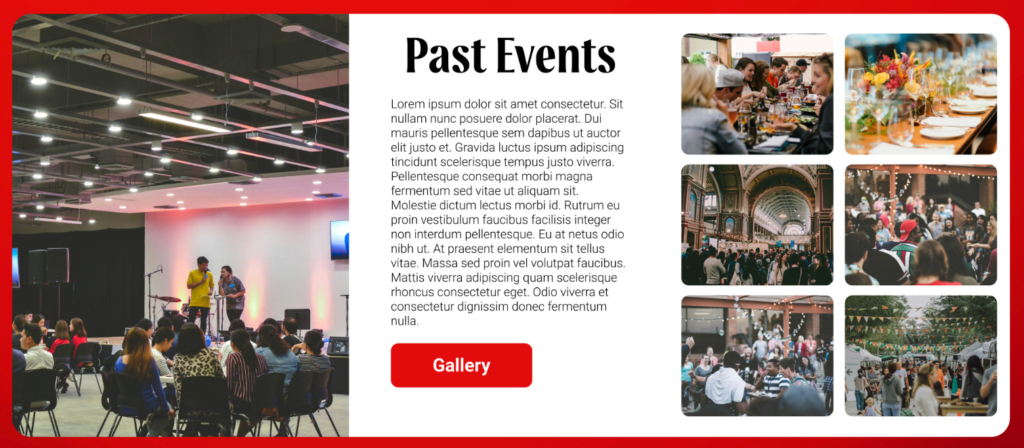
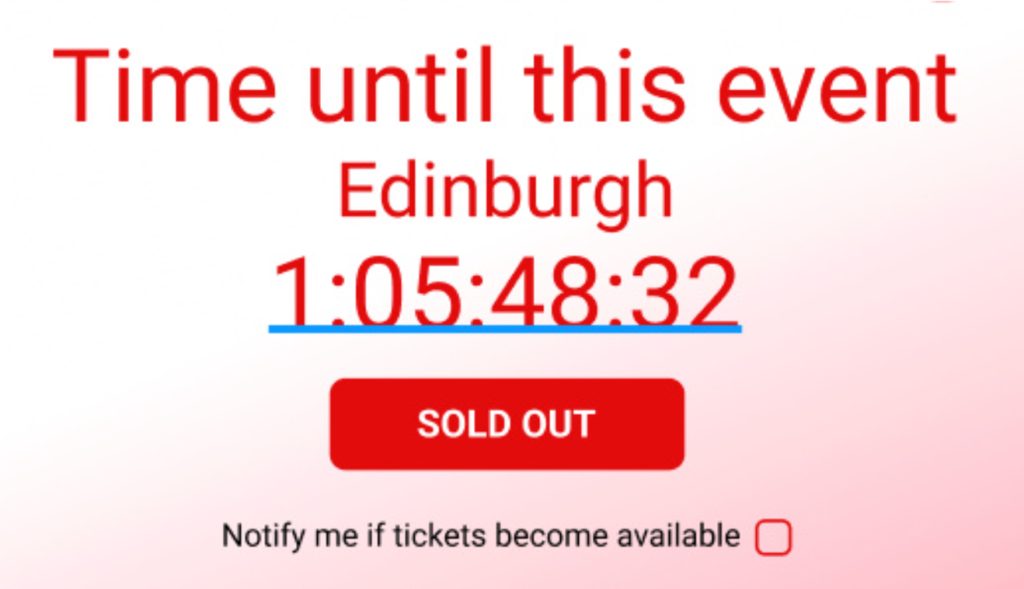
I just wanted to talk briefly about some parts I enjoyed most. The past events card, I think, really sells the event more than it currently is. If better images were used, I’m sure this would work very well. The time until event text, I’m very happy with. Let’s create hype for an event. With some research done by Hanley and Max, we found that countdown timers are also a great advertising device to get people interested and buy tickets.
Leave a Reply