In this post, I’m going to go over briefly what tests I did.
Tree Jack Testing
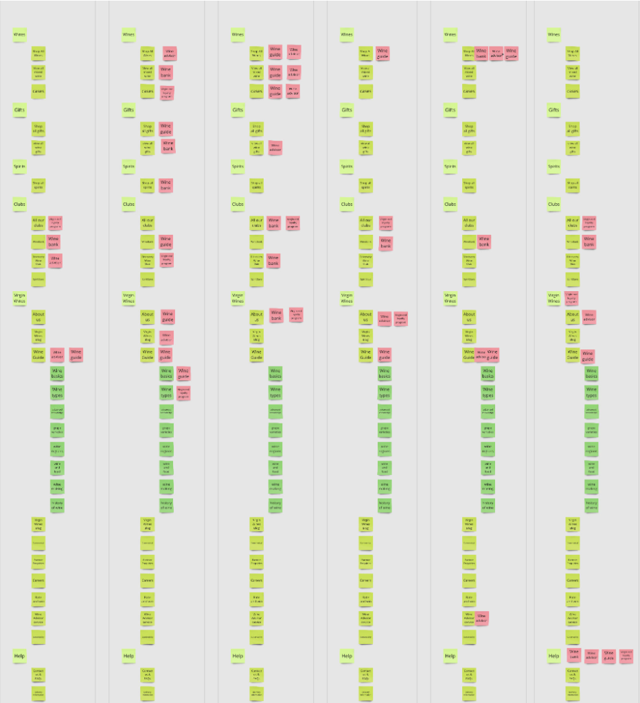
Why did I do TreeJack testing? We had a lot of things we wanted to get rid of on the About Us page, but those were just assumptions, so to validate them, I chose TreeJack testing. I’m sure there is a program or way you could do this better, but as I was doing this as a bit of an impromptu guerrilla testing, letting them use Miro was the most convenient.
The test proved a couple of our assumptions wrong. We wanted to get rid of a few Virgin Red Loyalty mentions as we didn’t think it had much to do with the About Us page. However, it was found that people did expect it in there. It also validated our assumption that Wine Bank isn’t integral, as most people would search for information about it elsewhere. Doing the TreeJack testing gave our copywriter information on what to or not put into the copy.
Flesch Kincaid Test
This was a very easy, fast test to run. Essentially, for any copy that we used, I ran a Flesch Kincaid test on using online tools; even Docs has one, I believe, making sure the copy had a score of 60+ for readability.
We got sent some new copy, which we decided to edit a little bit for tone of voice reasons. However, we wanted to test if our copy was better. Running the readability test on them showed that both scored almost identically.
Cloze Test
Since the Flesch-Kincaid test proved to be redundant as the results were the same, I began to test for comprehension. Now, you may ask yourself why I’m doing all this? Well, here, I’m testing mainly the About Us page and events. The about us has no flow, so nothing to click on, and the events are two flows, so while usability tests are great for design aspects, because both pages require reading, I want to make sure we have the best.
This is where I begin by saying a caveat. The way I tested, I believe, was incorrect, and the trust/confidence in this data isn’t there, but the data we do have proved that the original copy was more comprehensible than our own. So while I think a cloze test is good, I don’t think the data can be trusted (retrospectively), even if it benefits me that I do.
Below is the final cloze test I settled on. The first ones contained too much bias on my part, as I was selecting what words, as you would for a cloze test, but I made exceptions for both body copies, as it felt unfair. But just because it feels unfair doesn’t mean it is. That’s why I went for a new, completely machine-made cloze test. A software picked every true 6th word to remove.
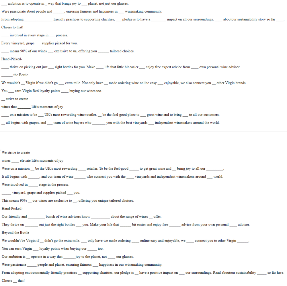
Let’s talk about the results. Their copy was much better received; however, their copy also failed to reach 60% comprehension. Another problem with my test was the limited sample size. Because things were moving very fast, I had to get answers pretty quickly, so I sent this out to maybe 10 people, and very few replied. Especially with the final version of the cloze test, I had to work with. Only one person tested our copy for the final test. That’s why these results can’t really be trusted.
User Testing
I would have loved to do much more user testing. I mentioned before, but things were moving very fast at this point in development flows and pages were changing daily, even this test below within a day of running the test, the About Us page design changed drastically, making a lot of the findings for the page I tested redundant. For this reason, I held off on testing too much, but that ended up backfiring on me as I ended up with not much time to test at all with other work that needed to be done. I really understand how and why user tests fall by the wayside in UX, and I should be more careful in the future.
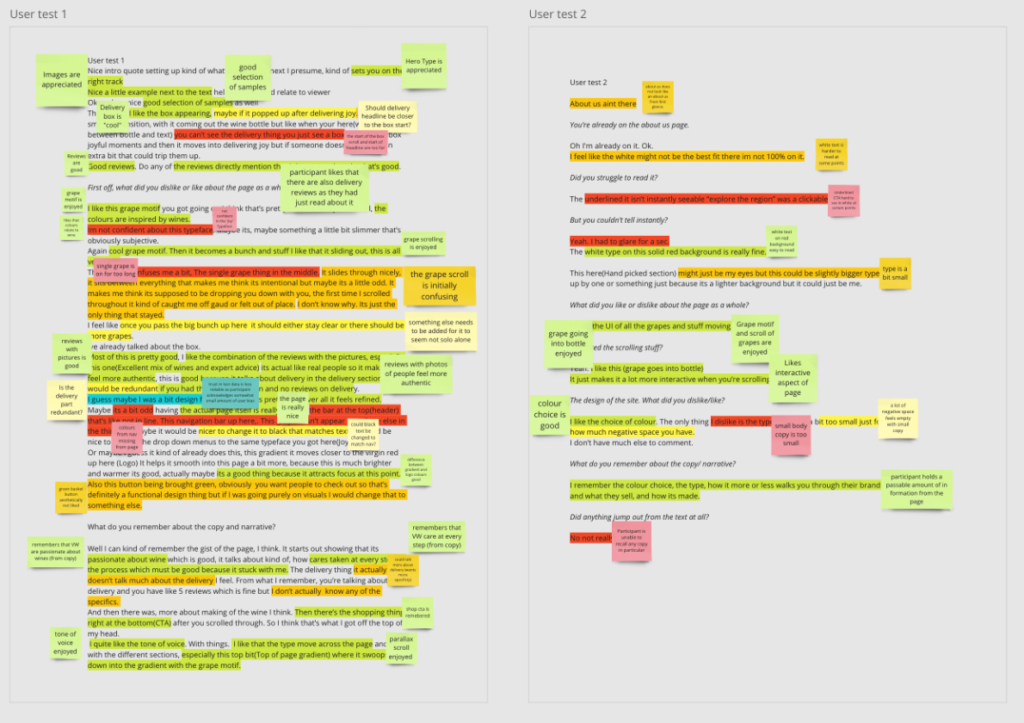
To summarize my findings:
- The About Us page doesn’t initially look like an About Us page.
- The interaction/parallax is enjoyed.
- The tone of voice is good, the Shop CTA is remembered, and a passable amount of information from the copy was retained.
- The hero type and images are enjoyed.
- The grapes were generally enjoyed but caused initial confusion.
- Reviews that match with delivery are good.
- Reviews with people’s pictures feel authentic.
- Participants enjoy colours and gradients. Maybe have more matching with the header nav bar, though.
Because we changed our page, the only good takeaways from these tests were 2, 3, and 7.
Leave a Reply