My final job for the project was polishing the Checkout page, mainly on mobile but then on desktop. The designs were mid-fidelity when they were passed over to me. I thought the prototyping wouldn’t take long because the mid-fi design looked good at a glance, but I did not realize how long it would actually take.
I don’t think it’s worth going over every little item as there was so much, but I’m going to quickly cover the changes I had to make.
First things first, I had to redesign each page. Just because of the different work styles, I was very confused by the auto-layout used and the lack of consistency. Luckily, we went with an accordion/modular style, so I made all the accordions/cards as components with an auto-layout that planned for future changes. Below are the cards I made for mobile; they are the final cards, but each went through a lot of changes. Most of my job for the week before the presentation was making changes to the checkout to what the team wanted. This went from text sizing to padding and spacing. I think they could be pushed even more, especially the prototyping. My goal for this page was to have it work on one flow. I was planning to do this with local variables, Boolean operations, and if-else statements. I attempted this for about a day before moving on, as it was wasting time we didn’t have, and just manual page changes did the job.
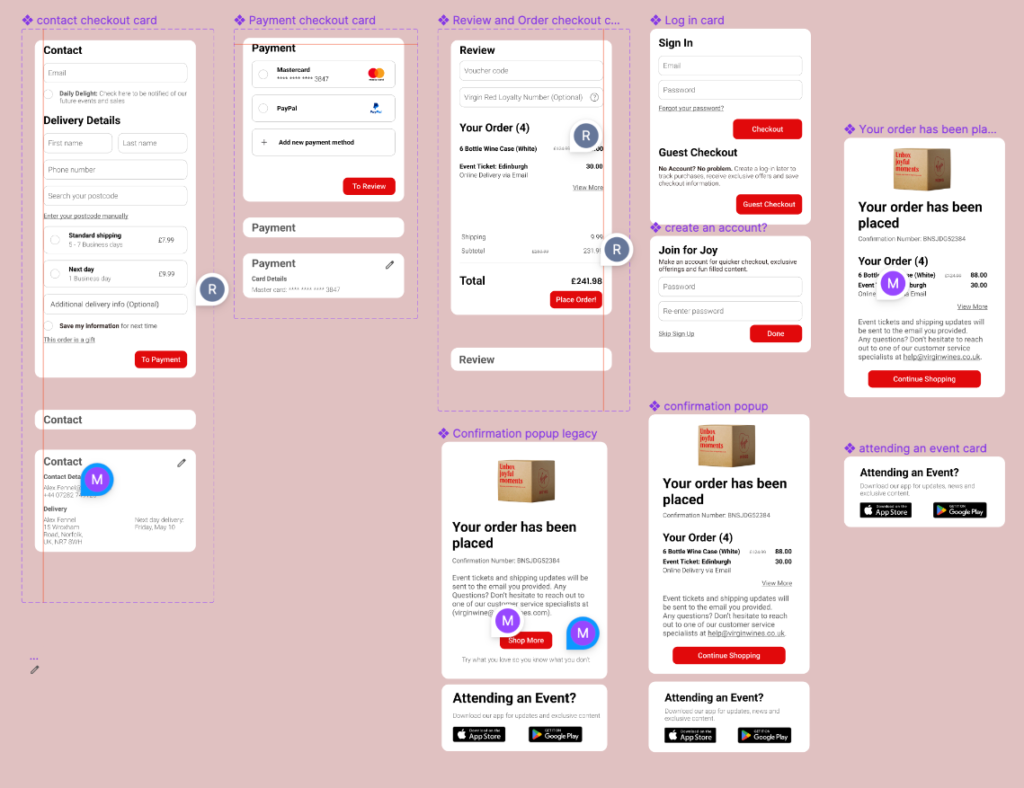
Daily, the team members would essentially audit the checkout with comments for me to make changes. You can look at the Figma comments to see how many there were. I very much enjoy fixing things and working out little nicks, so I’m glad I was able to use what I enjoy to help the team.
Before I talk about the desktop cards, there was a problem I wanted to discuss. This is a change I can actually point to, as I have the components to show. However when prototyping, a click state for text fields was the best option; however, one of our team members created an amazing “search your postcode” text field that you could click along with. But somewhere along the design line, the mid-fi text fields were all made using a component from a text box from the “search your postcode” component, which gave all of the below a different click state. No matter what I did, it wouldn’t change, so I had to scorch earth every text field and recreate it. This was good, as they needed work with text sizing anyway.
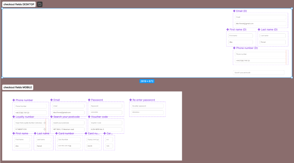
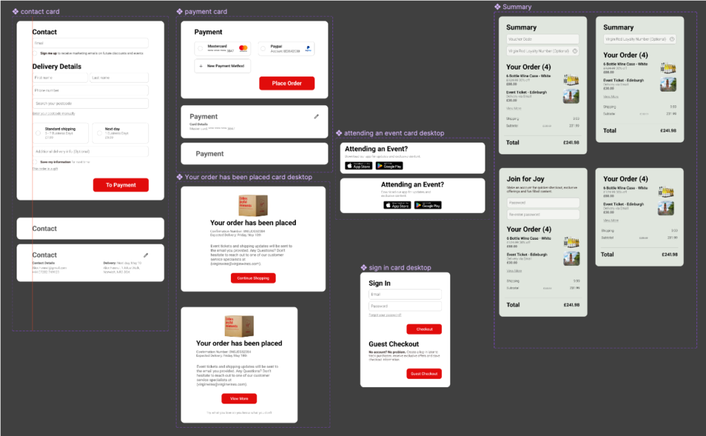
Below are the desktop cards I made. These only took a couple of days to make, as we had most of the issues ironed out with the mobile cards, and all I had to do was make them for the desktop. It did take an extra day because there were a few changes the team wanted to make, so I spent an extra day working out the kinks. But the process was identical to the mobile cards.
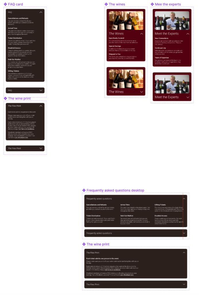
A team member wanted a few accordions made for them, and as I had been making accordions non-stop, I quickly took the time to make these components for them. Again, with the auto-layout set, so the said team member can edit text or add text boxes, and the entire card/animations would still work.
Prototyping took much more time than I thought it would (I’ve been saying that a lot). I really wanted to focus on a lot more other things like testing and such and felt bad that I didn’t feel like I was helping the team. However, I found out later that my focusing on these tasks helped give a lot of breathing room to the others as they were preparing the most important task: the presentation.
Leave a Reply