Mid/High-fidelity Designs
As described in the last post, we decided to create the flow so we could critically analyse each other’s designs and create the ultimate Virgin Wines flow – by merging them all together.


When creating the landing page, I created a checklist to make sure I incorporated all of the ‘important’ parts of my research.
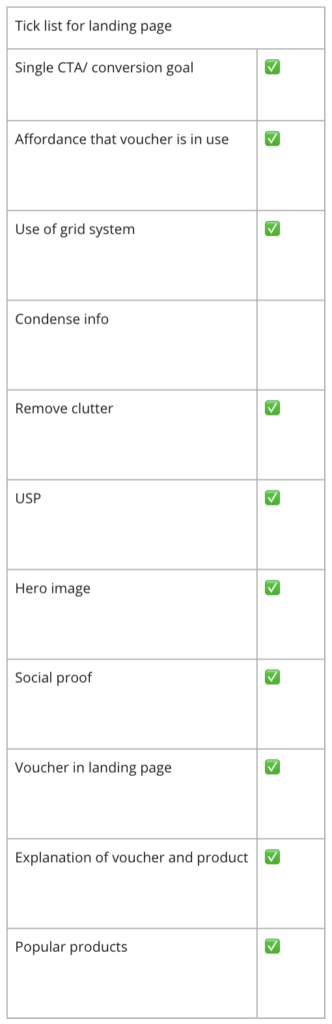
When designing the landing page, it was important to hit all of these points as the user’s first experience of the site either makes or breaks their experience. And the points that I noted down are all backed with research (which can be found on my Miro Boards).
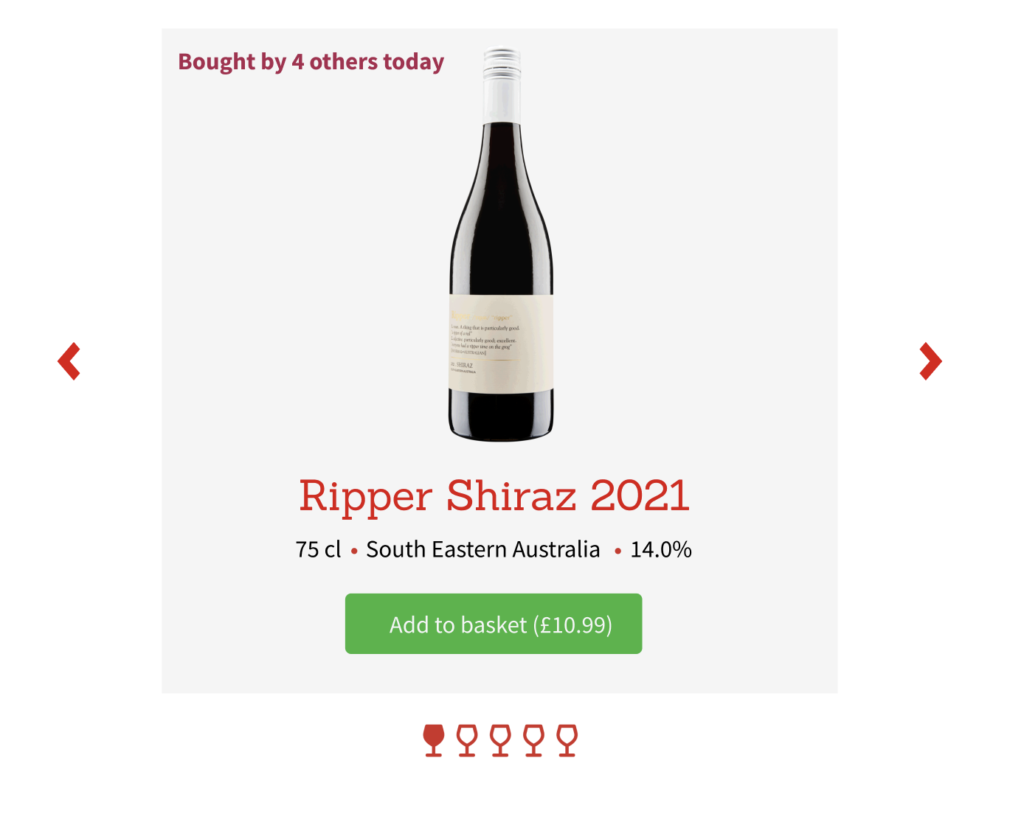
At the bottom of the homepage, I got a little experimental and made a wine glass animation for the carousel (which works in the Figma board).


The prototype above (which once again, works in the Figma file) was an idea that I initially explored in my first low fidelity design. However, after further research I came up with this design for the hover state – my hopes with this was to reduce the length of the page by making the information a hover-state and to make the website more interactive!
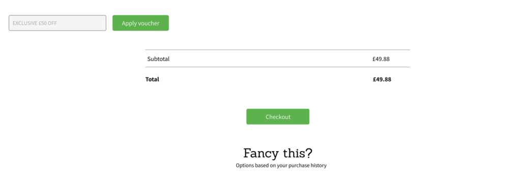
Although I am not the most proud of my actual design for the basket page, I do like the ideas I had for it. After studying other basket pages, I found that the voucher redeem section was often placed above the checkout, along with add-ons being placed in the basket page also – which I also explored.
Leave a Reply