Background Reading
Learning about accordions with Smashing TV
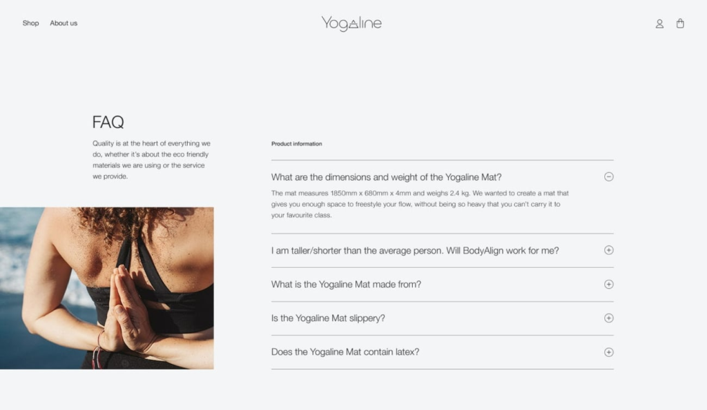
An accordion is an extra bit of information that collapses or expands when clicked – and they are regularly used in website design.
Accordions are often used to present information in a condensed way and information cards are often grouped to give an insightful overview of all of the available options, without overwhelming the user with each individual option.
Depending on whether a user is viewing an information on a large or small screen, can change how many accordions there are on a page. Usually, when viewing on a smaller screen there will be more, and will usually feature a CTA such as ‘details’; Due to the more limited amount of space, more information has to be collapsed.
Often an accordion will be used when displaying a table of contents. On desktop view this will be displayed normally, however on mobile this will be collapsed and will be able to be opened using a button (usually a plus icon in this instance) which will indicate that more information can be expanded, on demand. This is the same idea for FAQ sections (like the example above).
Designing accordions
There are many different options available when using icons to design accordions, and there are no real consistencies regarding this choice.
Moreover, you have to design to peoples expectations, which may differ from each individual. So it is important to appropriately title the accordions so users can find the information that they are expecting to find when using the site.
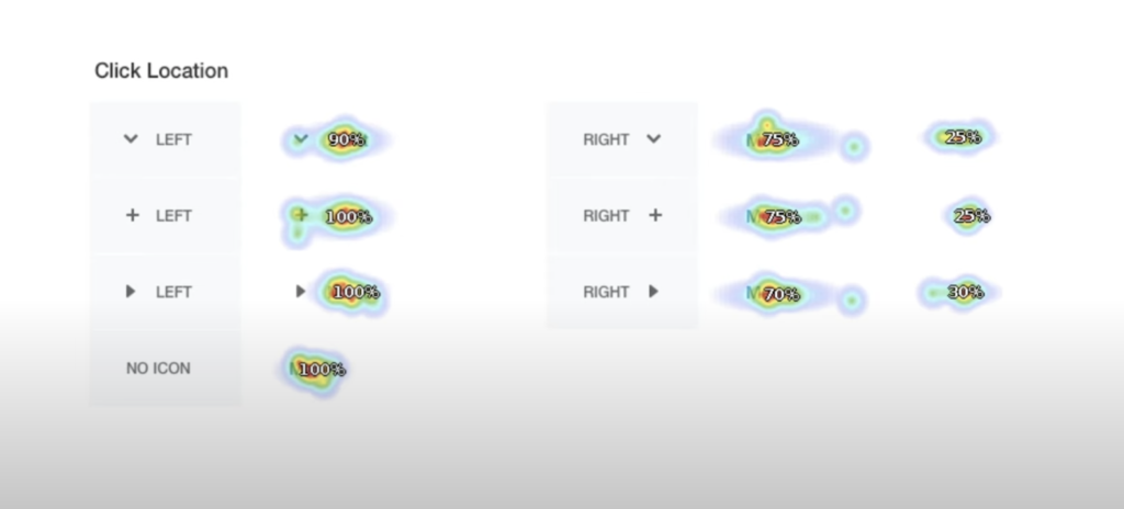
It was found that people clicked in different locations depending on where the icon was. With icons placed on the right, users tended to click on the icon – not the text. Moreover, with all options of the icons placed on the right, it resulted in slower task completion. Thus suggesting, that icons placed on the right were more likely to be clicked, showing the importance of making it big and noticeable.
The risks of using a plus icon
The plus icon can be used in many different ways – making it a difficult icon to use as the expectations set for it are really varied. Sometimes its used to show packages, to zoom in or to even add stuff to basket – let alone being apart of an accordion.
Accordion Design Checklist
- How do we design a category’s title?
- What icon do we choose to indicate expansion?
- How do we indicate collapse/expanded states?
- Do we place the icon on the left, inline or on the right?
- By default, should all sections be collapsed or open?
- What happens if a user clicks on the category link?
- What happens if a user clicks on an empty bar?
- Should expanded section collapse automatically?
- What if there isn’t enough space to display all items?
- Should the accordion contain a link to category’s main page?
- Should the user be scrolled automatically when expanded?
- Do we include the ‘expand all/collapse all’ functionality?
- Do we keep the state of an accordion on reload?

Leave a Reply