This week, my project developed more in regards to the behind-the-scenes research. Using one of my personas, I created a customer journey map which are used to show the emotions behind using a product and also opens the mind to what opportunities are available – and therefore what we, as designers, can do to solve those problems.

I also had a go at making an Opportunity Solution Tree, which after feedback was a useful tool (along with the ‘value proposition canvas’ that I also created) in understanding what my app needed to include, in order to be of use to the user. I looked into elements such as having ‘daily tasks to tick off’ will help to implement change in a way that is not overwhelming. A large focus of the product is creating change for the better, in a non intrusive/threatening manner.


Creating user stories and a user story flow were also important tools for understanding what needs to be included on the interface.


Visually, the app continued to develop also. I critically analysed interfaces which had ‘tracking’ elements within them, to see how they used data to create graphs etc. I was also researching to see the different ways that you could input data, and wanted to explore what was the easiest way of doing so.

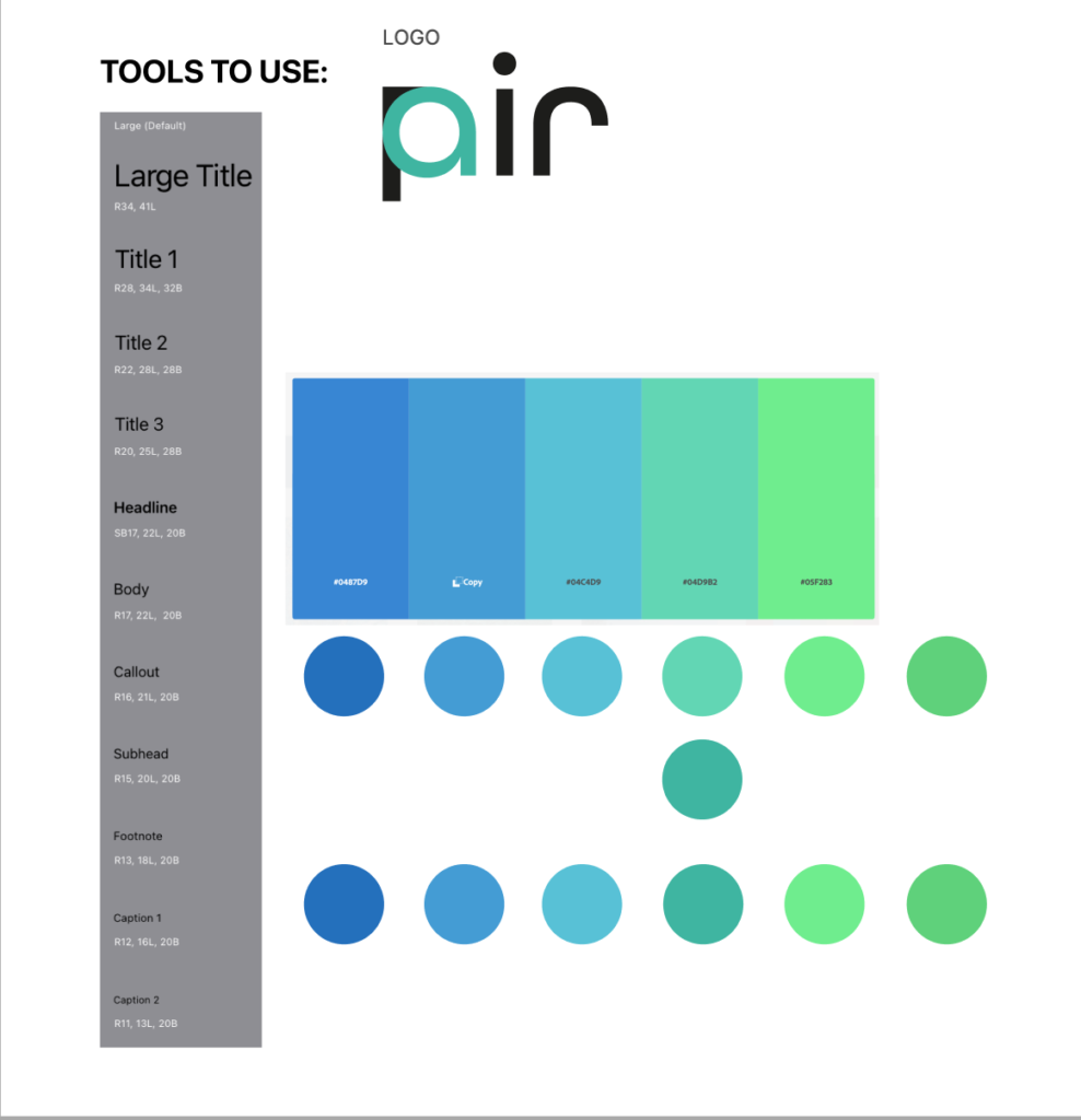
Using turquoise as the inspiration, I selected a colour palette and started to develop mid-fidelity prototypes (using the low-fidelity prototypes I had previously created) using it. I liked the idea of incorporating a gradient into my design, as this allowed me to capture a range of the colours in one go.

Leave a Reply