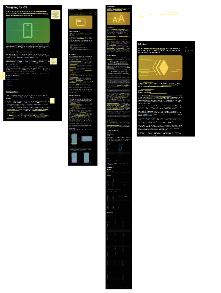
During the briefing last week, Dave told the class about the IOS Specifications, that Apple use whenever they design anything for an IOS device. I read up on some of the specifications and found each of the articles really interesting, I thought that for my Design for Good project it would be useful to include it, as I want to make the site look professional and inviting for users (so by using things that are familiar, such as font, I should be able to achieve this).
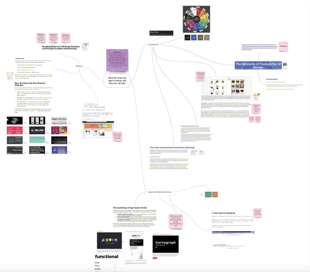
During the week, I also took the time to start developing the visual side of my project. For this I researched components such as colour schemes, and the psychology behind different colours to give my app the right feel. In my last project, using three words to describe the feel of my project was really useful. So, for my Design for Good app, I have chosen the words, Modern, Trustworthy and Welcoming/approachable – this guided my research into looking for visual designs and elements that will help with portraying this.
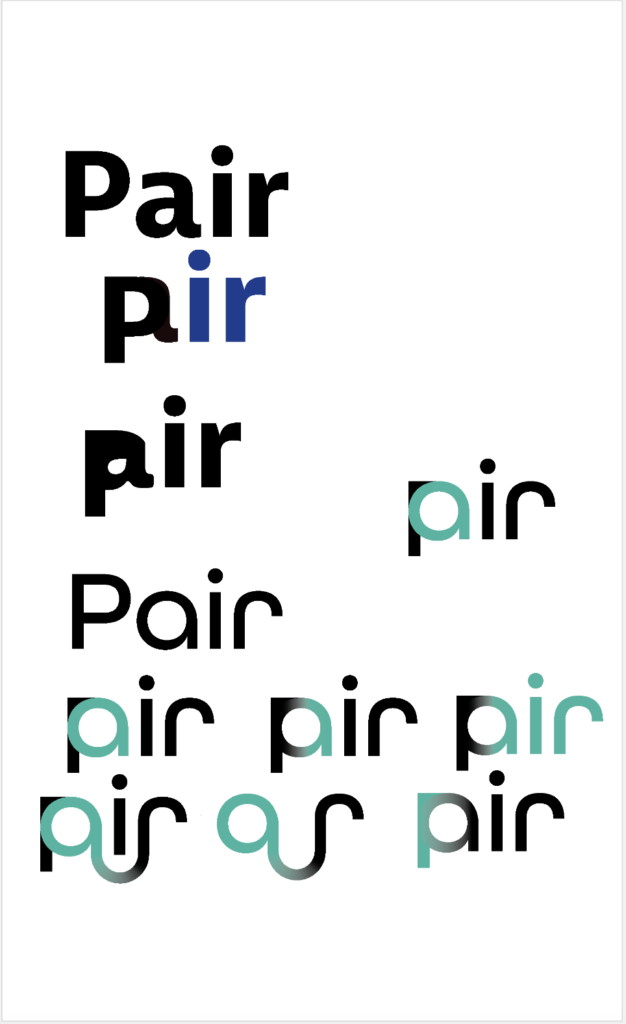
An important finding was that the colour turquoise is used in relation to clarity and communication, and I used this information to start developing a logo for my app:
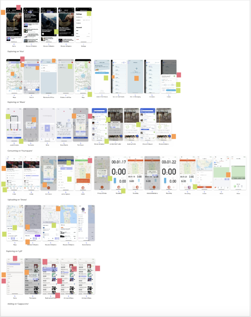
Further competitor research took place, and I critically analysed other app interfaces, as having an understanding of what other apps have will aid me in creating the best interface possible, when it comes to my own. It is beneficial to be critical when looking at other applications, as this will help me to avoid their mistakes.
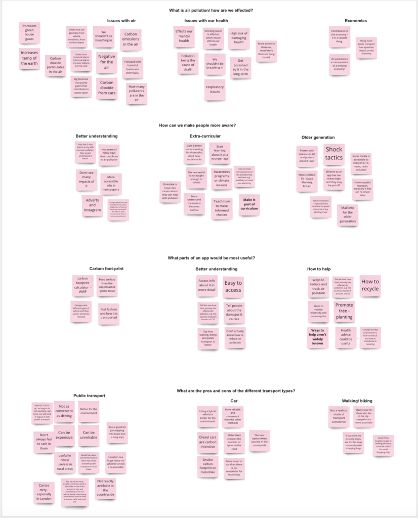
Another step I took within this project was the development of my interviews, which allowed me to add more data to my affinity map. I now have six interviews, which have a range of discussions and I feel this is a solid foundation to work from.
Leave a Reply