It’s sunday, and I’ll reflect back on the specific days this past week a little ways down. But right now, I am happy to say I’ve finally understood a simple figma principle. Admittedly, I wish I knew it about 3 weeks ago, but it won’t take too long to go back and alter things. That figma principle? Frames with Auto-Layout. Specifically in regards to icons and text boxes. So beautiful I could cry. With the classical piano I have in my headphones, I just might. It took some fiddling, but after a while I understood how to get the frame to constrain to one side, auto-resize when I type text and have the aesthetic effects I wanted. Glory!
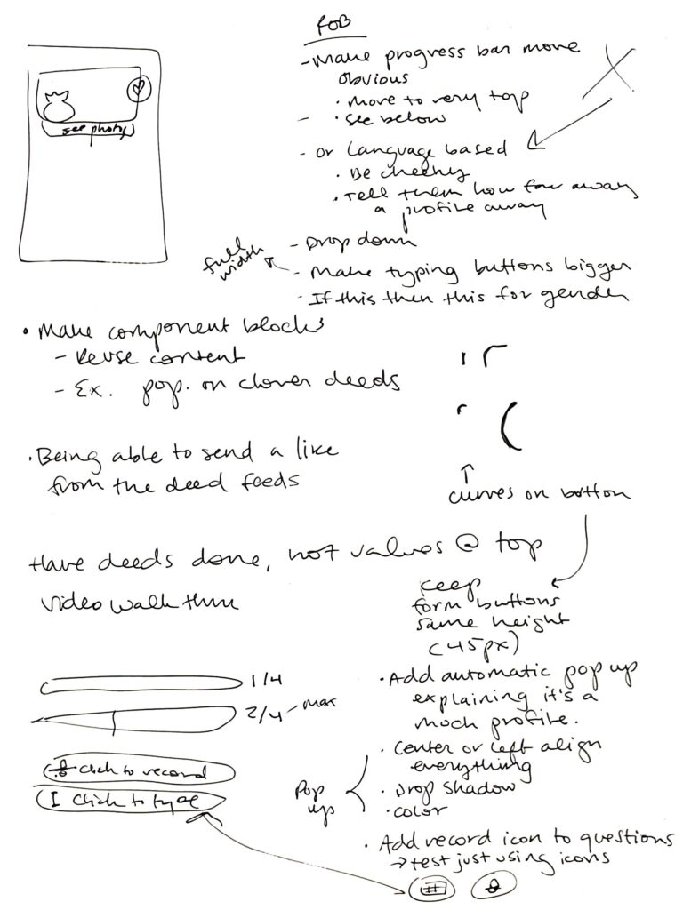
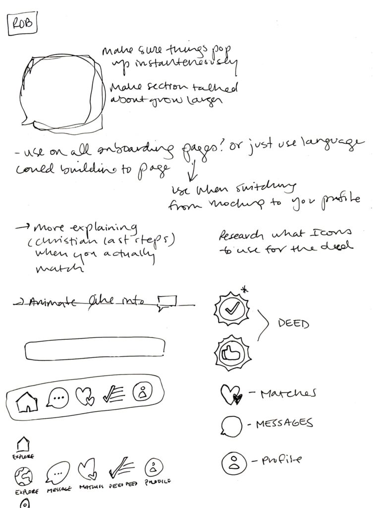
Working diligently in Figma this week, I am seeing hints of how I can arrange my workflow differently for the next project. I am extremely glad from the beginning I employed a design systems tab where I kept all of my components. Future me willplan to sketch up a few different ideas for a card layout (lets say a photo with text description and a button) and how those can be arranged. That way I could make a few mock wireframes with the cards made and compare them side by side. This time around I made one card and then would make changes as I go. Of course I will always make small adjustments, but by playing around more in the wireframes with style guidelines, it would save me a lot of time building out the rest of the app by having a reference point.
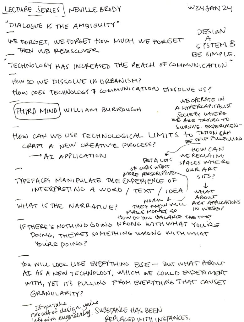
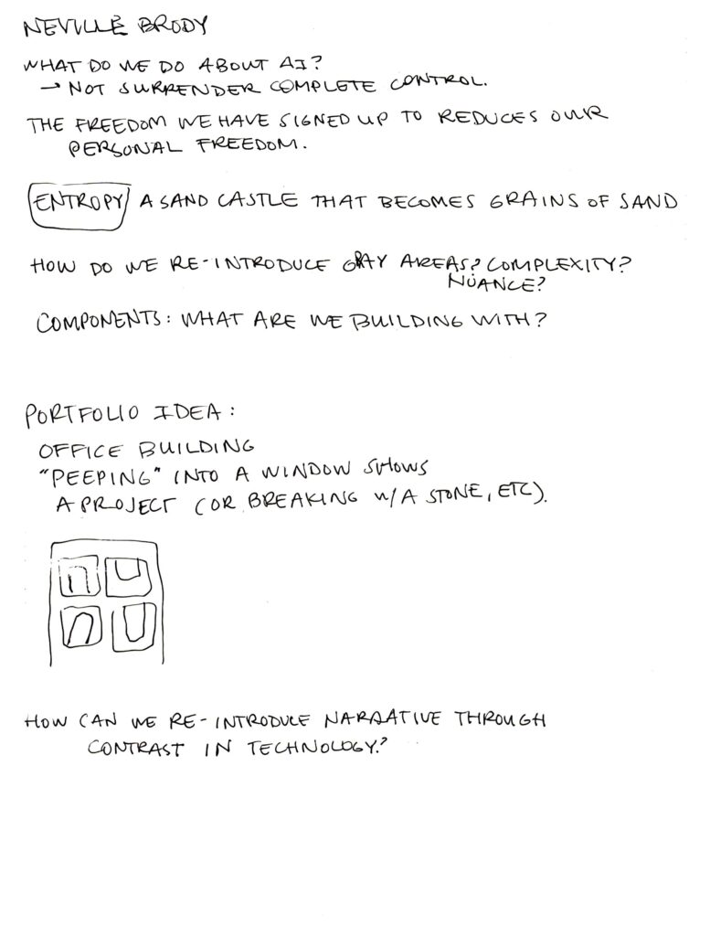
Found a lot of interest in Neville Brody’s talk. However, I wanted him to admit (which I did at the end) that if you want to experiment, we as students need to know that financially that is quite different than going into a corporate setting. I don’t think he loved my question.
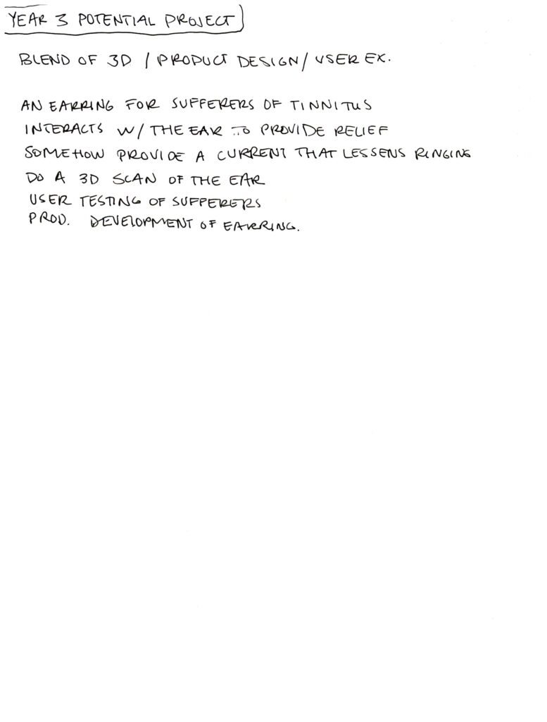
Finally, had a thought for a later project after a bout of tinnitus this week.
Leave a Reply