\ Experience Website \
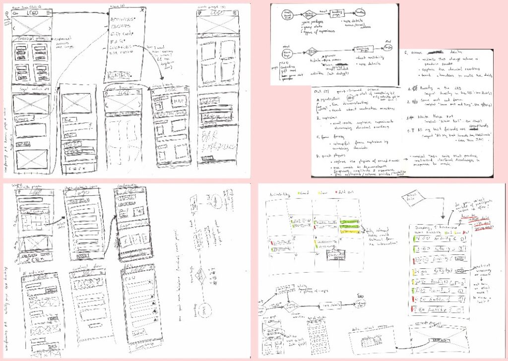
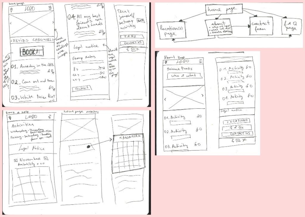
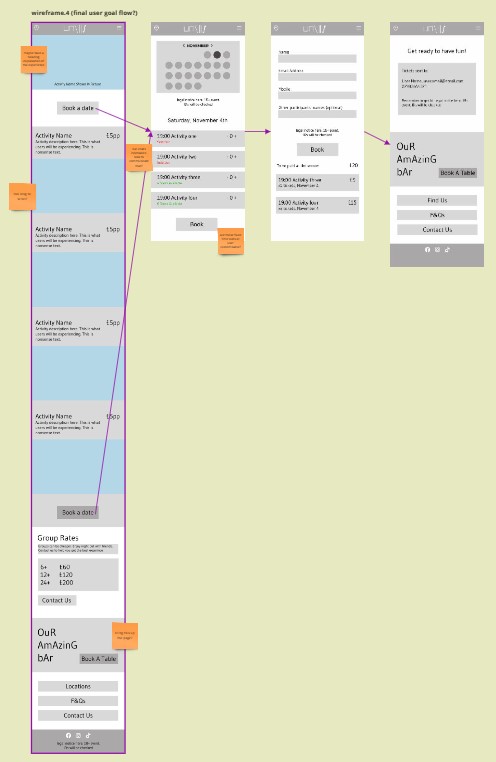
I started the wireframing by focusing on the user flow for the mobile device. As due to the smaller size of the screen you have to limit information to the absolute necessity. That helped me to distil and organise information on the pages.
Though I came up with a website map, for the final product I settled on creating a user flow aimed at booking activities for a custom date.
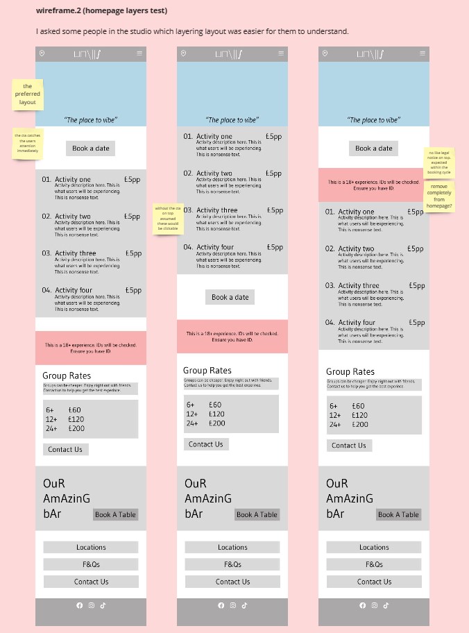
Using low resolution wireframes I sought informal studio feedback from people across all the graphics courses. I wanted to make sure the information layering made sense and was helpful to the potential users.
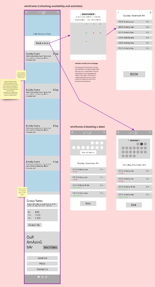
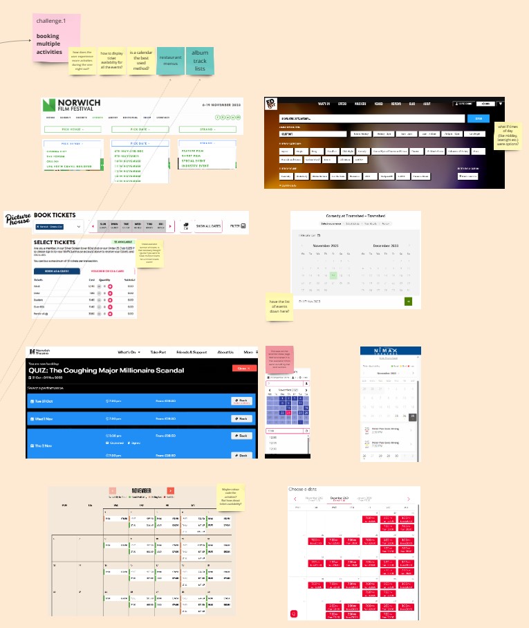
The UX challenge was how availability of activities on dates and times would be communicated. I looked at different types of calendar systems across different entertainment experience websites. In the end I used a system similar to the Capitan Climbing Gym Software.
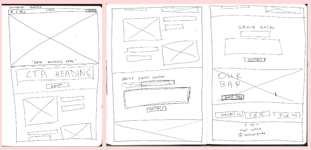
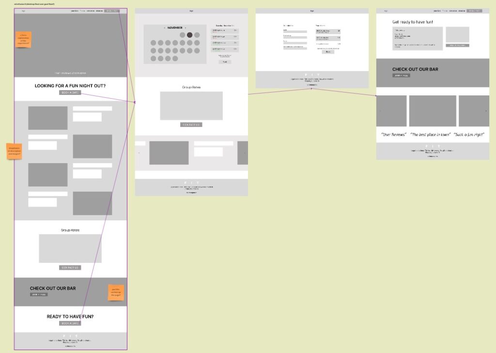
Making the desktop user flow was easier and quicker. Based on the mobile one, I already knew what information went where. The screen size of the mobile device meant that information had to be adapted to prevent pages to become an endless scrolling bore. But the desktop screen had space to expand on information and CTAs.
miro link: Project 3 / Experience Website / Maggie
Leave a Reply