Graduating from Norwich Uni in 2016, Sutherland showcased her work and thought processes from her work as a Graphics student through to her summer internships and career.
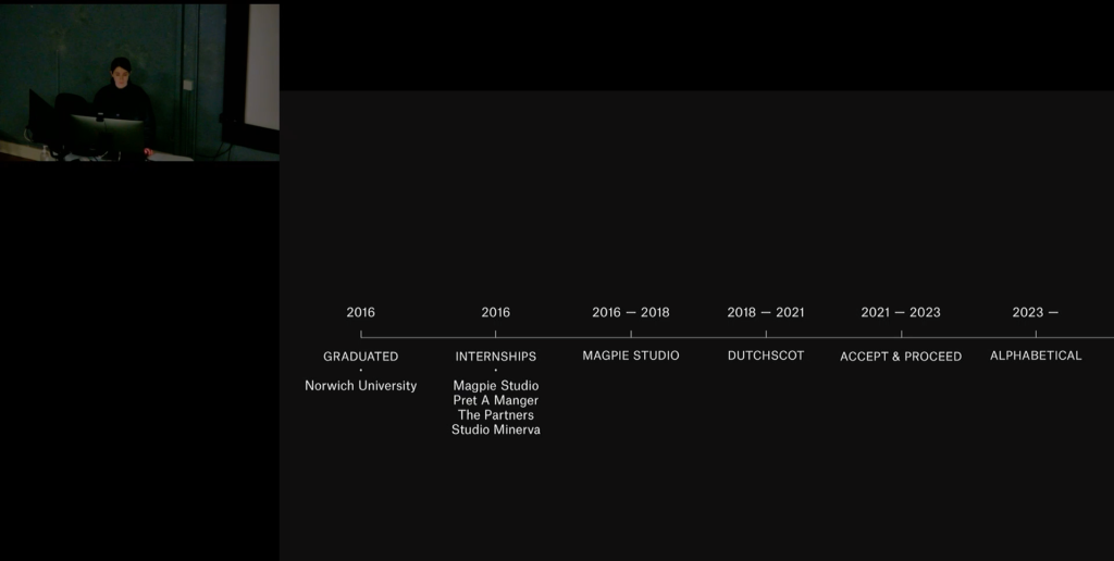
Before discussing her work, Sutherland discussed the internships she’s taken over her education and career. One that particularly stood out to me was that she worked for Pret’s in-house team, reminding me to keep an open viewpoint when looking for internships and that the most obvious design studio might not be the only or best placement.
Sutherland gave some really interesting tips tips to taking on an internship:
- Gleaning what you can afrom the people around you
- Be proactive, always offer to help
- Act like you would in an interview
- Try not to compare yourself to others, focus on doing the best you can do
- Take notes when getting feedback. It shows you’re listening and will work as a to-do list for yourself
I’ll remember these.
Interestingly, the word “glean” came up a lot in Sutherland’s presentation. Gleaning isn’t a phrase I was familiar with, but now I have a new word in my dictionary.
glean
/ɡliːn/
obtain (information) from various sources, often with difficulty.
Second Sea
Something I always try to get out of the Talk Lecture series is how I am able to link their work with UX, and they very often provide a great and very unusual insight into web design, app design or interaction design in a way that’s very different to what we learn in the studio.
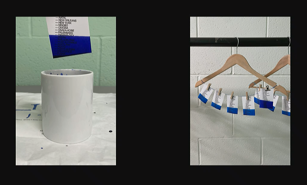
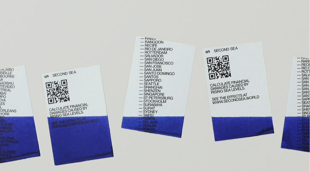
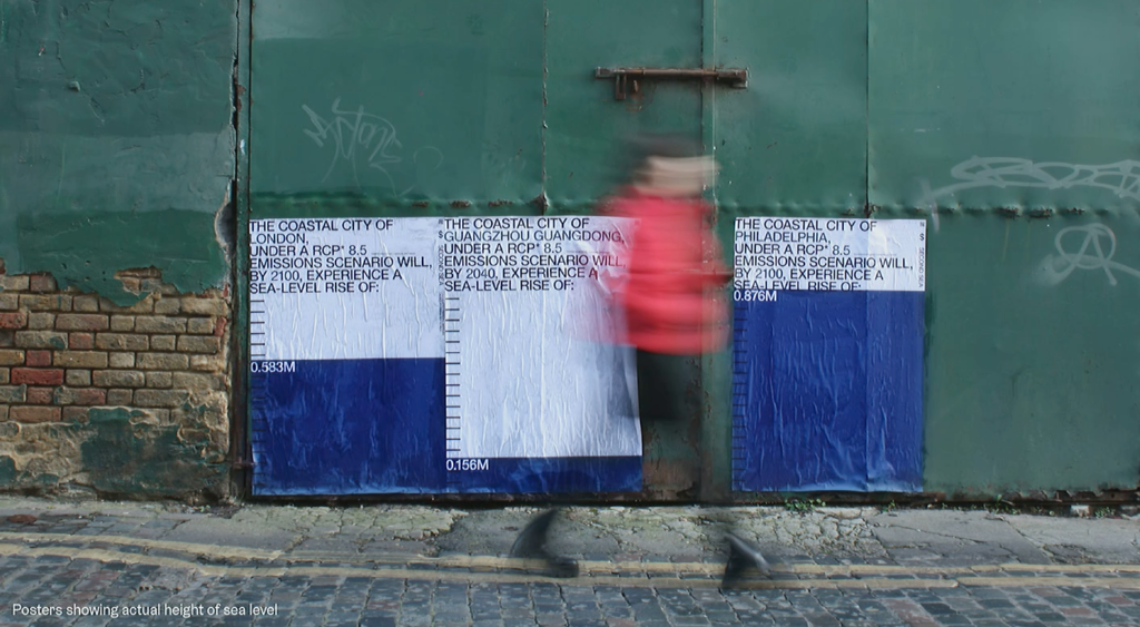
Sutherland worked on Second Sea, a visual guide to how rises in seas levels are projected to affect coast cities across the globe.
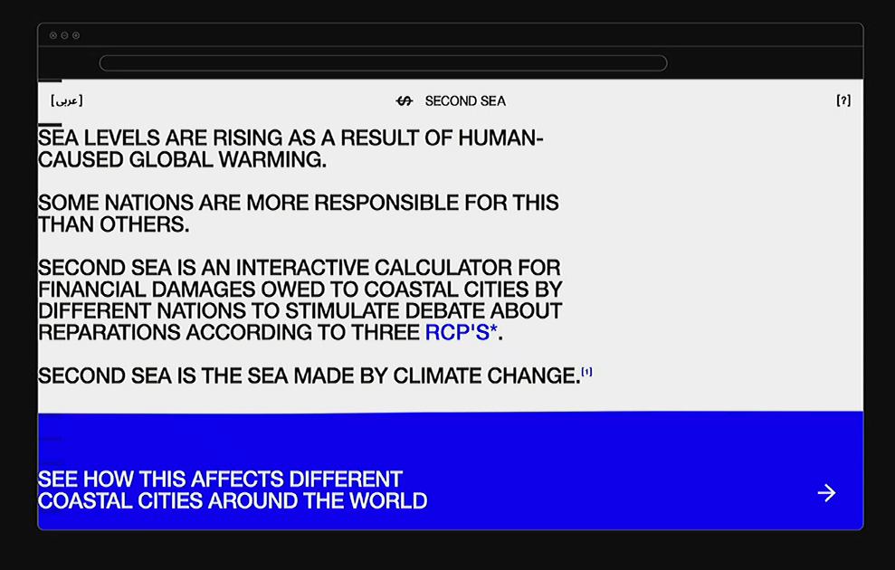
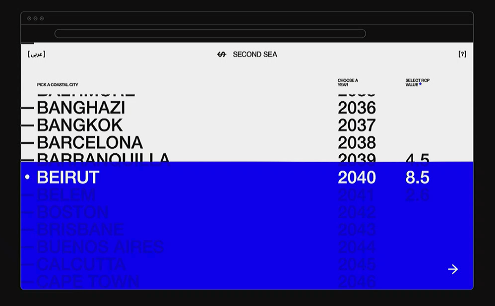
I am a big fan of the design thinking that’s particularly seen in Norwich Uni’s Design for Publishing course, interestingly to me neighbouring UX in the studio. I’d like to apply this thinking to my work more, really taking advantage of the fact UX/UI can be used as a canvas to provide experiences much more memorable than say a book or a poster. UI is powerful and I want to be able to really take use of this, in a similar way to how Sutherland did in this project.
I also like how Sutherland took this digital idea and bought it into the physical, in the form of dye-dipped business card and dyed fly-posters.
Littlemore
On the topic of bringing a different perspective to UI design thinking, another web project of Sutherland’s stood out to me. I do not agree with this UI design at all (I think it has it’s own issues in terms of readability, accessibility and navigation — but I suppose that’s why UX/UI designers exist in the first place and maybe they should leave it to the professionals). But, I still think it’s interesting to take a step back from UI as we know it most commonly in the field and explore refreshing design thinking and methods.
This dynamic homepage is interesting to me, however as you get into the site it just seems more useless.
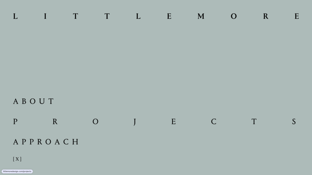
As you over on interactive elements, they expand to fill the page. Sutherland in her talk used the notion “it has to fill the entire space”. It doesn’t, but I like the thinking.
The pages are then split up strangely, with no/poor hierarchical flow or navigational flow making it known to the user where on the site they are.
Not something I want to create exactly, but I enjoyed taking a step back from the UI I usually create, and thinking from the perspective of a “graphic designer”, not a UI designer. I want to apply the “graphic designer” mentality, creating an intersection of stand-out design that’s also functional and accessible.