This week saw a big push in the development of our Virgin Wines collaboration project, in terms of my own concepts, bringing those ideas to the group and moving closer to a shared developed outcome.
Getting size right
Something I briefly want to touch on is my prototypes. A skill I picked up from my group member James is using the Anima Figma plugin to preview prototypes in the web browser, giving a much more realistic demonstration of the sizing of elements than Figma’s inbuilt prototyping preview. The example below shows the prototyping screen and what at the time was normal looking text fields, compared to the web result. Oversized and ridiculous!


By utilising this tool I was able to produce more realistic prototypes, better leaning towards a more realised solution.
Working on Concepts & Ideas
I pushed my concepts and ideas, sometimes developing them into a higher level of fidelity (where this helped me to communicate my concepts and ideas in terms of pitching ideas to the group and lecturers).
Mobile Matters
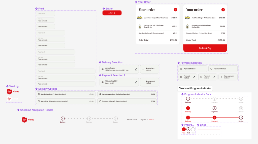
Last week I demonstrated my idea for my checkout page progress bar as seen below.
Feedback from Graham questioned how this would function on mobile. I experimented and created different versions, ultimately resulting in a progress bar that kept communication of progress and the number of tasks the user still has to complete.
I am pleased with this approach as I feel it’s a space effective and functional solution to a tricky problem.
Creating an Engaging ‘About Us’ Page
I wanted to create an About Us page that’s striking and engaging to a user.
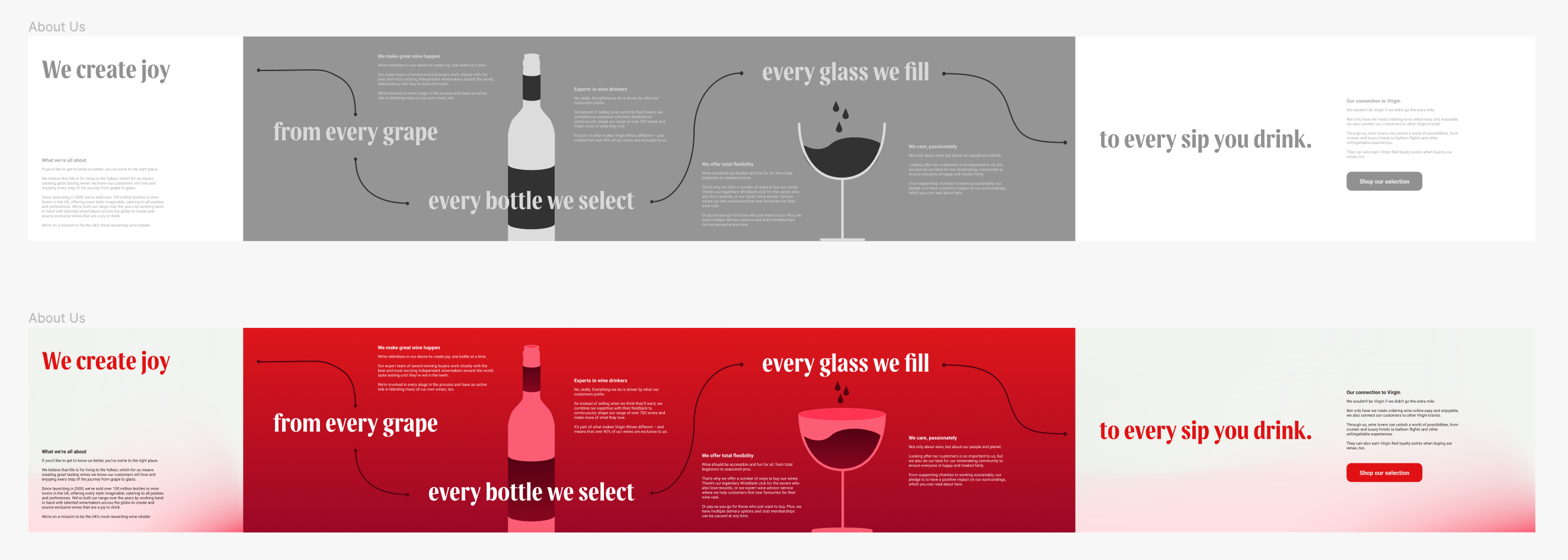
I did this in two ways, creating a story and creating visual excitement.
Firstly, I wanted the page to flow from left to right like a page of a story book does. I was inspired by treasure maps to create a route for the users eyes. The user follows this visually as they scroll, creating a full story as they read, while picking up information about the copy.
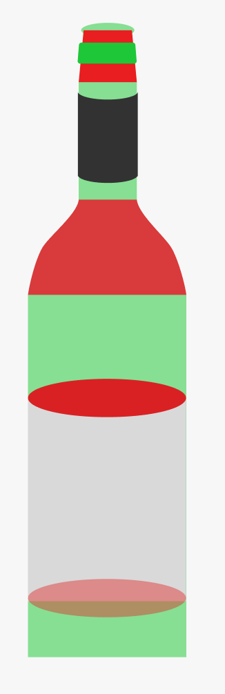
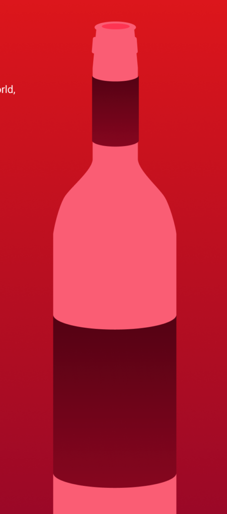
Secondly, I wanted to create visual excitement. I did this by using bold, Virgin Red colours to create a sense of fullness but to also connect the page deeply to the Virgin brand and colours.
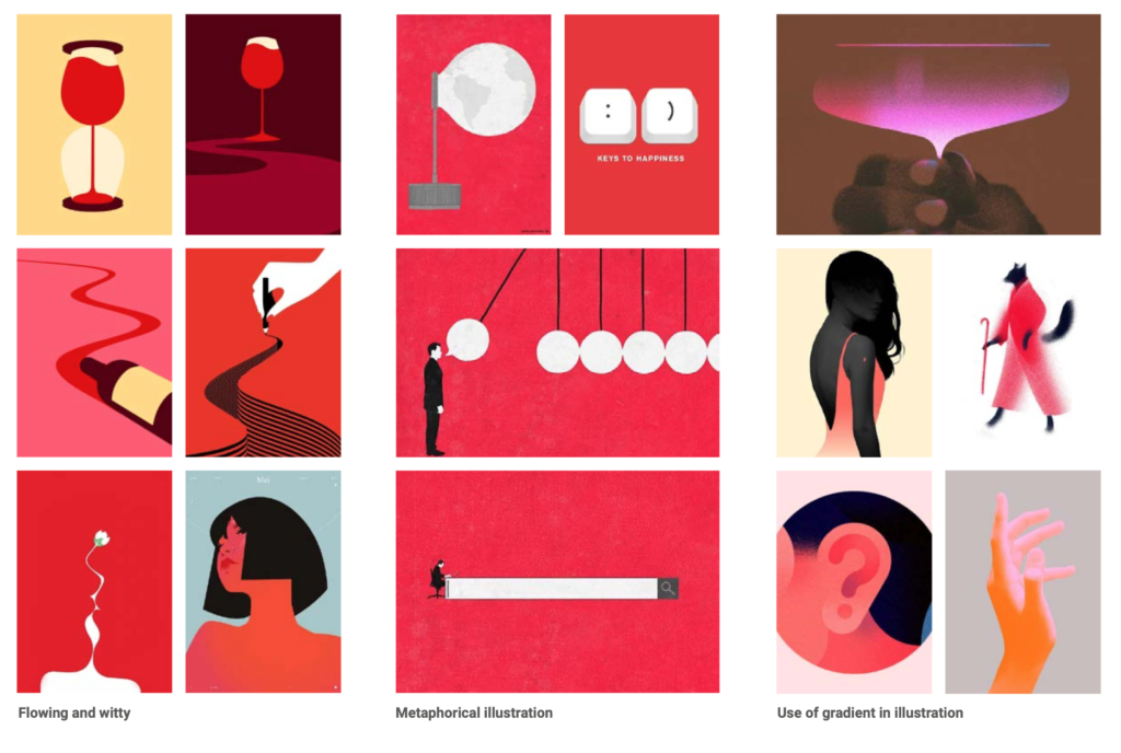
I created engaging illustrations within Figma, using the union and exclude selection tools. I used a careful choice of colouring to bring these to life and make them feel part of the brand. I was inspired by the illustration inspiration featured in the Virgin Wines Brand Guidelines, particularly the use of gradient in illustration.
Starting on the ‘Wine Tasting’ Page
I wanted to create informative Wine Tasting pages, with a focus on pulling difficult to find information on the current site out, and making it more available and useful.
I created these early prototypes.
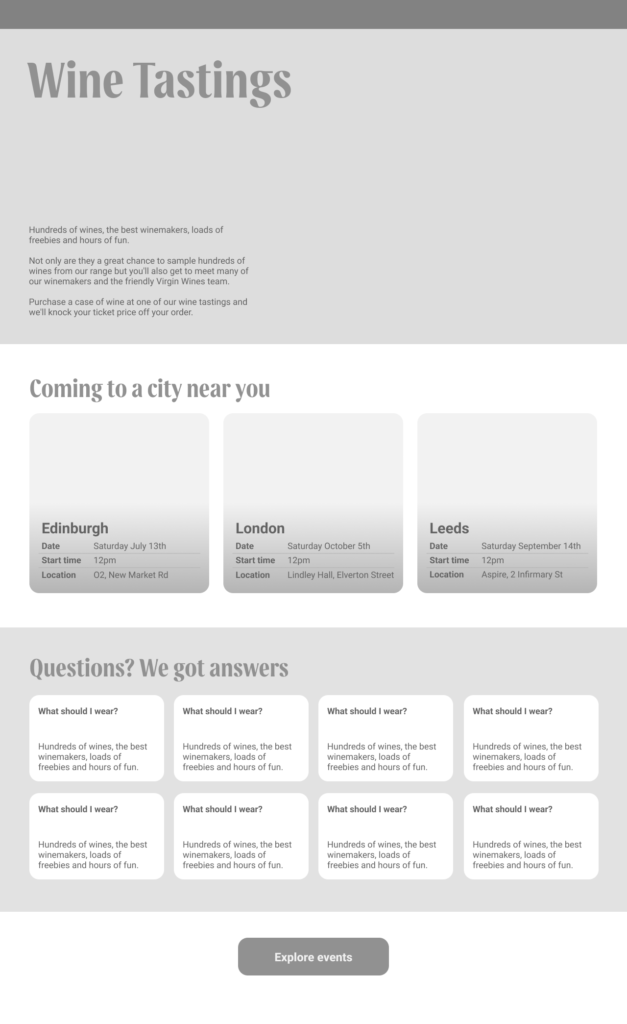
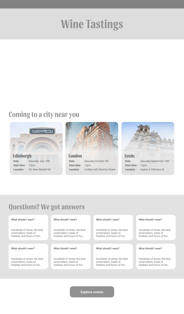
The focus of this was on the individual event cards. I considered how on the current site, the information is boxed in and difficult to read, with key information only being separated from the rest of the body text with bold text. This isn’t enough for the user to be able to quickly glance and take in key information. This is what I wanted to improve upon.
Through several iterations, I feel I produced a functional and informational card that significantly improves on that of the old site.
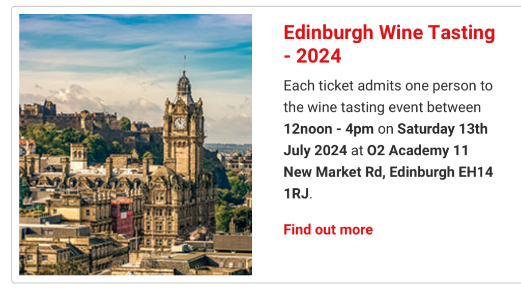
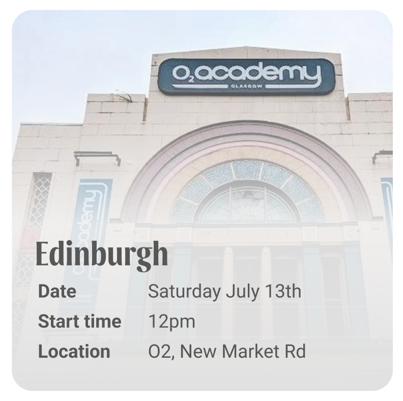

This card captures key information, allowing the user to access more information if they choose.
Collaboration, Communication and High-Fidelity
We had a group meeting, in which we discussed our ideas and concepts for each page. We discussed and agreed on what elements we liked from each contributor and what we wanted to bring to high-fidelity.
| About us page | Using statistics to show information re the company Using illustrations Horizontal scroll Well sectioned Snap to screen |
| Events page | Layout of information for events Use of images to show events FAQ cards Considered ‘Add to Basket’ design |
| Checkout-page | Well designed progress bar UI Design from existing prototype and strong use of auto-layout |
Moving into High Fidelity
From this, I moved onto creating a high-fidelity design that is currently unfinished.

With this design, I aimed to take the key information of the tastings, simplify it and make it communicable. I look forward to adding to this design.
Designing in Synchrony
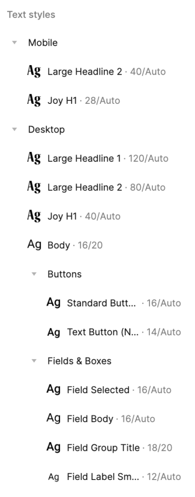
Created by my co-designer James, we are using a cross-project style sheet, as well as Virgin colour schemes. This means we can design in partnership creating designs with the same language.
I’m also working to the shared design assets created by James, to create a synchronised design.