I continued developing my high-fidelity work for the desktop and mobile Wine Tastings pages. As well as this, I worked on animated illustrations to transition between sections in the ‘About Us’ page.
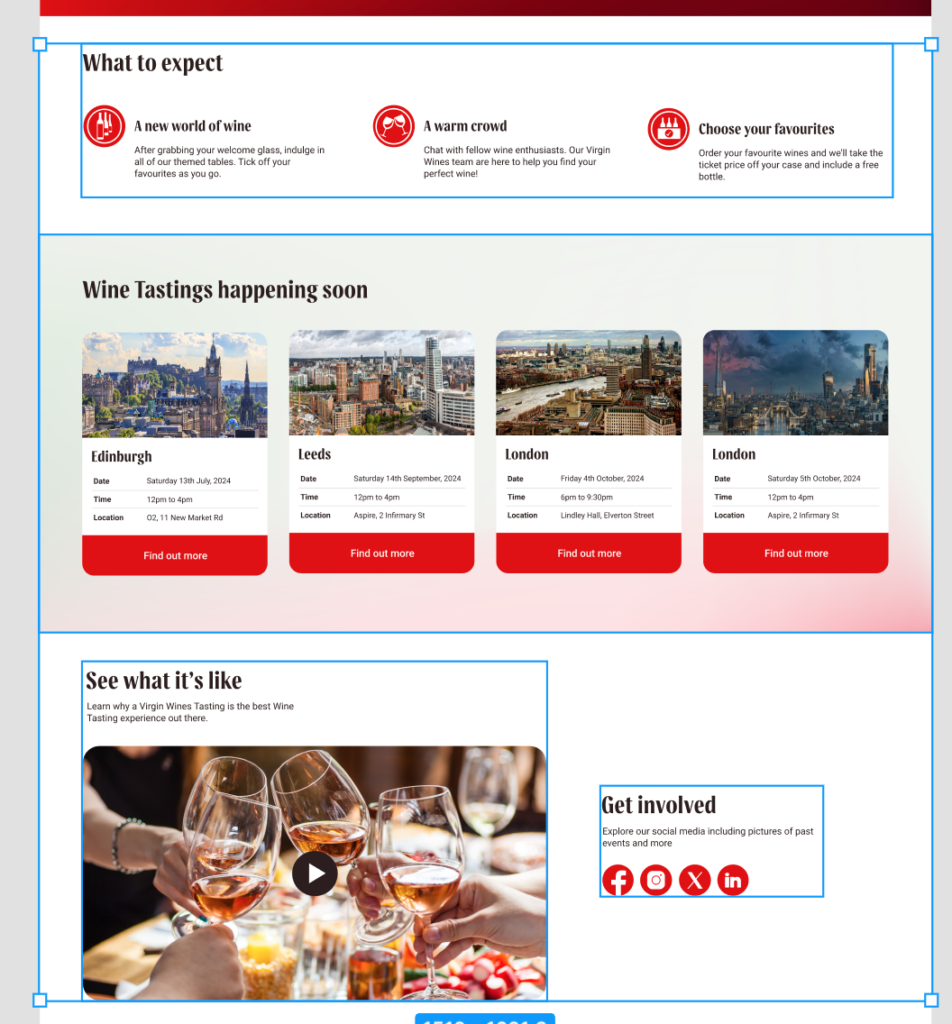
Wine tasting Homepage
Working to a Grid
Throughout my designs, I have worked consistently with a grid.

This is useful, as it allows me to ensure my designs are consistent with the content designed by my co-designer.

By ensuring we designed within multiples of 4 and agreeing on design decisions together, we kept our designs in the same digital design language.

I followed a 6 column grid on mobile with a margin of 28, best fitting this smaller screen size. Note in this image the icons are not yet complete, which is why they are not pixel perfect as of yet.
Experimenting with Auto-Layout
As part of the FAQ section, my original plan was to have cards that expand to fit the copy of each question and answer.
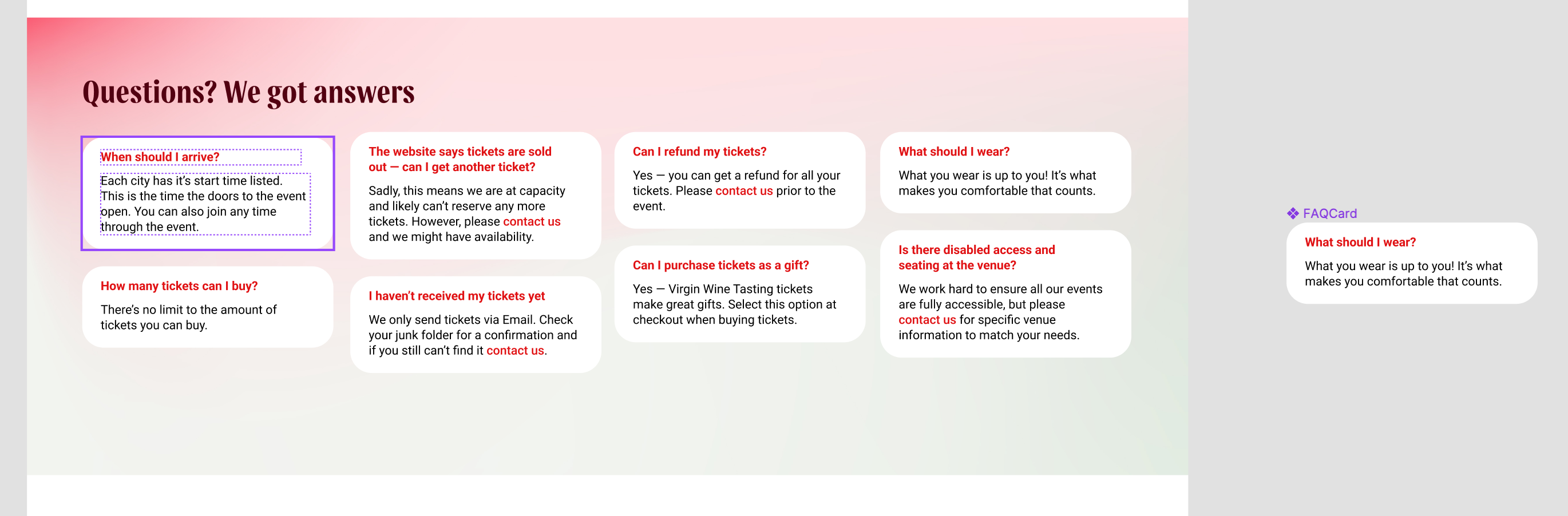
While I liked this approach, I struggled to create a natural and organised look to the FAQ section. I ultimately scrapped this in favour of a rigid approach to each card.

Writing Natural Copy
When writing the copy for the FAQ section, I considered how tone of voice can balance effective communication to best answer the question and advised tone of voice from the Virgin Wines brand guidelines. I also kept answers short and punchy, getting to the point quickly. I also considered how I keep replies professional, as I feel the FAQ is more functional than a selling tool.
Using Colour Appropriately
I kept in line with the Virgin Wines Brand Guidelines. I was considerate about how I can best use colour to create sections and variety within the design as the user scrolls down.

Using inverted gradients helped me to create a natural and well-sectioned flow down the page.
Organisation
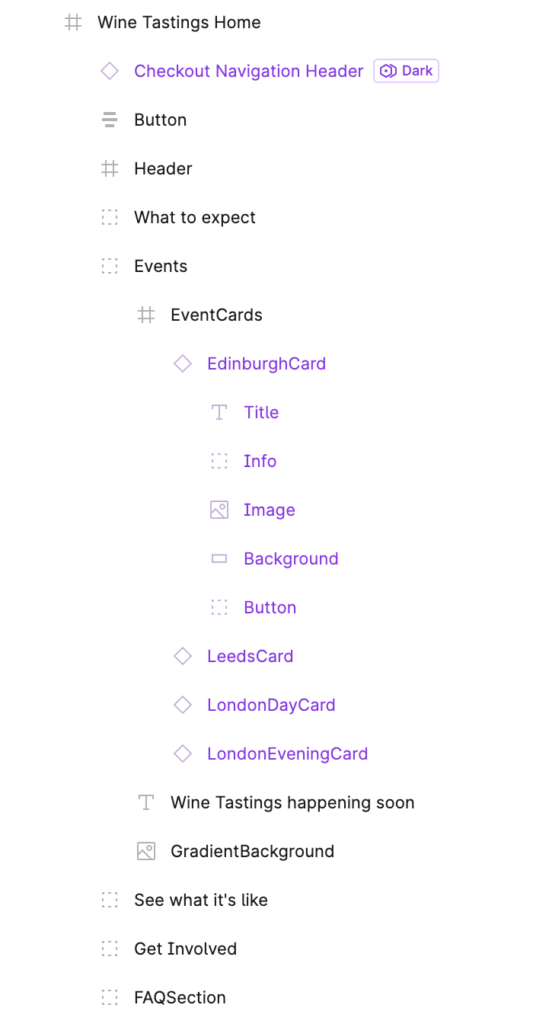
Throughout my designing, I maintained a hierarchal mindset to elements on the page, helping me to easily identify and keep track of what I’m working on. I considered how I name elements of the design to keep organised, and allow them to be easily accessed when applying things like overlays.
Wine Tasting Event Page
Add to Basket Card
As part of the Wine Tasting Event Page, I created a payment card that significantly improves on the old design.


In my improved card design, I considered how information can be best shown and interacted with so the user can perform the task they need to task, booking tickets, as quickly and efficiently as possible.
I focused on bringing out key information in an organised way. I also added the feature of showing the order price before the user places it into the basket, which is a problem we first picked up in our analysis of the existing site.
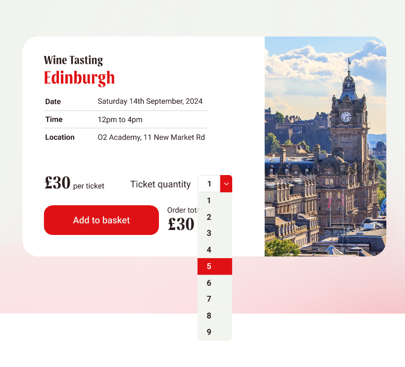

I also created this dropdown with organisation in mind, allowing me to easily change colours and elements of the dropdown using components and styles.

Mobile Add to Basket Card
I considered how people interact with their devices and determined using a tappable counter is the best way to create an alternative Add to Basket card for mobile devices.

Confirmation Overlay
I designed an improved overlay informing users of their tickets being added to their baskets. I found the overlay was awkwardly placed in the corner and did not at all stand out. In many times I didn’t even realise it was there.
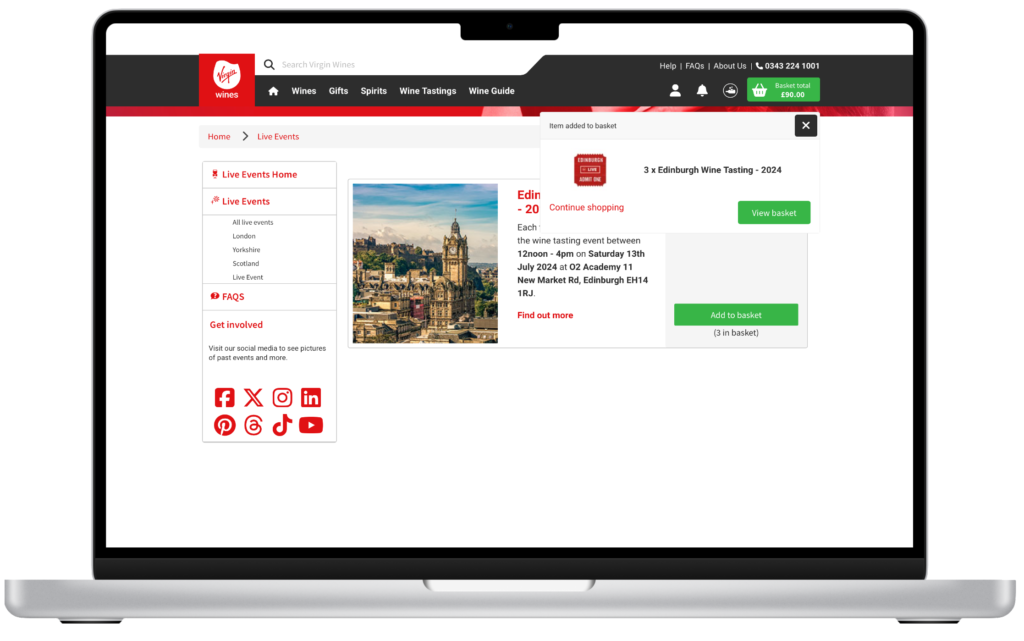
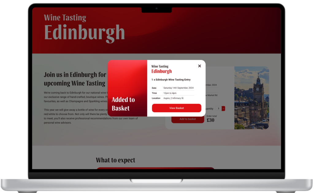
I created an overlay that not only aesthetically utilises the Brand Guidelines but also functions to inform the user of what exactly they have just added to their basket. They are shown event details and number of tickets so they know exactly what they’ve added.
I also removed the ‘Continue Shopping’ button due to it being redundant and to reduce unnecessary complexity. If the user wants to continue shopping they can hit the ‘X’ or click off the overlay. This is an intuitive action.
About Us Animations
I worked on creating illustrations and animating them for the ‘About us’ page. I created three animations:
- Wine bottle falling
- Wine glass filling
- Hot air balloon flying
These serve as transition assisters between the established sections of the about us page. They create enjoyment as they are triggered by scrolling across the page (mouse enter for prototyping purposes due to Figma limitation).
Wine Falling
As the user scrolls across into the next section, the wine falls bridging the sections.
Wine Glass
By using masks, I created this wine filling animation.
This works by transitioning the wine shape upwards on the event of the trigger, which is otherwise hidden by a mask shaped the same as the wine cup, giving the effect of the cup filling.
This is a Smart Animation triggered by the mouse enter trigger.
Hot Air Balloon
A work in progress, the hot air balloon acts as a finale to the ‘About Us’ page. However, as seen in the below image there has been some difficulty due to glitches with Figma’s Smart Animate feature.
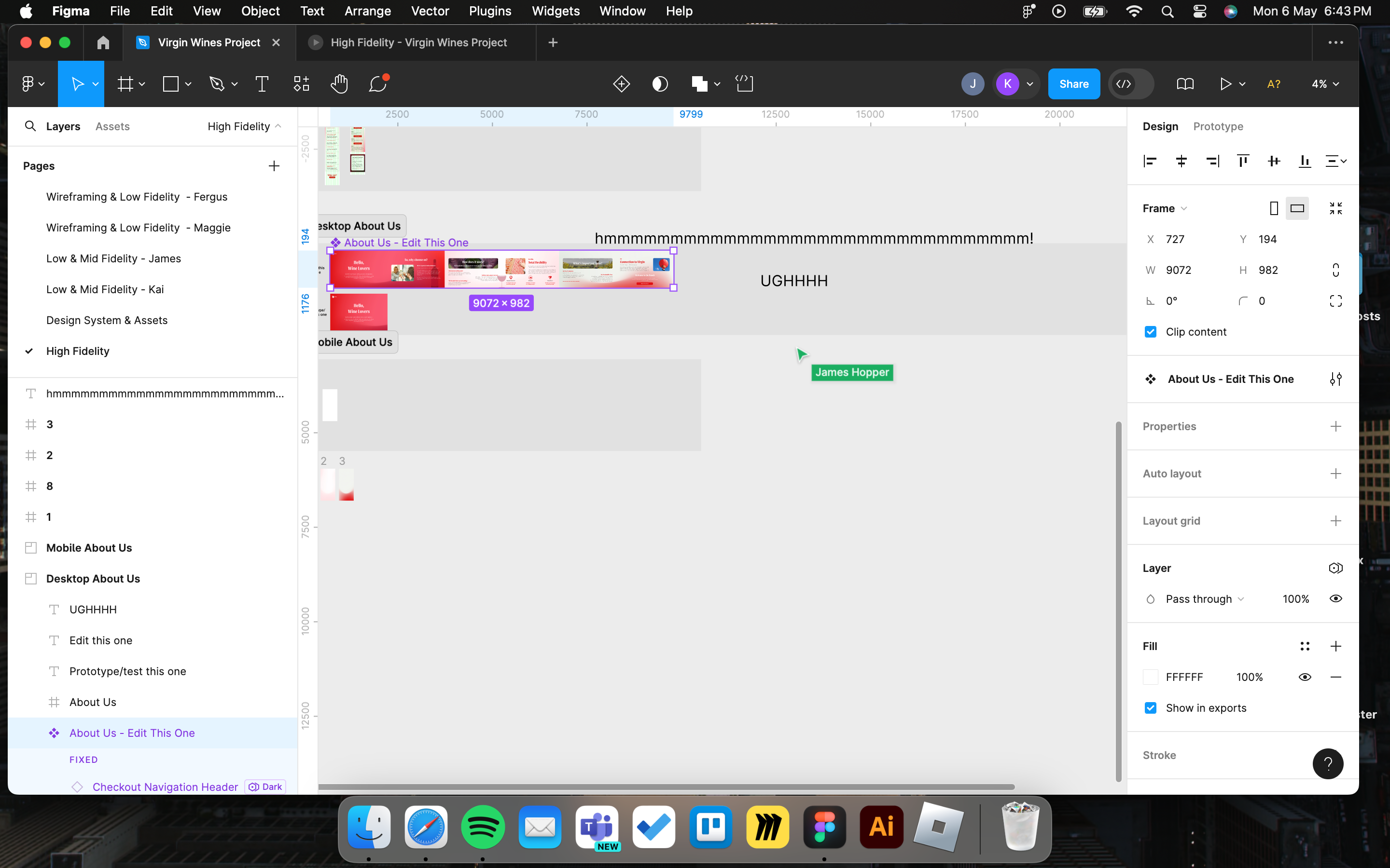
I did this by creating a large frame with a ‘visible section’ and creating a component with multiple variants, each with different positions of the hot air balloon. When the first component is triggered, it smart animates to the next component with the hot air balloon in a different position, and then to the last component with the hot air balloon in a different position.
Due to limitations within WordPress, please see the Figma file to see the final animations.