Finishing off research
Wine Bank Research
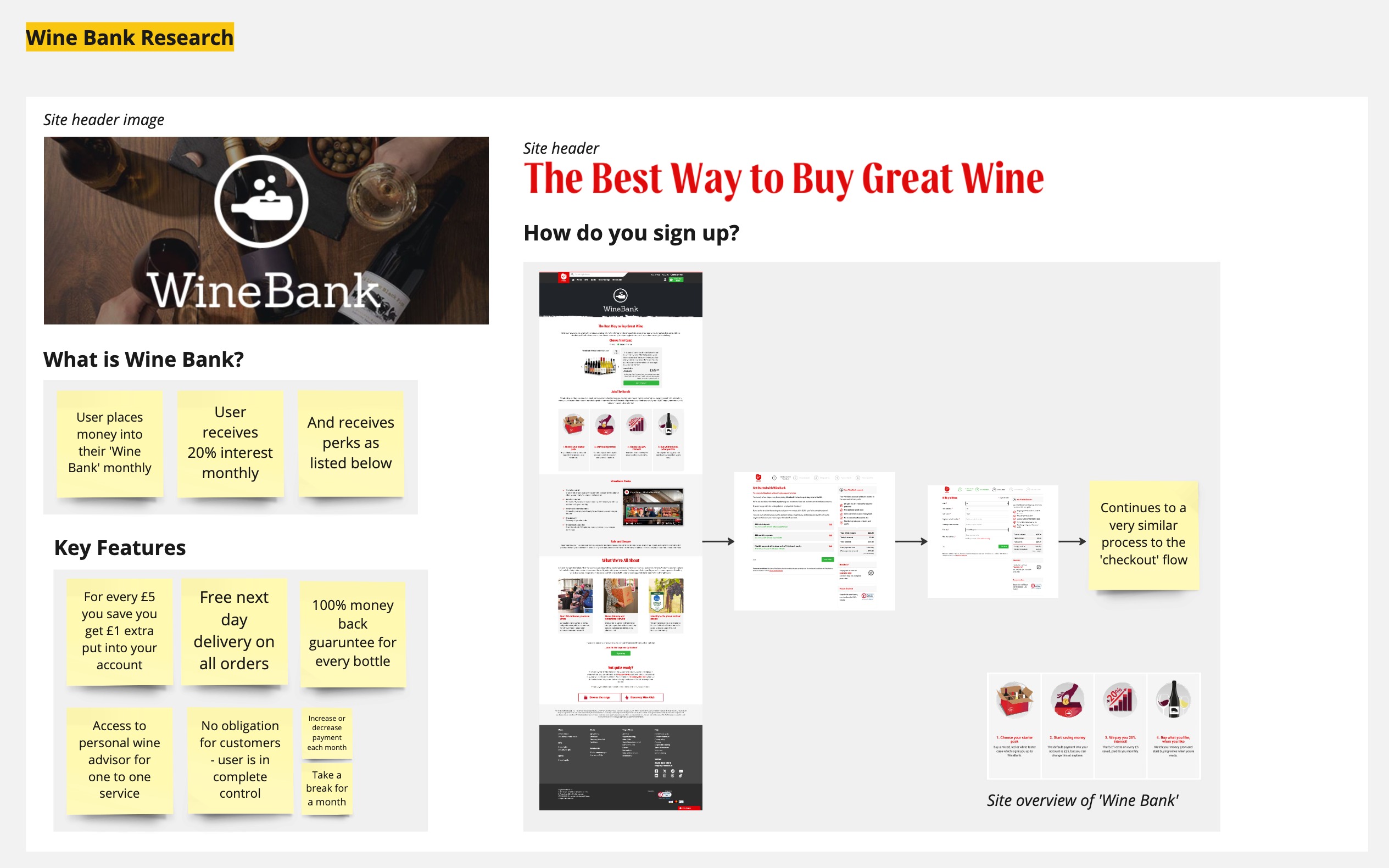
This week, in preparation to move onto the prototyping stages of our Virgin Wines website rework, I completed some small areas of research so we were as a group fully prepared. This research was brief, but a good point of bringing the information on the Wine Bank site together to one place for reference.
I did this not because I needed the information but because I am working collaboratively and took the responsibility of completing work not directly benefiting me but benefiting the group and our shared goals.
Bringing Together our Heuristics
In preparation for moving on to the prototyping stage, we brought together the results of our individual heuristic analysis.
The red sticky notes-show my contribution.
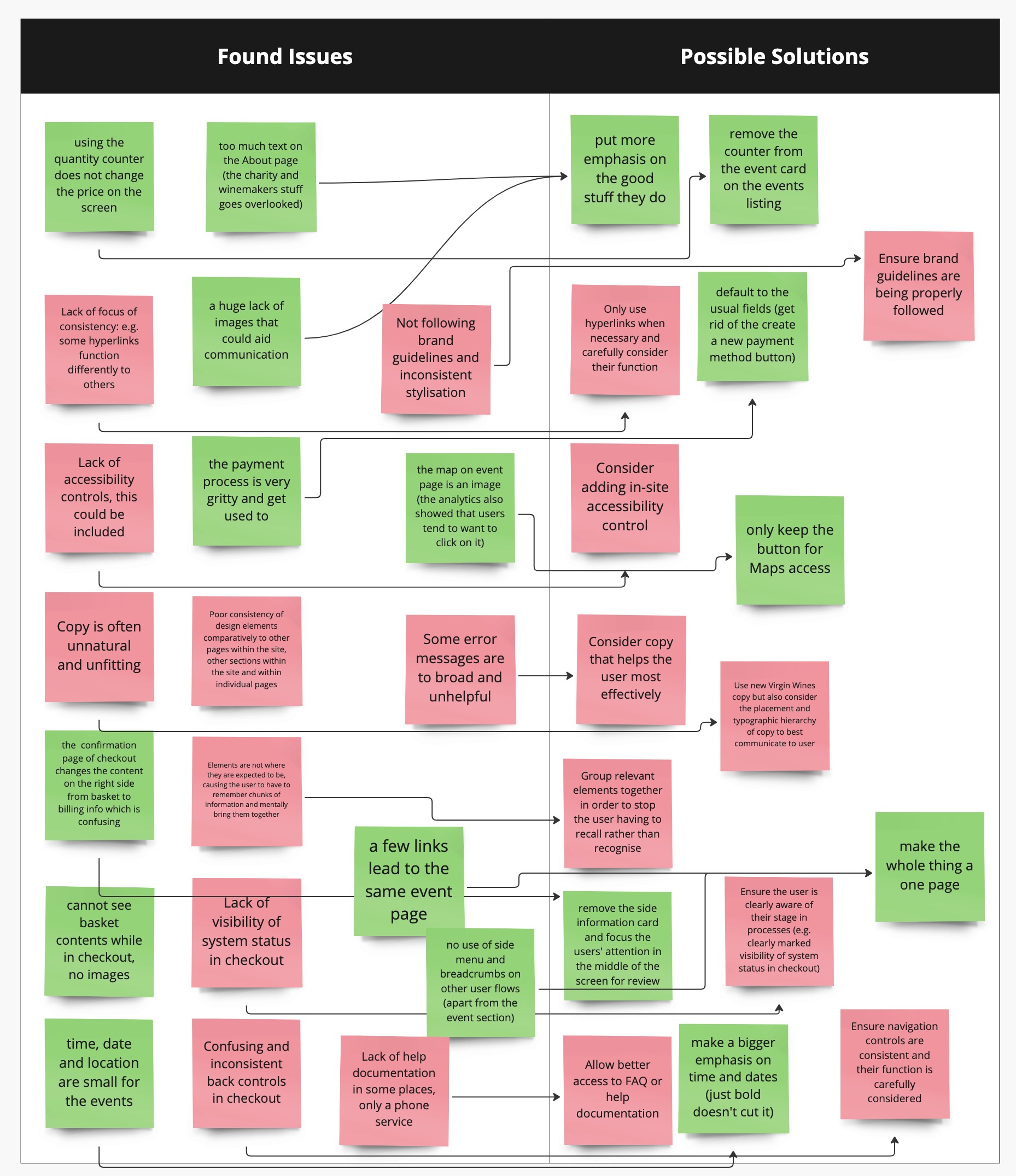
This table, while being messy was the result of a group call where we brought together our ideas and discussed them together, giving us a collaborative idea of the issues we found.
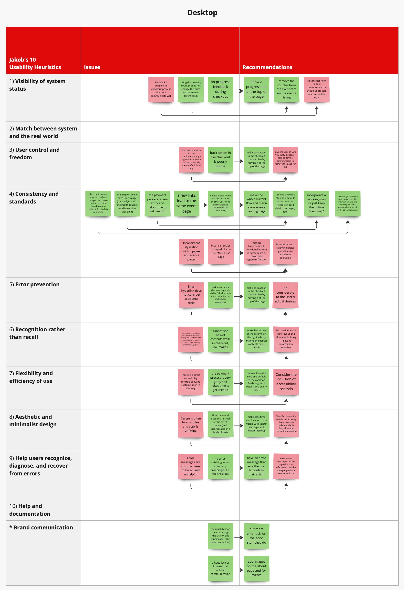
We then individually brought our analysis back to heuristics so we can best apply our findings to our design.
The red sticky-notes show my contribution.
Experimenting with Prototyping
This week, I began exploring different routes for the ‘About us’ page and the ‘Checkout’ page as part of our redesign. We split this part of the project into our own Figma pages, giving each designer control over how much they want to see collaborator’s designs. We did this to avoid subconscious bias in our designs and to allow different routes to naturally develop, instead of accidentally copying from each-other’s designs.
About Us
I explored different methods of creating an engaging About Us page, rather than focussing on the content. I imagined using parallax could be an engaging and user-focused way of displaying content, on a horizontal rather than vertical scroll. I explored a horizontal scroll because if we move to a story focussed About Us page, I was interested in the idea of a “left to right” style flow, similar to how a line in a book is read.
I was interested in Figma’s parallax capability, but I was disappointed to realise it only works on a ‘drag’ trigger as there is no in-built scroll trigger within Figma. This didn’t stop me experimenting more.
I imagined a ‘Z’ type website, where the user can scroll in different directions to reveal more information. This is only an early concept and I will discuss more with the group about how this could potentially be applied or inspire a further development.
Checkout
A big feature I wanted to improve upon was the progress level, showing the user where they are up to in the checkout process. For this, I wanted to clearly show the stage the user was on. I took inspiration from my design from my Bsc2a Design for Good project, where I had a progress bar in my app showing progress.
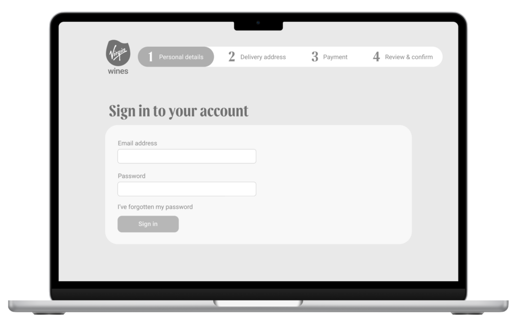
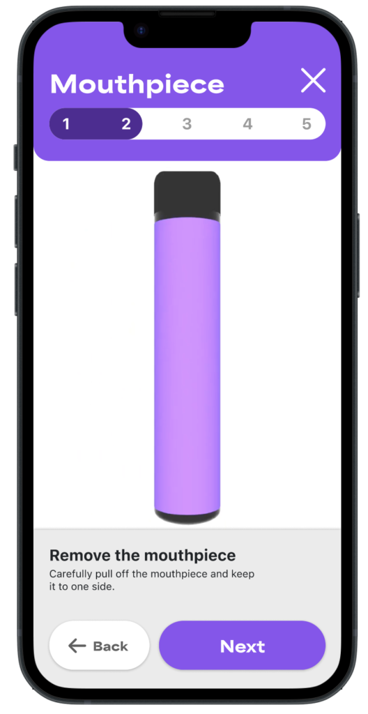
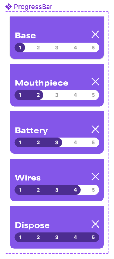
I was inspired to execute a similar style progress bar, using variants of components. This allows me to easily change the progress level of the bar with triggers and I can also consider using variables within this.

This is something I will bring forward for inclusion with the team.
Other Checkout Pages
I began experimenting with layouts for other areas of the checkout to try to develop a visual style that is useful and follows the Virgin Wines brand guidelines.
As part of this design, including the Sign in page, I considered the “interactivity area” and how this creates a specific plane of interaction above the background.


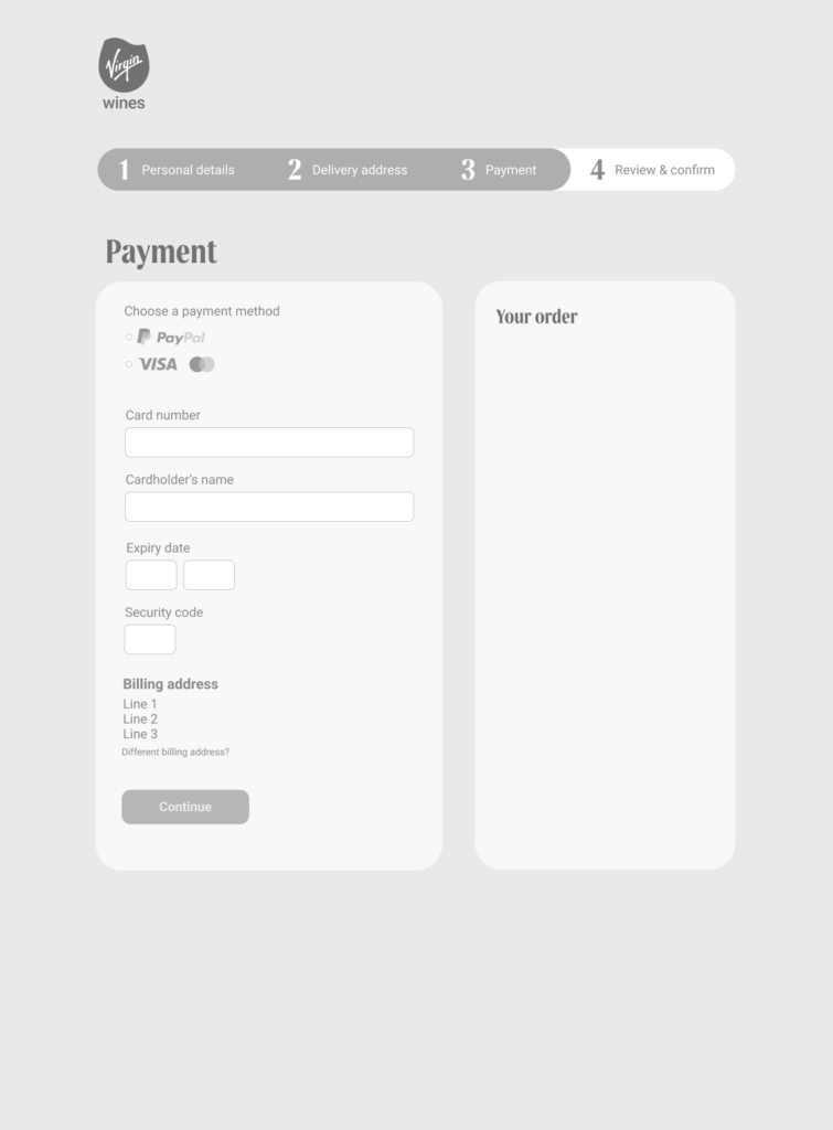
These wireframes are in their early stages but I look forward to expanding on them.
Virgin Wines Brand Guidelines Activity
Not for the purpose of wireframe development but rather than a branding activity, I tasked myself with adding colour and theming to one of these wireframes. I did this not for the purpose of jumping ahead but to immerse myself in the Virgin Wines Brand Guidelines and experiment with colour and hierarchy.

I carefully chose a gradient that is boldly Virgin red (as best I could without having access to the brand gradient assets) and used Virgin Red and Malbec to create bold coloured elements. I considered how shadow can be used as a device to create hierarchy and lift from the backdrop, creating distinct elements where the user should look.