Beginning with the name VapeRecycle, I began to sketch out possible features my app could have. From my research, I decided on 4 solid features the app must have.
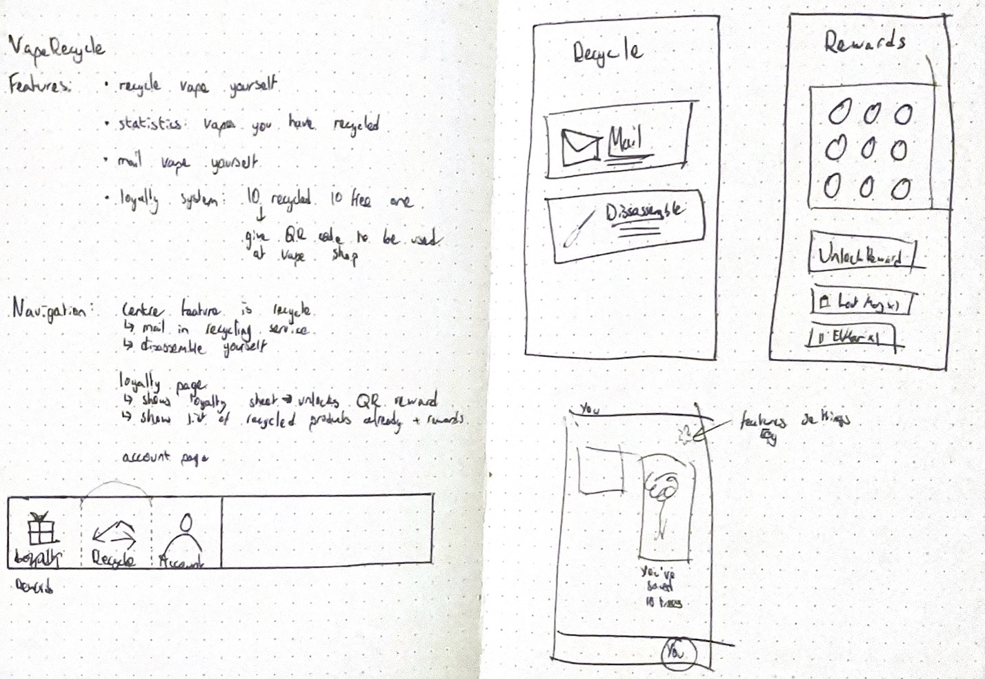
I began to imagine how I’d like my app to be laid out, starting with the most straightforward navigation features.
I knew the user must be able to
- Be able to recycle the vape themself
- See their environmental statistics
- Mail their vape for recycling
- Access a loyalty system to keep them using the app
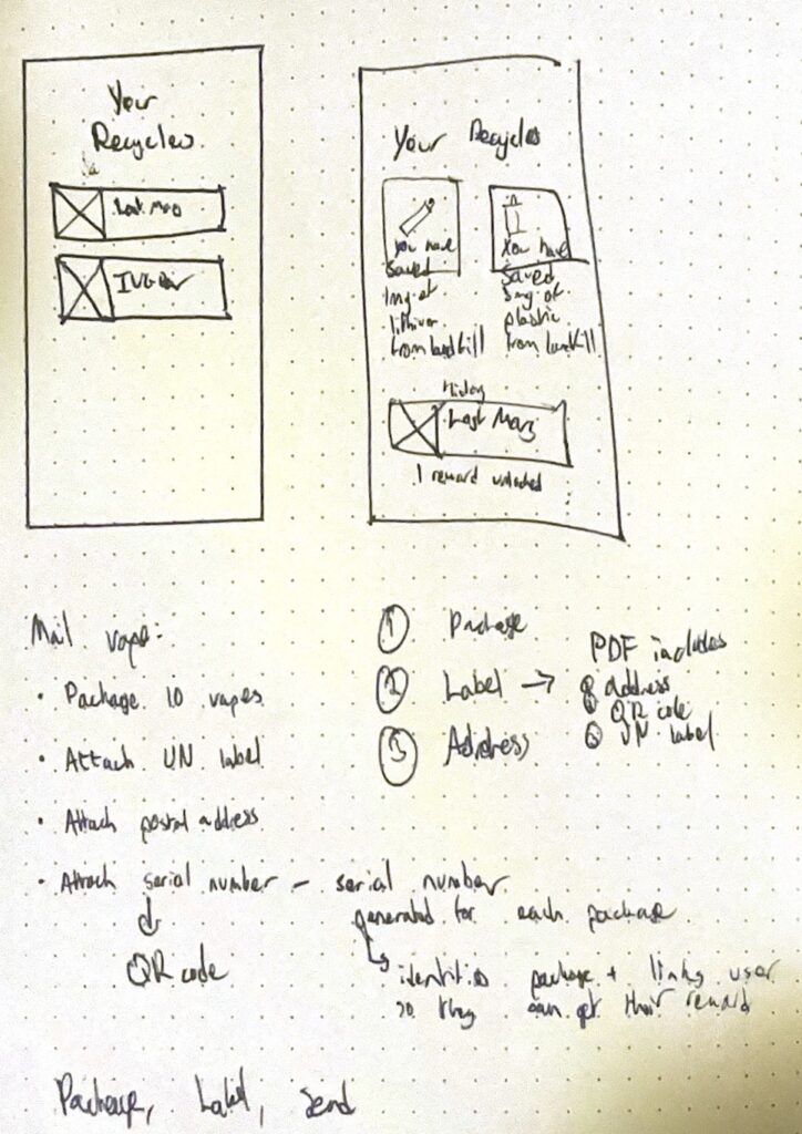
I took these rough sketches, and began to work them up to more full designs.
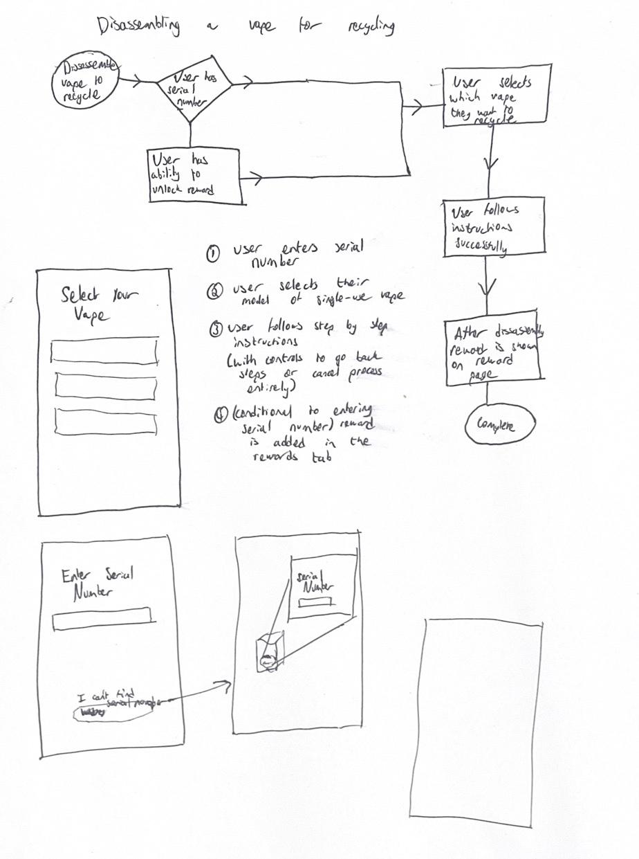
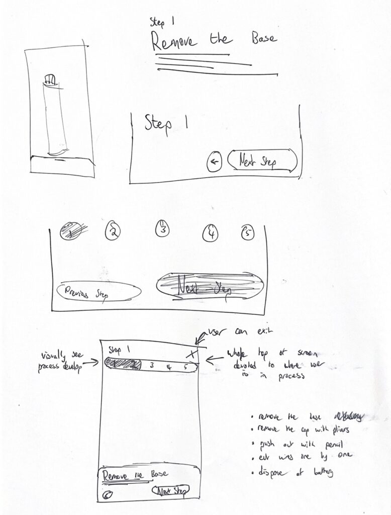
I was considerate of the processes I was following within the app, having these based of research. Although they started as very rough hand-drawn sketches, I knew when I move these into wireframes in Figma I would get a result more similar to the images in my head. I know my own strengths and weaknesses and I know hand drawing is one of my weaknesses.

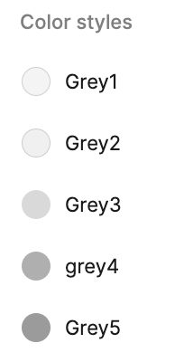
I set boundaries to the function I would like my wireframes to serve, to ensure I was creating them with purpose and fluency. My wireframes would be greyscale, with purposeful definitions of shades to portray hierarchy and layering, which I determine now to use in my design. Use of each shade is grey is intentional and shows me how I would like the app’s layering to function.
I also intentionally chose iOS’ system font San Francisco Pro in order to hold a neutral tone before I move to bring a visual identity going into a higher fidelity than current.
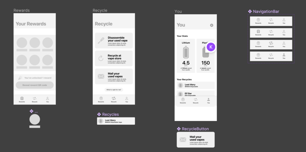
I was also specific about my use of components within this stage of prototyping. I used them where I knew they aided me in creating the wireframe and making design choices, yet I didn’t want to feel tired down or have a lack of full control.
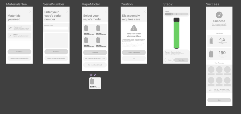
I created flows, laying out areas where I want them to be.
This basic layout is useful to me, as although I can see much more potential within the greyscale layers, I understand over time I will take an iterative approach to moving up fidelity, incorporating lecturer feedback, as well as analysed results from user testing.
Starting to incorporate animation

At this point in the project, I knew I wanted to incorporate visual animation to show the vapes. This would allow me to create a stronger visual identity and a really engaging mobile app. I have some experience in using Blender that with enough Googling I could create this vape design, of which I could use keyframe animation to manipulate the sections.
I was then able to consider how I used these animations in my prototype. This was a rough test animation which I included in the wireframe to show how the prototype will function, eventually with more complex animations and a developed visual identity.
Starting to think about a visual identity

I started (in a very early stage way) experiment with adding colour and visual branding to my app. I tend to draw inspiration from my interests, and for this project I had a typeface style in mind.
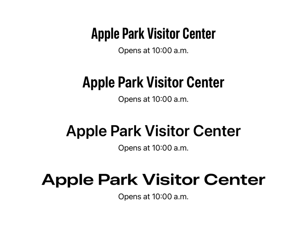
A few years ago at WWDC, Apple introduced San Francisco Pro Extended, which is a sub-typeface of Apple’s main typeface San Francisco. Being a big SF fan, I was really intrigued by these new alterations and the different characteristics each alteration brings. While I did not use SF for my final typeface, I used another extended typeface, called Area Inktrap Extended.
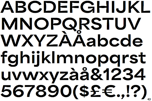
I feel this typeface portrays character, especially when used with a strong colour scheme.