This week I worked on producing the details to improve visual quality and communication.
Symbols with Meaning

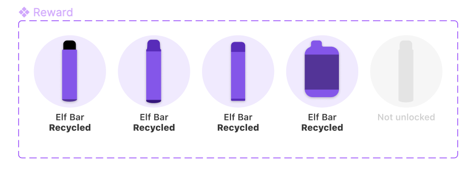
I created a set of vape symbols based of real vapes to be used throughout the app. The colouring of these had to be specific and intentional to link my icons to the real brand of the vapes. Also, as these icons sometimes appeared on buttons they had to work both over a light and dark background. This is where I used something I called dynamic icons, in which I changed the colour of the icons slightly depending on the background. This is not noticeable when using it, however would be much more noticeable if the colours didn’t change and the icons would look poor with much less contrast.

By considering this, I created an engaging, dynamic and quite attractive set of buttons which users enjoyed pressing.

These icons also function within the rewards tab of the homescreen. Not only are they informative to the user, showing clearly which vape brand they have recycled, but they also contrast well to the not unlocked vapes.
The coloured background and slight shadow lift the vape from the circle beneath it, creating a sense of depth. I feel this works well because simply, the icons are based off of real world items which have shadows.

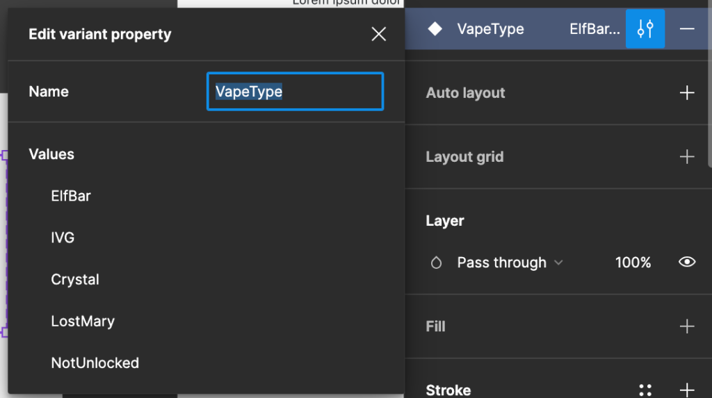
Again, I have used components to my benefit. By creating well labelled variants I have made it easy for myself to implement this design into the project.
If I were thinking about this project in terms of pushing it outside the time and workload restricted bounds of BSc2a, I would consider pushing my use of variables within Figma to create a more interactive and functional prototype.
Making People Aware
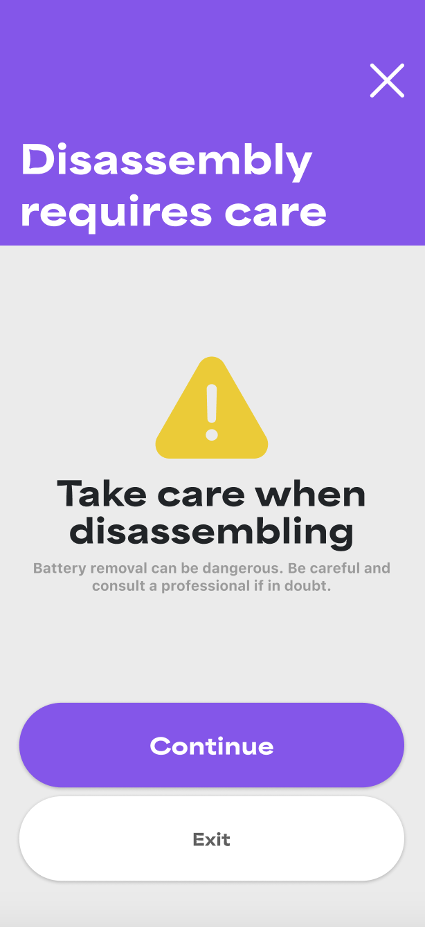
As there is a risk when it comes to disassembling an electric product, one feature I added this week has the aim of making it clear there is a danger and encouraging the user to understand this risk.
Before
After
By creating this red, animated approach I feel it gets across the risk to the user much more effectively. The highlighted warning icon first catches the user’s attention, making them actually read the information when it is shown to them instead of skipping past.
Thinking critically and reflectively about my own work, I should have user tested this. It would have felt better to me if I had some evidence to show this makes users 90% of the time interpret more of the information displayed to them. I didn’t do this however.
Not being afraid to go back to the drawing board
After receiving lecturer input that my Home Screen might be interpreted as a list rather than 3 separate functions, I experimented with a different approach.
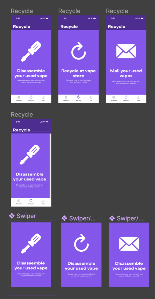
I experimented with using a swipe across approach instead of 3 tiered buttons. However, I ended up ditching this idea as the 3 tiered buttons worked better. My point is I like being open-minded and if it comes to light a feature isn’t working as well as it should or as intended, I will try to rework it, taking a different or outside of the box approach.