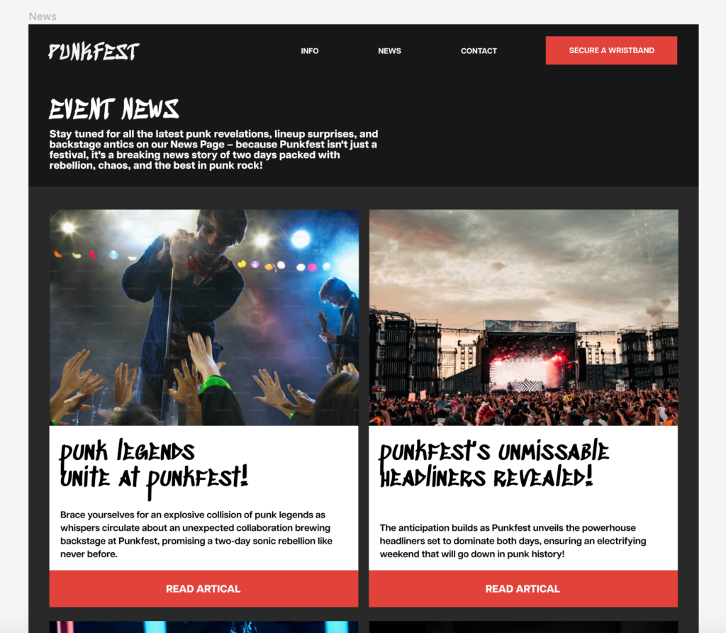
In spent this week combining my low/mid fidelity designs, and my experimental Figma prototypes to create a new, high fidelity design.
Firstly, after “turning the lights off” from my experimental design and determining I need to move towards a dark theme, I needed a title and body font that show off my desired aesthetics with connotations of punk rock, as well as being based on my research.
Initially, I came across variable typefaces. I thought this could be interesting as it could add an interesting level of interactivity.
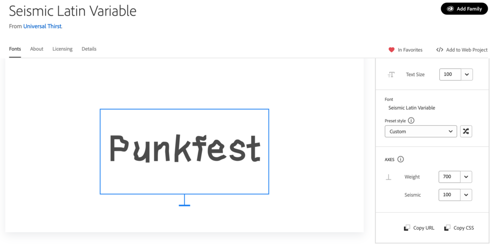
I thought this was interesting, as the scalable ‘seismic’ variable adds an interesting dimension, for example the possibility of increasing in ‘seismicity’ as the website loads or scrolls, or an increase of ‘seismicity’ as the user hovers over aspects of the UI or the type itself. However, I ultimately moved away from this due to not liking the design of the typeface itself, and complications in prototyping this in a way I deemed good enough in Figma.
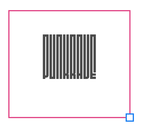
Another variable typeface I was interested in is “Fit”. However for the above reasons I did not choose this.


Ultimately, I chose the “Sedgwick Ave” typeface as I appreciate the punk rock connotations it gives to users.
For my body typeface, I chose “Articulat CF”. In my research, this body font represented 80s nostalgia, while still remaining modern and fresh. This matches my event of 80s nostalgia in modern day.