This week, despite illness limiting my productivity, I focused on increasing the fidelity of my project, developing research and fine-tuning the event I was creating the website for.
In terms of moving towards a higher fidelity website, I wanted to draw inspiration from 80s punk media, in an attempt to mirror this style. I looked at 3 80s posters/zines.
Punk’s Not Dead
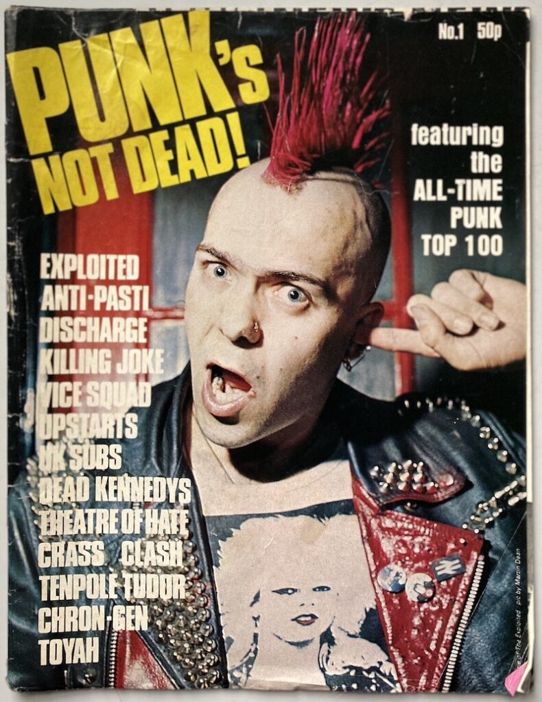
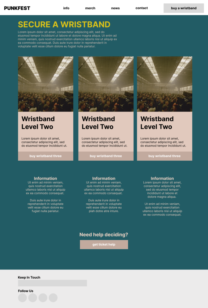
I firstly chose this “Punk’s Not Dead” zine. This was a British Punk magazine from 1980.
Firstly, this looks ugly. The successful use of colour on the zine does not transition at all to a website. However it did get me thinking of more successful products I could experiment with using this style.
Damage
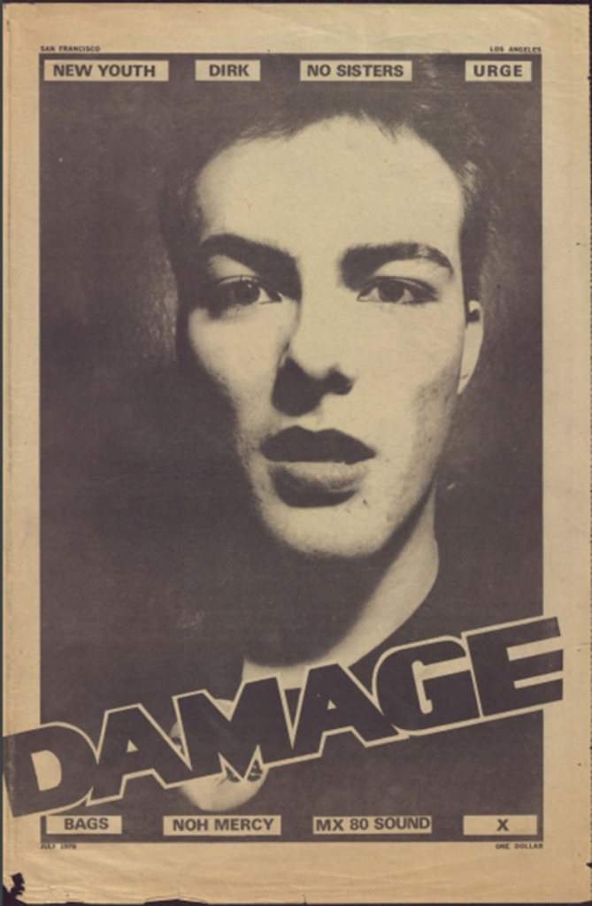

I liked the brown, rugged feel of this poster, although I’m not sure of its origins. I didn’t like how the brown translated to the website. While the poster felt somewhat edgy, the design on the wireframe looked tired, somewhat elderly.
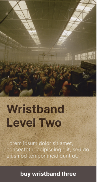
I experimented with texture on the site, however I felt this looked cheap and unprofessional.
Anarchy in the UK
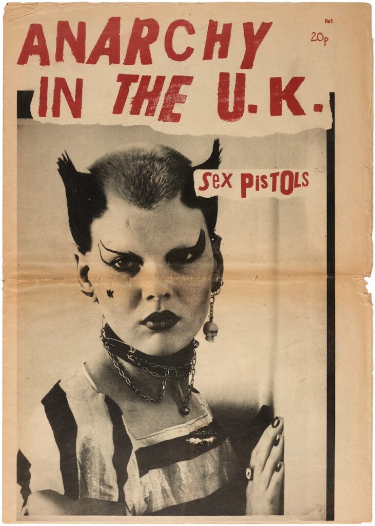
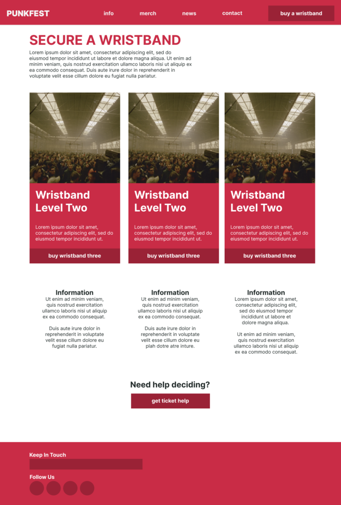
I liked this colouring, however with no element of theming it just looks like a generic red colour. I found a typeface I liked and added it to the site.

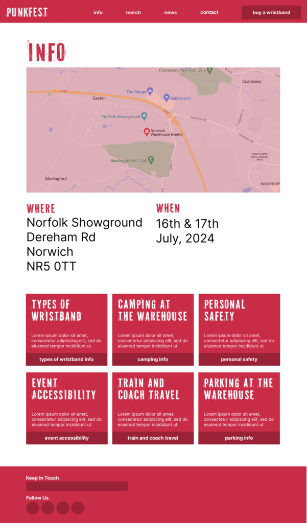
I felt now I was more on the way to developing a website with appropriate theming, rather than a simple wireframe.