Constant Iteration
My focus for this week’s work was developing my Figma skills as I develop improvements for the TK Maxx retail site. I based my work of the research I had found on my Miro board → and iterated my designs after considering feedback from lecturers and fellow students.
Getting the Navigation Right


After my user testing left me with some concerns about discoverability of the original navigation bar (users unable to find features due to then being hidden under icons), I choose to bring out features using labels as well as icons to increase the discoverability.
I faced problems within the development of this NavBar, such as button shape, clunkiness and contrast, which could lead to unnecessary accessibility problems.
Contrast
Buttons did not contrast with the background, so I first added a stroke. However, this was clunky and did not fit with my design vision.

I changed the foreground colour to white, but again this did not fit my design vision.

I resulted with a slight shadow to differentiate the foreground and the background.
Button Shape

Originally, buttons were all pill shaped navigation. I changed them to rectangular buttons as I wanted them to denote navigation and not action.
Product Page
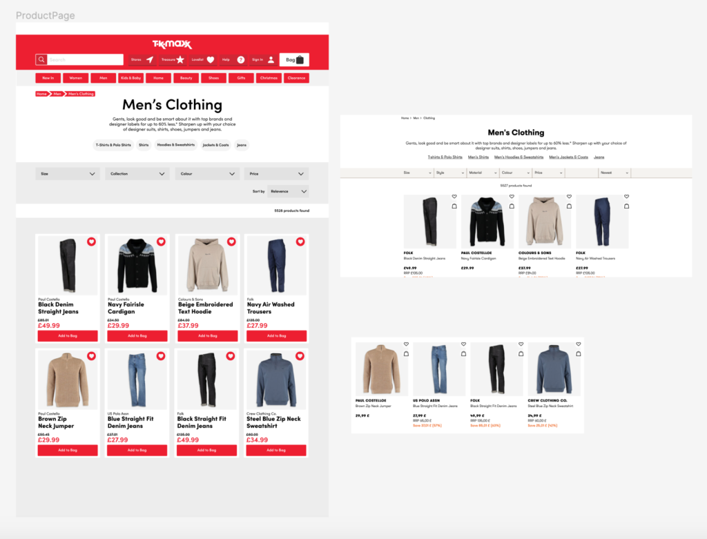
I designed the product page and navigation system to link between the home page and product page. I was inspired by traditional product labels in using a darker background colour than the foreground colour. I feel the design system I have generated is fluent across the website features and the navigation bar and I am pleased with the outcome.