Now I had a fluently developed design language for my website, including title and body typefaces, colours and layouts, I worked on filling in the details and creating a more fluent website.
Info
I developed my information page of the website, allowing users to gather more information on the event. As I developed the page, I considered the three main tasks the information page needs to do.

- Show the user more information, answering any questions they have
- Allow the user to request more information if their question remains unanswered following looking on this page of the website
- Book a ticket. The main CTA across the whole site still needs to stand on this page.
Starting with the when and where.
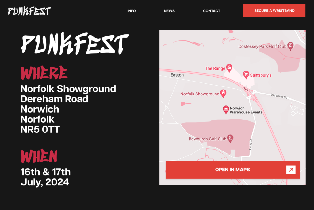
At the top, centre and bold are answers to the two main questions: when and why. A matching map which I modified using blending modes compliments this, giving the user context to the address. The user also has the option to open this in their default maps app, allowing them to get directions to the event in a way that best suits them.

Each info card was designed with hierarchy in mind, with the main information the card contains being the most attractive element, with the medium weighted text beneath containing more detail. I chose type for each button’s CTA specific to the specific function of the button rather than a generic ‘more info’, making each buttons purpose more obvious.

When the button is pressed, the user is presented with more detailed information, as well as the option to receive more help. This allows the user to send a message through the ‘contact’ page of the site to get help from a human.
Also it’s worth noting at the bottom of the page is the main site’s CTA to encourage the user to purchase a wristband to the event.
Contact Page
I designed a contact page to make getting human help as straight forward as possible.
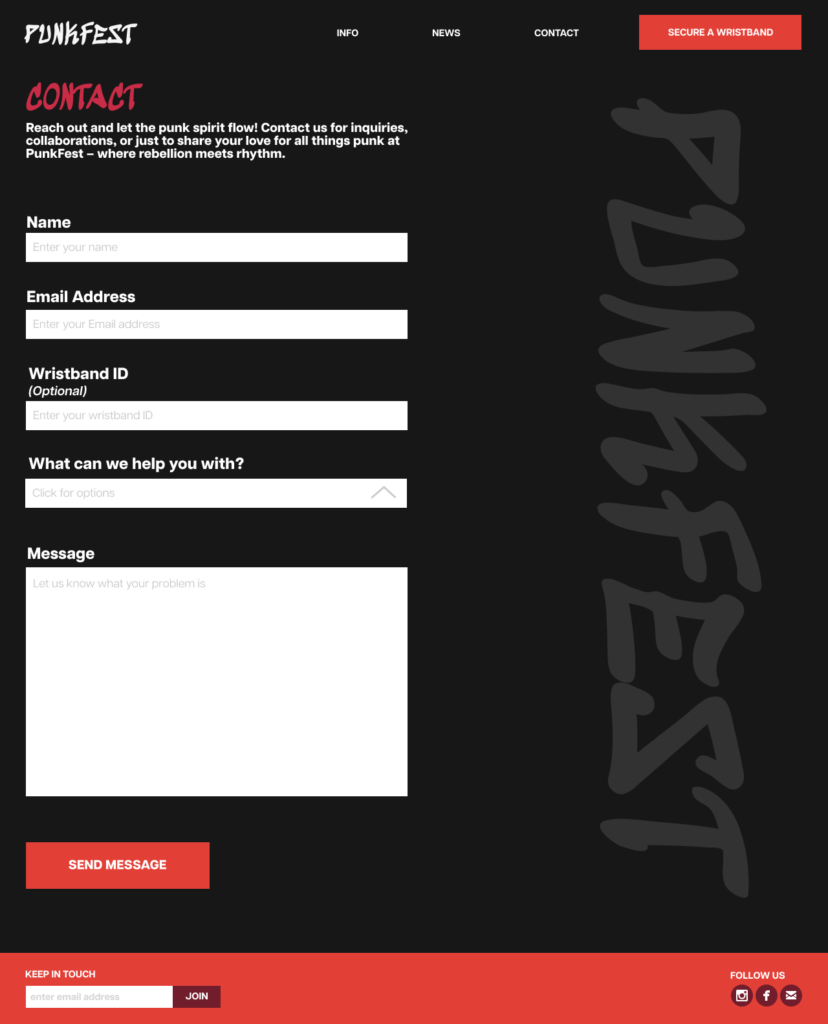
This contact page, while being straightforward provides a solid purpose. Allow users to pass on their requests to a human who will reply to them via Email.

An interactive dropdown allows users to select their area of query.

The user can then return home and continue to explore the site.
Booking Page

The booking page of the site allows users to see an overview of the tickets along with copy purposed to sell the products, rather than providing in-depth information. That is the purpose of the ‘help’ button, if the user still remains unsure about which wristbands they should purchase. Each interactive card allows users to input an amount and then proceed to their basket to checkout.