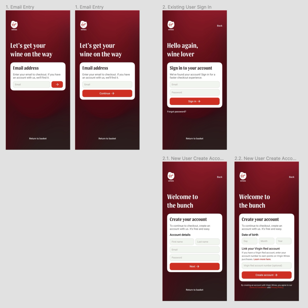
This week, we finished low fidelity and came together as a group to decide which elements to take forward into high fidelity. Before this meeting, I focused on exploring some of my checkout ideas in a mid fidelity state, and also developed my ideas for the About Us page further.
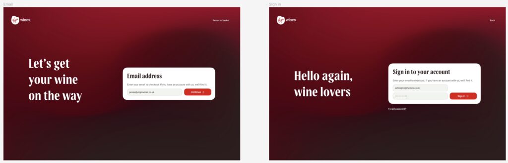
Having received the official brand gradients from Virgin Wines, I updated my sign in page ideas with these. The gradient image was wider than the frame, so I used the extra width to position the ‘smile’ of the gradient beneath the large headline text – supporting it and then drawing the user’s eye up towards the email entry card.
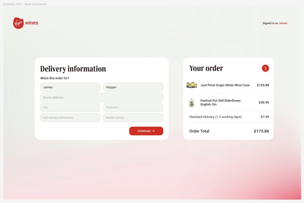
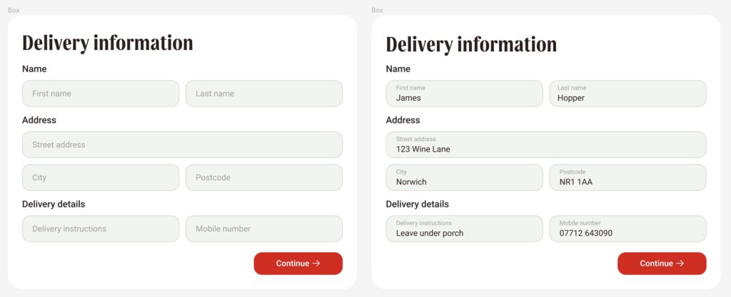
I also experimented with some further checkout pages in mid fidelity, and created an order summary card with auto layout.
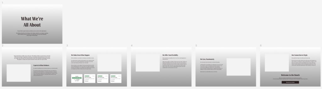
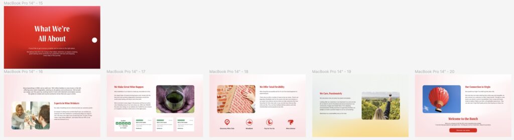
A horizontal scrolling about page was a concept I was keen to experiment with and present to the group. I designed this in low fidelity first but moved to mid fidelity to visualise the design with the brand gradients. The page would snap to each section through continuous scrolling, to keep the user’s attention focused but avoiding it feeling too much like a presentation with the scrolling motion.
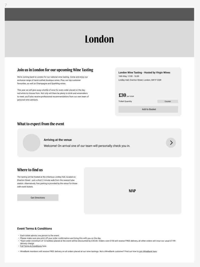
Following on from Grahams’ feedback at the end of last week, I also created an event detail page for the wine tastings section. He explained this would be necessary for marketing purposes, so I ensured the page had more of a focus on location & event specific details such as time, date and address, including a map of the venue’s location.
After our group meeting, the focus was then onto moving our designs into high fidelity and making as much progress as possible. We voted to take elements from each team member’s low fidelity designs, including my checkout concept, and potentially the horizontal scroll format of the about page – as Kai had also tried this.
Moving into next week, we divided group tasks with Kai & I focusing on high fidelity design and Maggie & Fergus focusing on preparing for and conducting user tests.
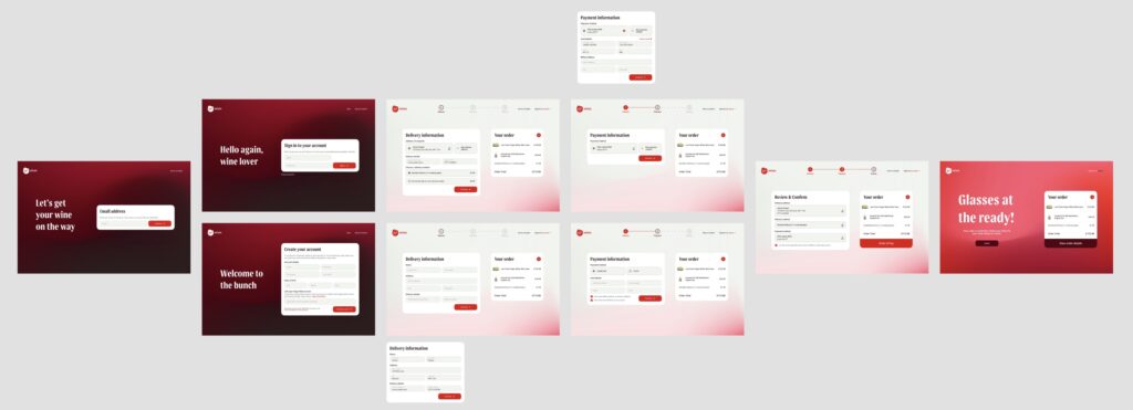
At the end of this week, I have now completed the desktop checkout design in high fidelity. My focus at the beginning of next week will be adding functionality to every button and interaction, including making variants of the delivery & payment information cards – such as editing saved payment methods, etc.
I have also made a start on the mobile checkout layout – I’m hoping to have it completed by the middle of the week so Maggie & Fergus can begin testing this too.
After I finish the checkout, I’ll begin working on the about page with Kai. By the end of next week, we’re hoping to have all high fidelity done and testing in progress. While we tweak the design in response to feedback, we’ll also start work on the presentation.