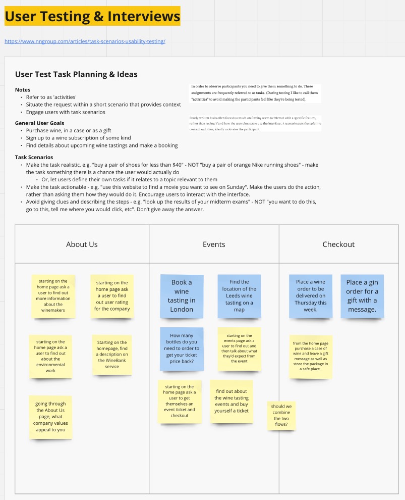
Following on from Week 22, we continued to work on a few tasks over the Easter break, the first being planning potential user testing tasks that we could use to form a script.
At this time, we were intending to user test the existing site so imagined tasks with that purpose in mind. I read a helpful Nielsen Norman Group article about creating task scenarios around user goals and the benefits of creating user tests from this approach. I summarised the article at the top of the Miro board on the left, and with this in mind we imagined user testing tasks with the blue post it notes representing my ideas.
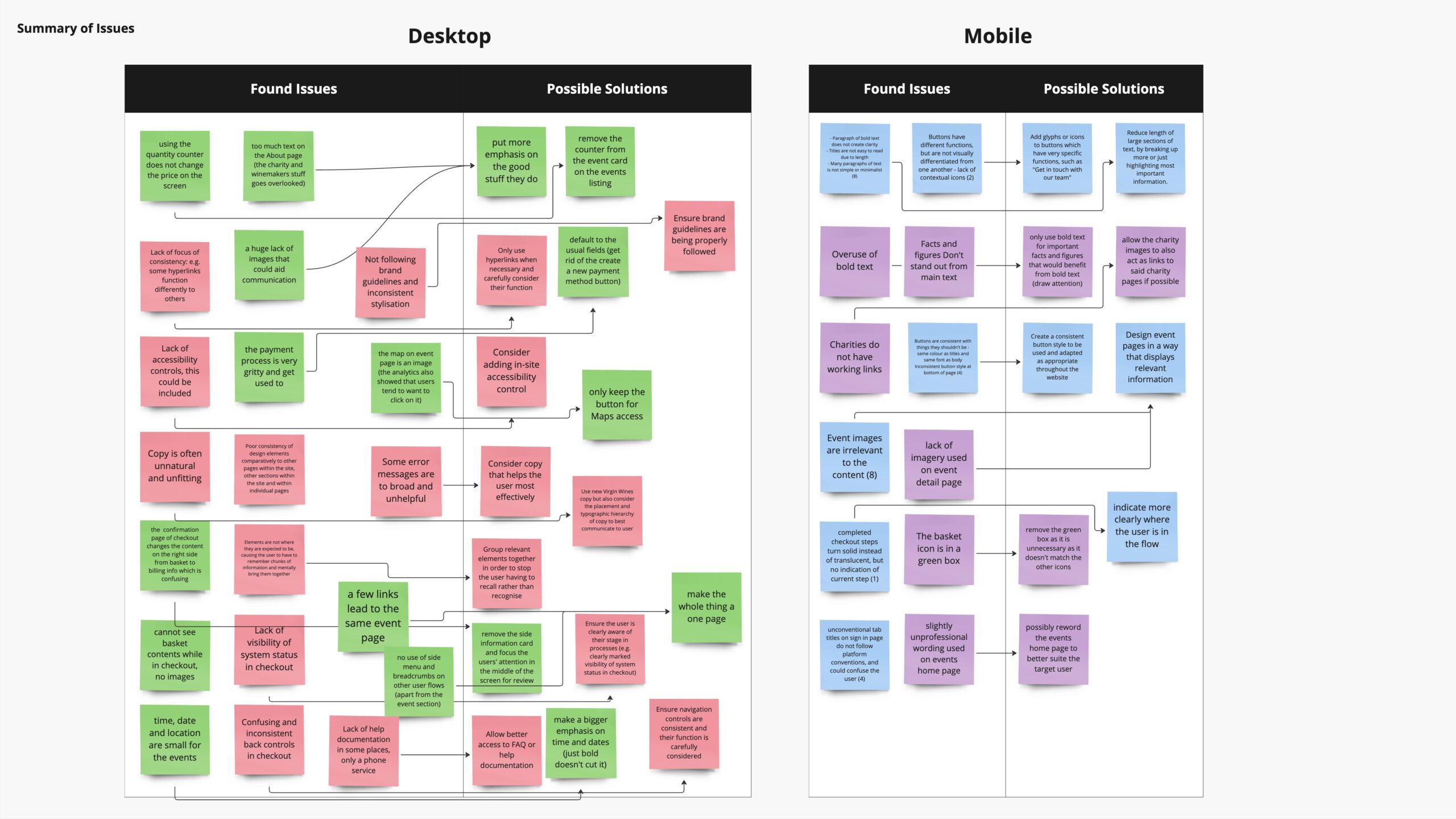
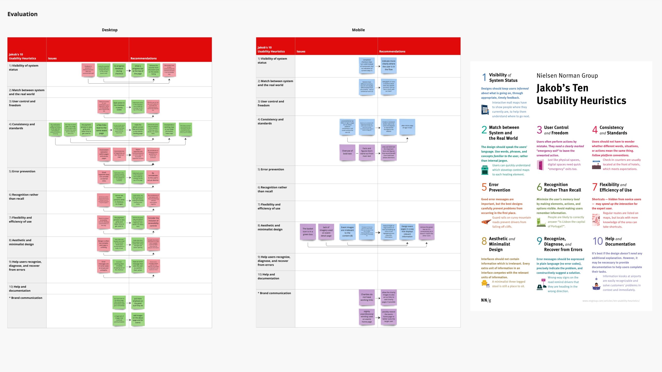
We also completed a heuristic evaluation over Easter, drawing together findings from our individual analyses and categorising them by Jakob’s Ten Usability Heuristics. Again, my contributions to the group task are on the blue post it notes. See the Miro board here for a more in depth look at our findings.
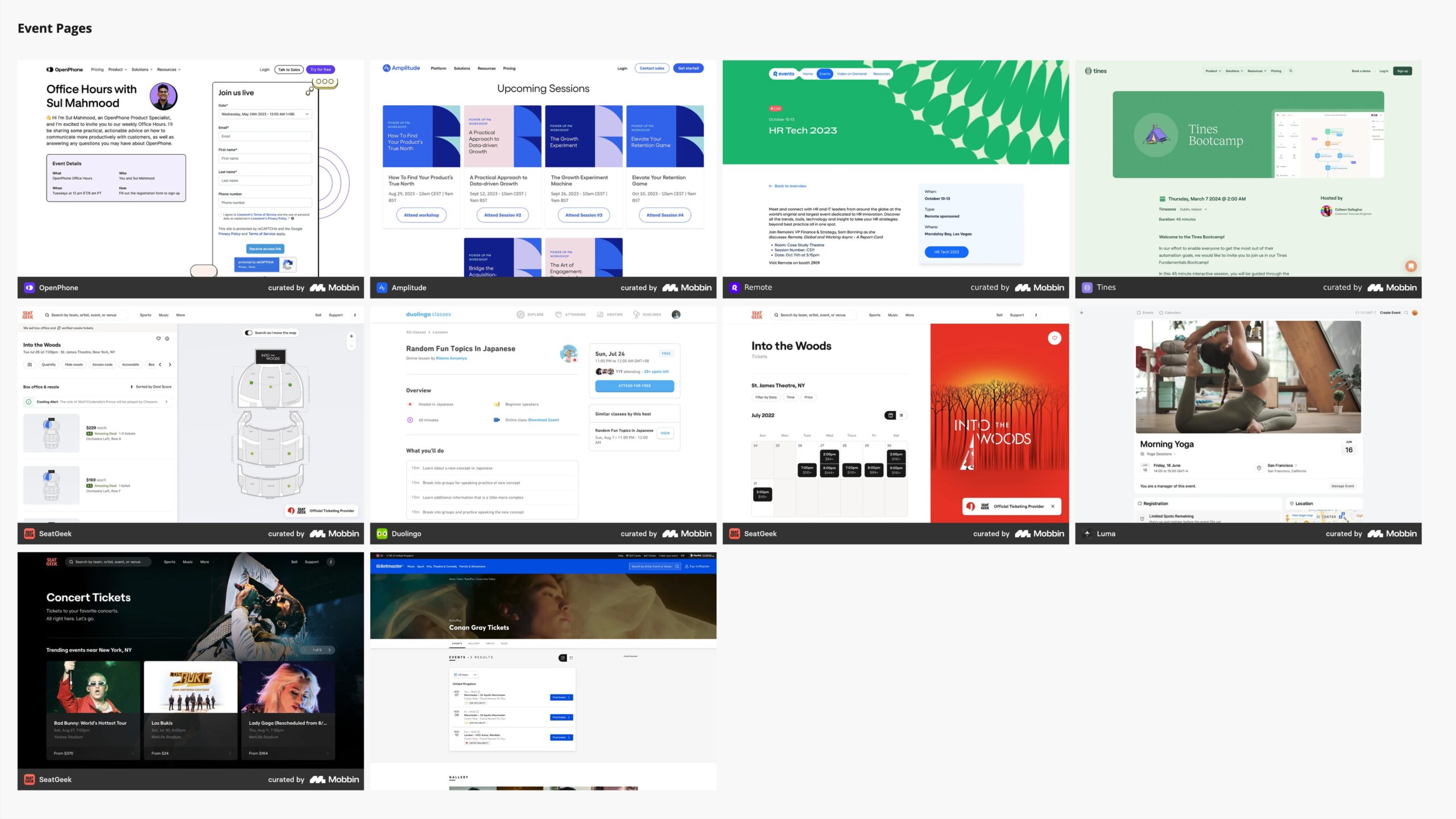
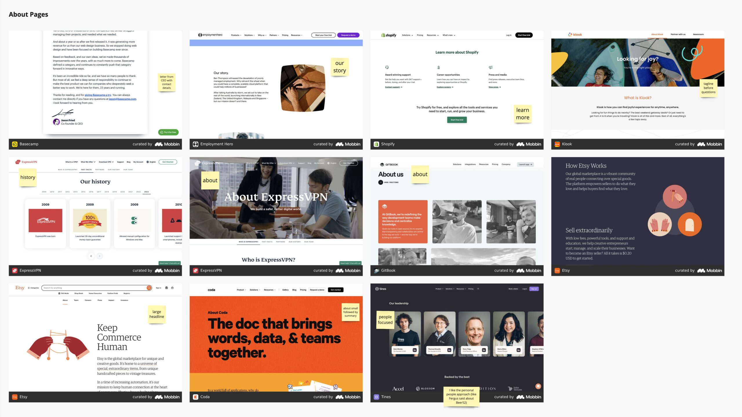
Before moving into low fidelity designs, I decided to do further research into design patterns in addition to my competitor research. I created three Miro boards covering checkouts, about pages and event-style pages.
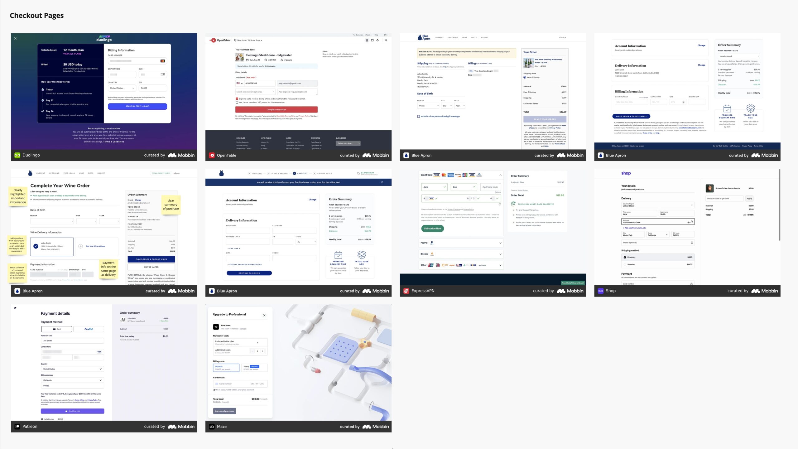
For this design research, I used a website new to me called Mobbin. Signing up for a Pro subscription provided access to a large library of entire user flows for sites of all sizes, including Etsy, Duolingo and ExpressVPN. The ability to specifically search for examples of checkout flows, for example, was very helpful and made my research significantly more efficient.
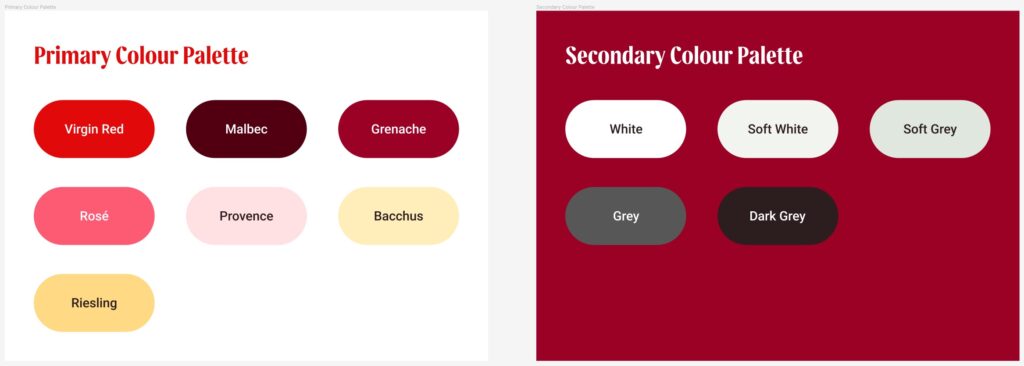
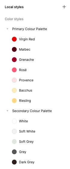
Referring to the Virgin Wines brand guidelines provided, I set up Colour Styles in Figma in preparation for design work. Although these won’t be essential until high fidelity, it has proved useful so far in testing how some elements would work with each other.
Finally, by the end of this week we have now began work on low fidelity wireframes for each page. We chose to start with a desktop first approach, feeling it would be more straightforward to condense into mobile versions afterwards.
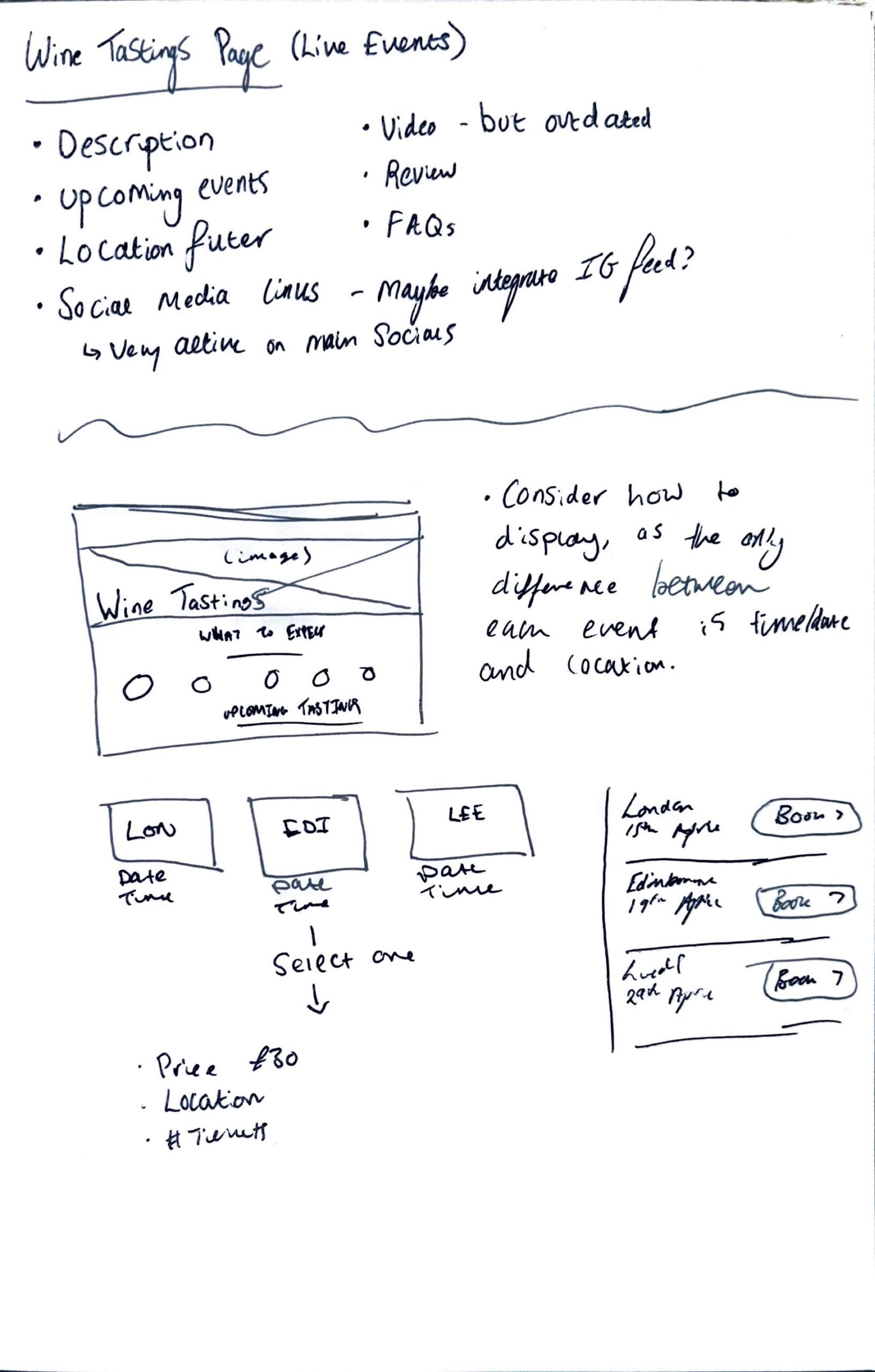
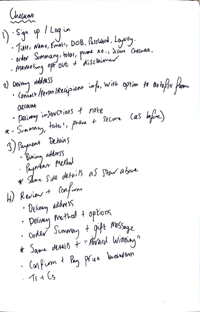
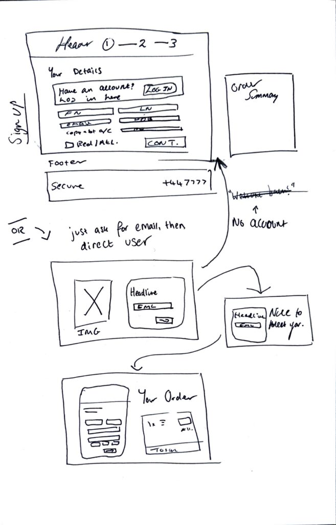
I started with wireframing some basic ideas with notes of what content each existing page contains, and any modifications a redesign might make to this content. Much of this was in the checkout flow – seen on the first scan to the left – with a focus on modernising and streamlining the number of fields & data entry points. Condensing ‘daytime’ and ‘evening’ phone numbers to one field was one of them, with most people now carrying a mobile phone on them all day.
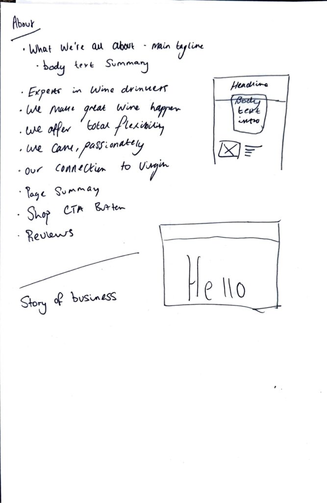
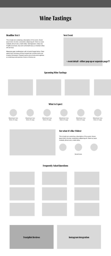
I started low fidelity in Figma with the Wine Tastings page. Much of the information about the actual events themselves is hidden inside the event detail pages for each location (which are all almost identical, so I imagined how this could be made more visible and accessible on the main Tastings page. Each upcoming event would be displayed in a card format, with the soonest event highlighted the top.
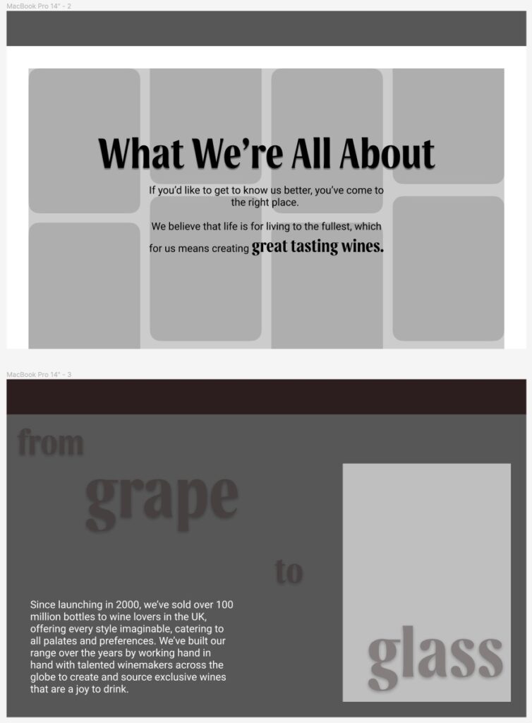
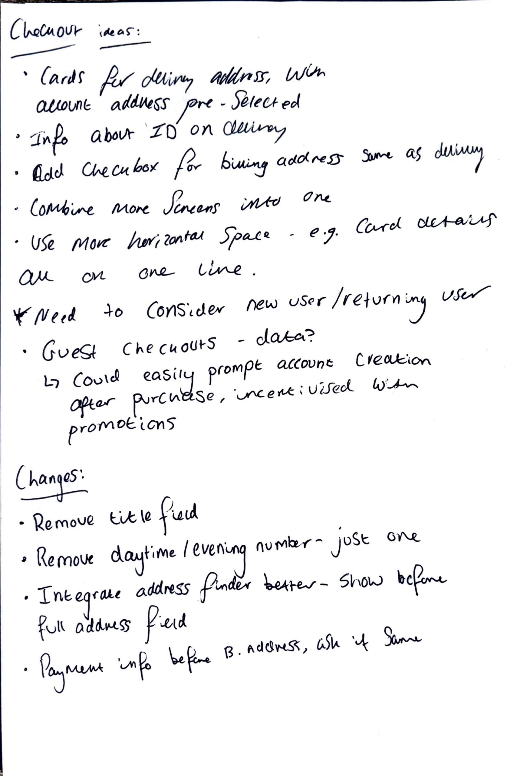
The about us page is proving to be more challenging to design as there is a less obvious solution – though this does mean there is space for much more creativity. So far I have considered a grid of images in a card style, potentially scrolling, beneath the main title header. I’m keen to consider potential movement and animation on this page, to tell a story through introducing chunks of the body copy one at a time. This one is very much still a work in progress.
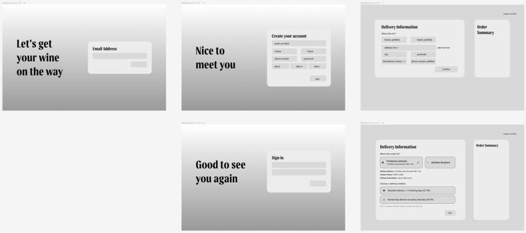
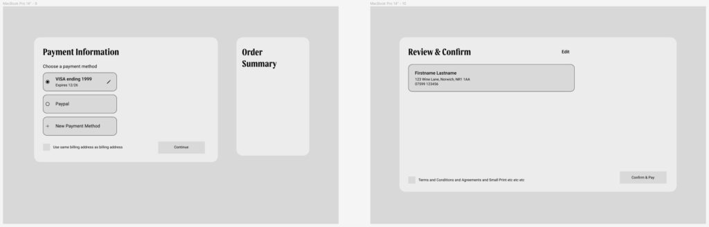
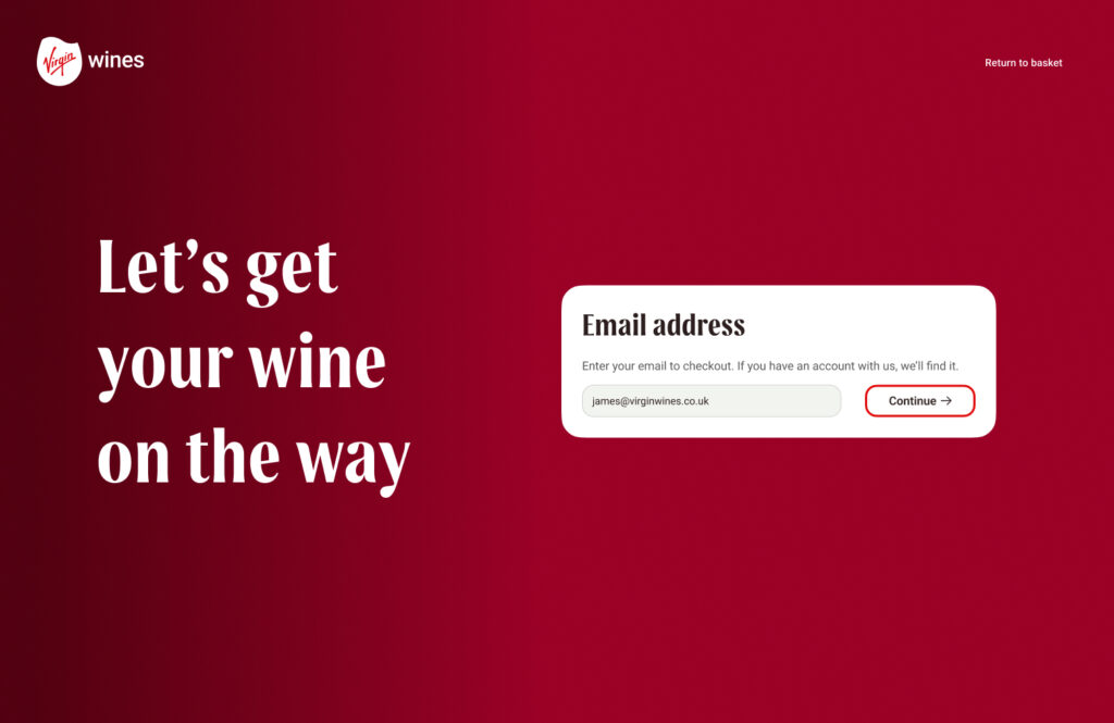
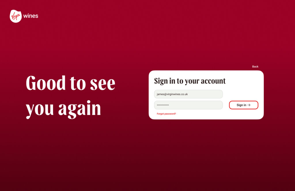
I’ve made fairly significant progress with the checkout flow, starting with the idea of the user simply entering their email address and being directed to either a log in or sign up page depending on whether they have an account already. As noted in my wireframes, many of these pages focus on streamlining the process through condensing inputs and relocating where some information belongs in the flow – such as moving the delivery method choice to be in the same place as entering delivery address.
Finally, I experimented with taking a couple screens into high fidelity to get an idea of how it could look – this was helpful to direct the development of my low fidelity prototypes.
Next week, we are aiming to complete low fidelity by the middle of the week so we can choose which elements from all of our ideas we should take forward into high fidelity.