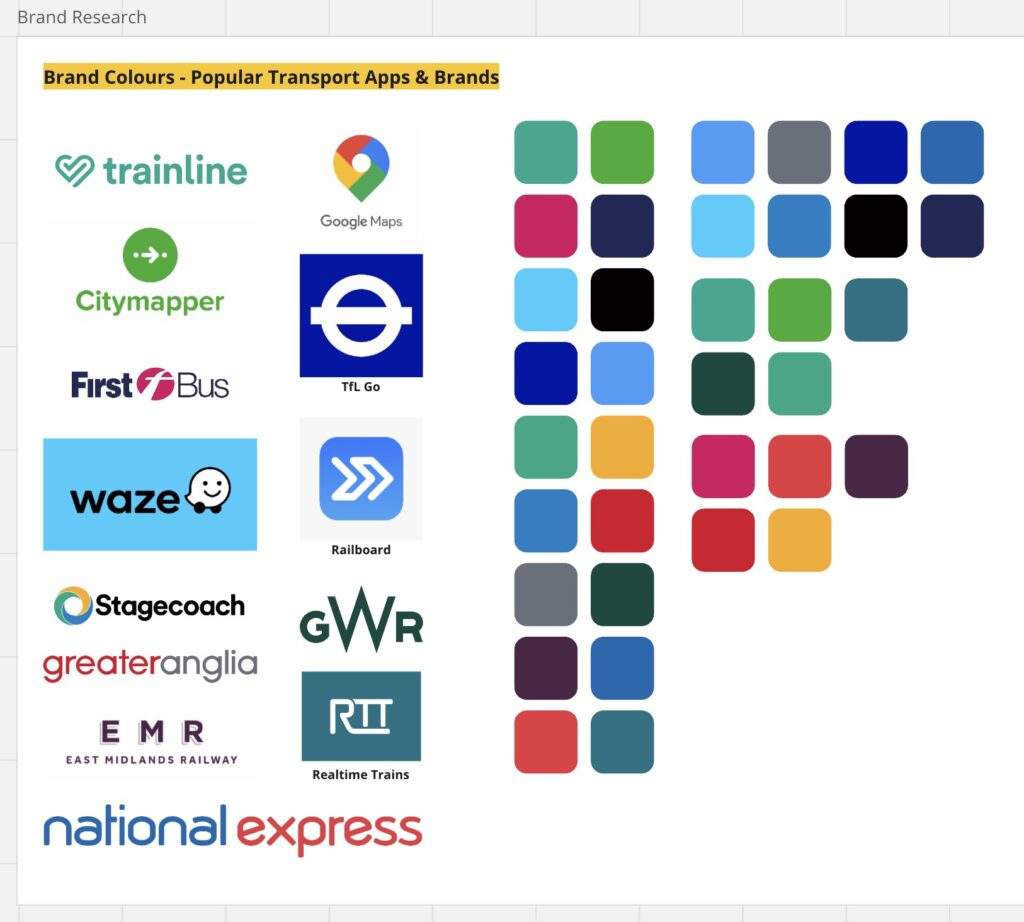
This week, I aimed to focus on developing a clear brand for the app by choosing brand colours, a name, and a typeface. Before doing this I did some research into colours used by other travel and transport apps and websites, and collated this in a Miro board.
I colour picked the primary colours from each brand logo, and made a palette of all of them together – and then made additional palettes of the colours grouped and split into common themes. I noticed variations of greens and blues were most prominent, alongside some warmer red/orange/purple colours – although these were less common.
To pick typefaces, I paid attention to common themes in some of these brands, to create an idea of what to look for in selecting typefaces. Some common patterns I found were often sans serif, bold typefaces, with curved or rounded elements in them – likely to suggest agility & motion.
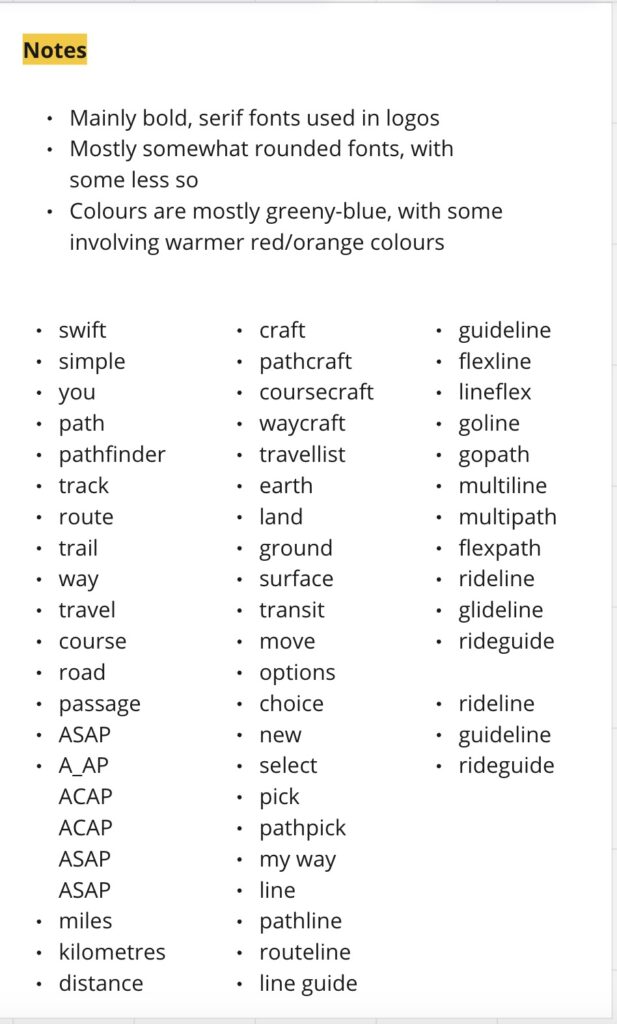
Alongside my typeface experimentation, I also considered potential naming options. I started by brainstorming any travel related words, to try and think of any logical combinations that embodied the purpose of my app.
I tried a wide variety of names in a wide variety of typefaces. I wanted the typeface to be clean and simple, but also have some personality to it – something that felt modern, youthful, agile and clean – whilst also retaining a professional, trustworthy and efficient appearance. I chose the typeface Urbanist, as it fit these needs and was also available in a range of weights, and is a variable font providing flexibility.
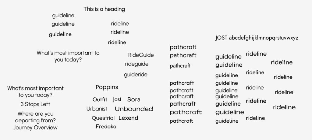
I went with the name ‘rideguide’ in the end after considering lots of options. It’s generic enough to cover all modes of travel, and also links to one of the core purposes of the app as a navigation aid that adapts to your personal needs.
At this stage I also decided to translate my notes and sketches into a Journey Map using FigJam. I had some experience using the platform at Sync the City, and find it to be more logical than Miro for design based mind mapping. I still prefer Miro for research stages. The board can be seen below.
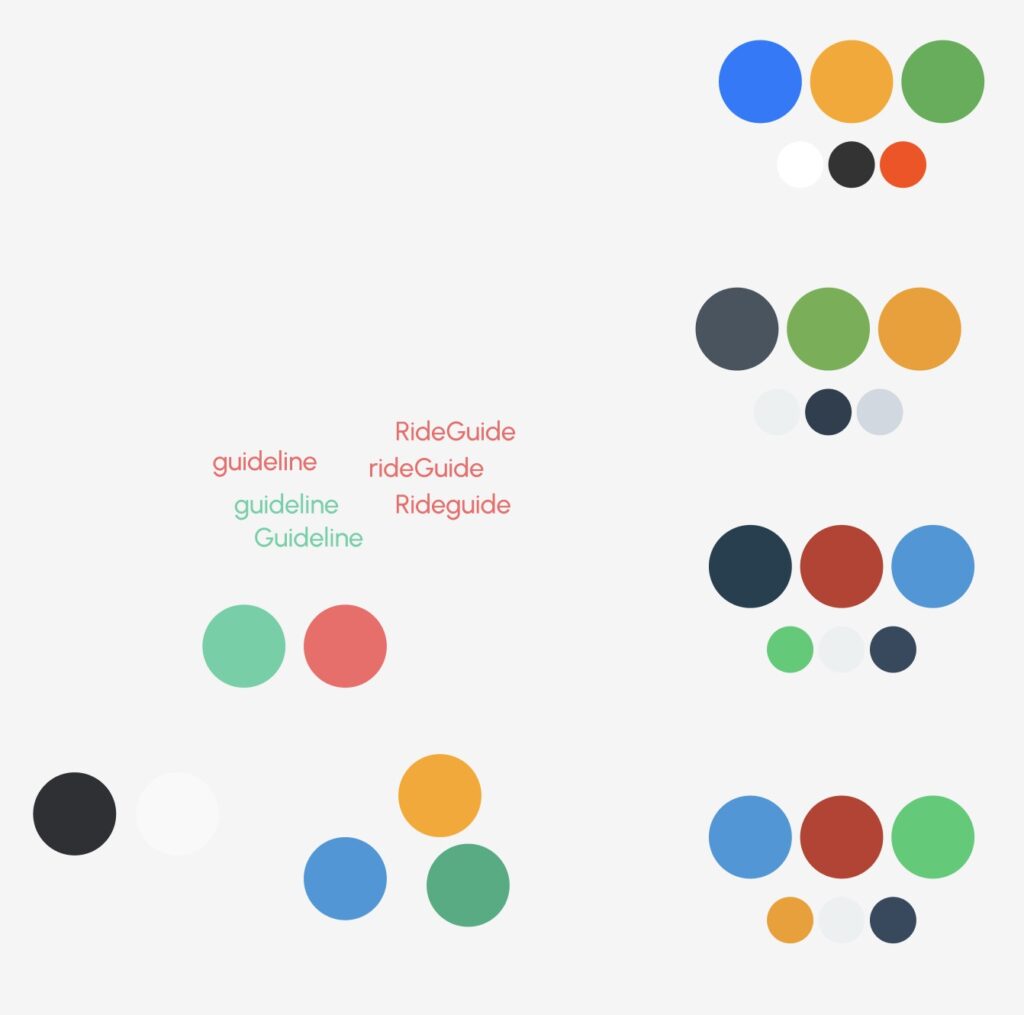
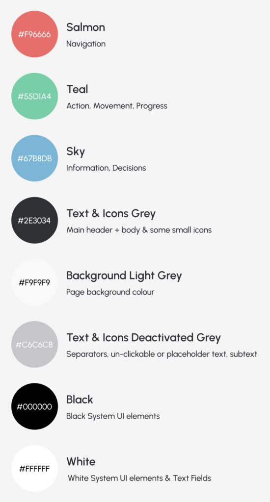
I experimented with a range of colours (see left), but decided to go with the set seen on the right. I then also later designated their specific uses to help keep the design consistent.
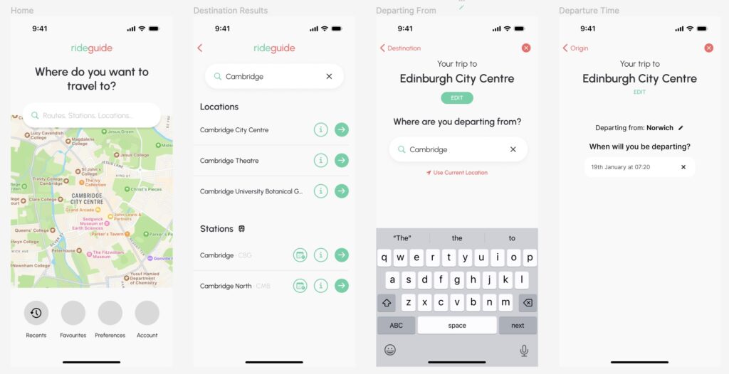
Finally this week I experimented with how this would translate to the design by colouring the low fidelity frames and creating text styles.
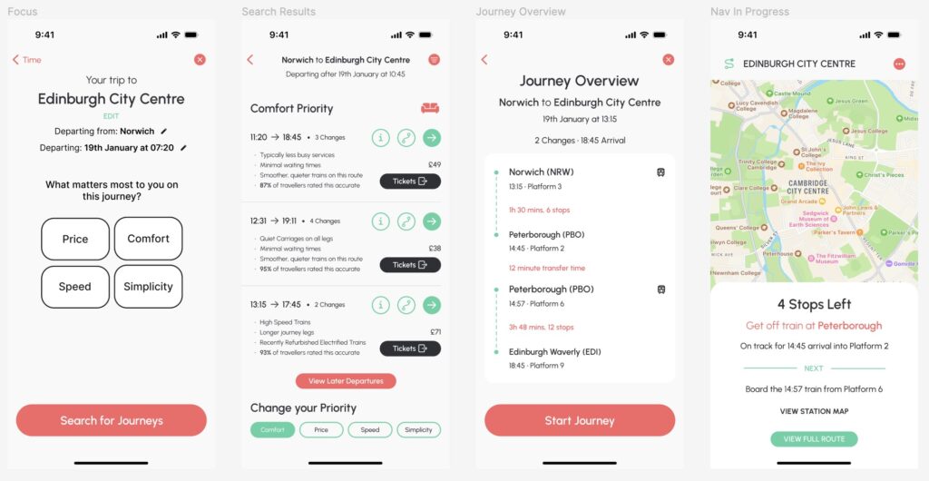
Next week, I want to make significant progress on the high fidelity design, create components and variants and start to polish the design.