For the research of this project we first did a deep dive into the website itself and how it flowed from one page to the next and what information they had.
As a team we split most of the research equally between us and because there are 3 different pages that we are redesigning we split these up as well. With 2 of us doing the about us page research (Lizzy and Ellana), two of us doing the events page (me and Saalihah) and then all of us chipping into the checking out page as this had the most parts to it.
At the start of this research I did a user flow for the events page to show the users journey from the start of the events page to ending up choosing an event to go to. I found that this journey is quite easy to follow through to the finish as there is not too many steps a long the way. This is a good thing about it because it leaves little room for confusion with the users. However, there are some directions that are more difficult to find. For example, if the user wants to see more information about what the event is there is some small text that you can click on but this is not very obvious and could easily be missed.

When researching the events page I found that there was a lot of issues with the location of important information and the organisation of the events on the pages. I found this through do heuristic mark-ups and analysis of the page in desktop form. This then helped me come up with new design ideas where I mainly just solved all of the big problems first and then ended up fixing smaller issues as well.
I was in charge with heuristic analysis which allowed me to find out why certain parts of website didn’t work. For example, quite a lot of the website failed to follow the 8th heuristic of minimalist and aesthetic design, with over populated pages and unnecessary information.


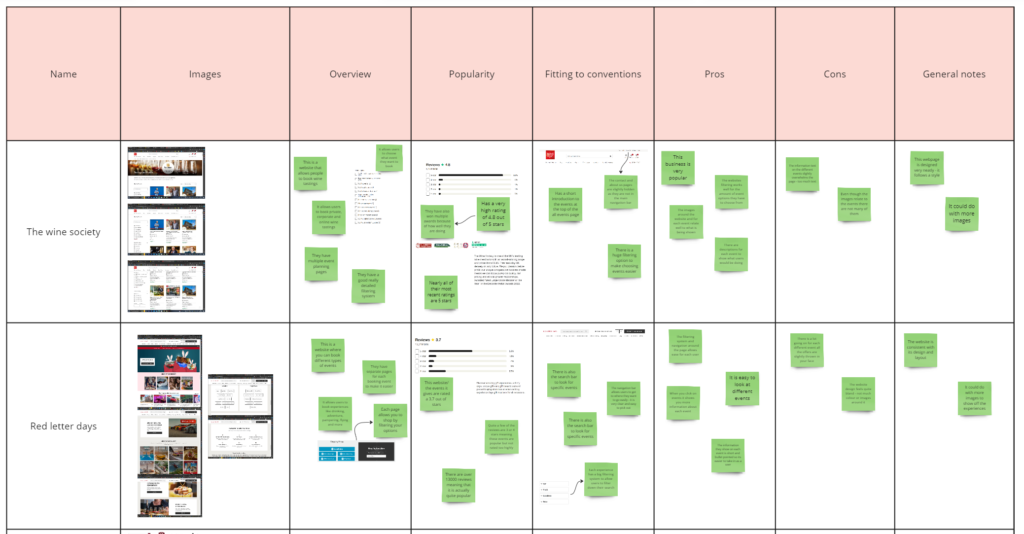
The competitor reviews that I conducted showed similar issues to the virgin wines website. This is that there is a lot of of text and information on the page and even if this text is important they could of designed it better with more of a hierarchy and different placements so that it didn’t overwhelm each page.