Use industry-standard methods to conduct evaluative UX research into an ecommerce website, and make design recommendations for improvements to the site. For this week we were tasked with just completing the first three tasks which were to choose a website and using standard flowchart notation create an annotated user flow diagram for the site. Referring to Don Norman’s 7 principles of design create an annotated screenshot for each design principle explaining and evaluating how the principle has been applied. Identify and capture what you consider to be the most commonly used parts of the website and use these to build a visual sitemap in Miro.
To do this first I researched and studied the different principles of design and how websites might use them. I then went on to Miro and analysed some websites so that I can see what ‘good’ website design might look like and what ‘bad’ website design might look like.
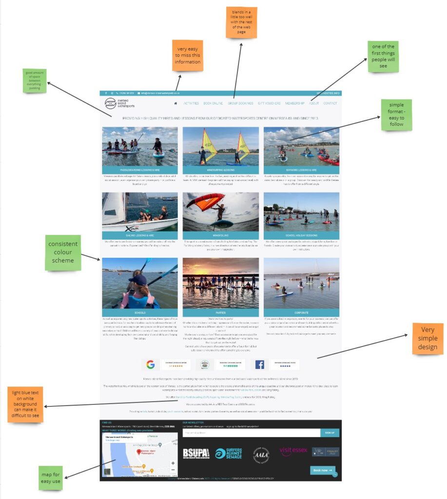
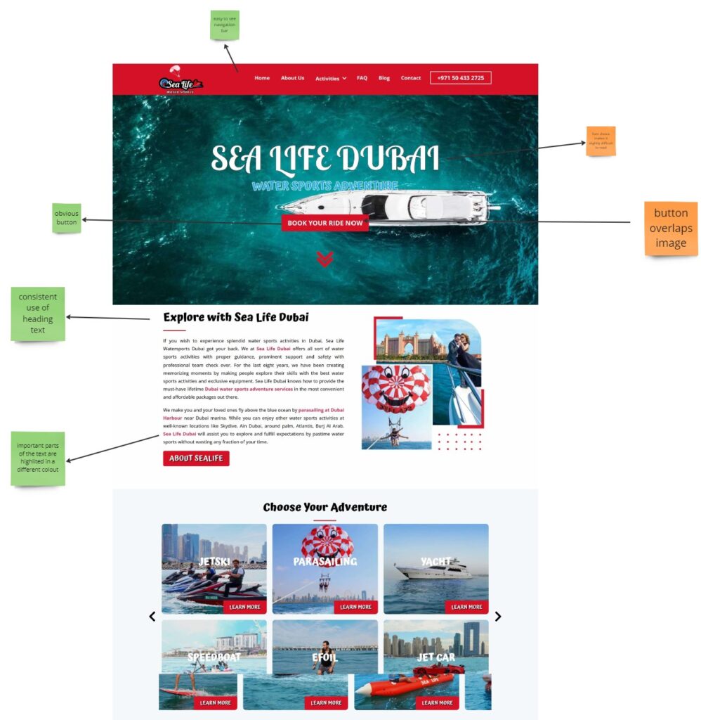
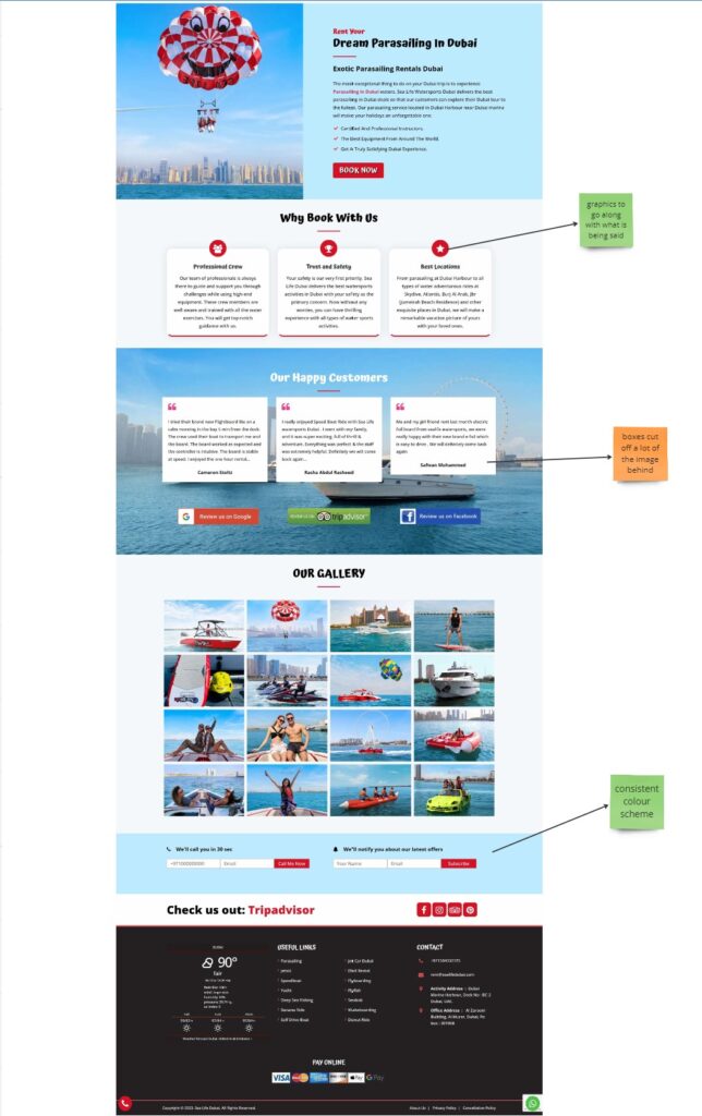
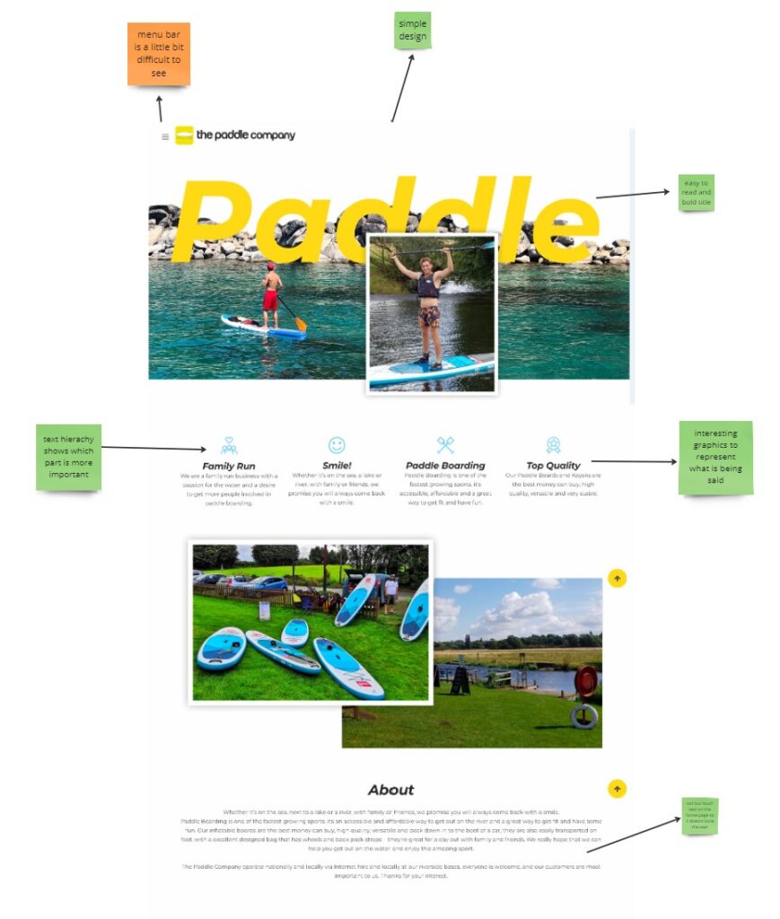
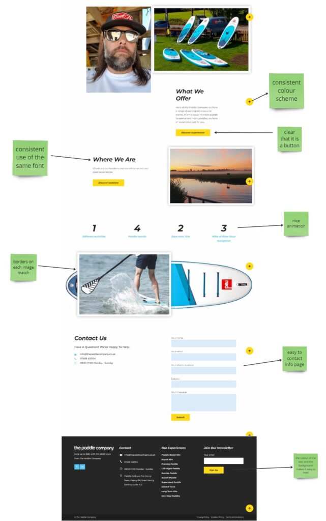
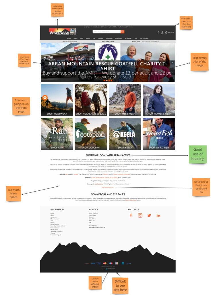
After these examples I found a website that linked to my idea for later website designs and made a flow diagram from the site and I identified and captured what I considered to be the most commonly used parts of the website to build a visual sitemap for it. I then annotated its pages with sticky notes on Miro with green representing positives about it, yellow representing ideas or questions for the website and then red representing what needs to be changed.
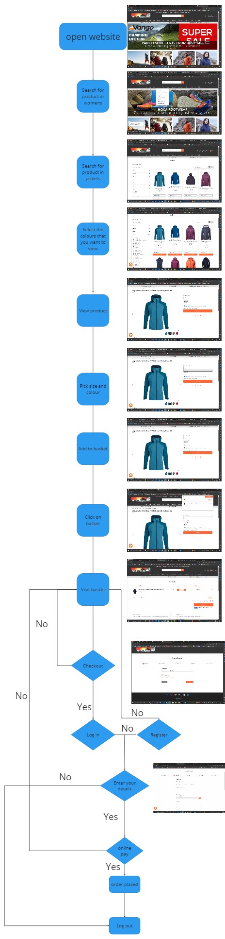
I then did a user flow for this website and annotated what is good about is and what is bad about is. I also annotated how it related to don Normans seven principles and whether they had them or what they could do to include them.
User Flow
Don Normans 7 principles
Discoverability
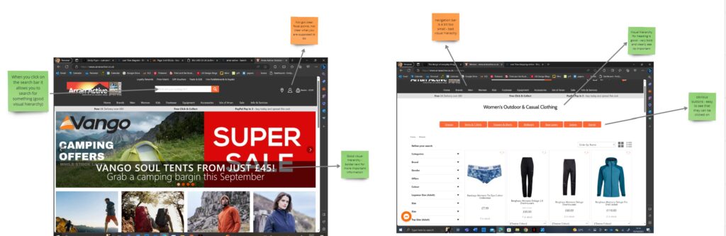
Feedback
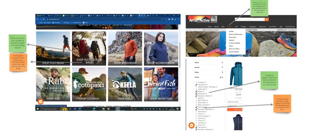
Conceptual model
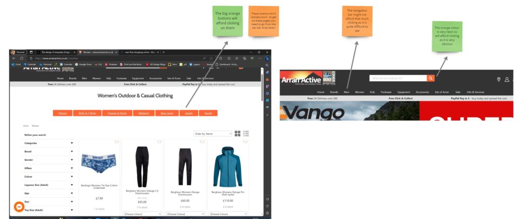
Affordances
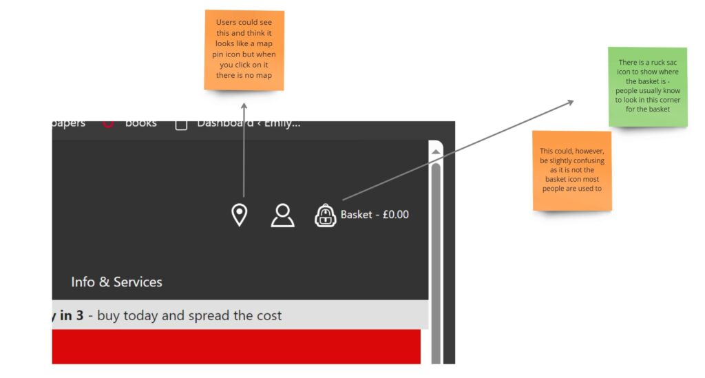
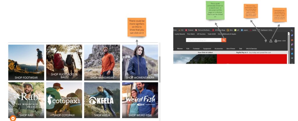
Signifiers
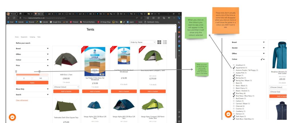
Mappings
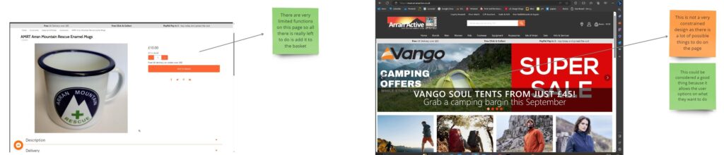
Constraints
User testing
For this we were told to interview 5 different people and give them a task to do on our website of choice and then make notes on how they used it and any difficulties they may have found as well as anything they may have found as a positive.
Person 1:
First I gave the situation that they were wanting to go on a camping holiday and wanted a thick coat as it was going to be cold. They did not want to spend over £200 and they wanted the coat to be blue. I asked them to find this without using the search bar and add it to their basket.
I then also tasked them with finding a pair of gloves and, again, without using the search bar adding that to their basket.
This person originally struggled to find where the coats were as they were under the name jackets, which caused some confusion as she thought that they could be held elsewhere.
She found it quite easy to adjust the price so that the products showed were ones only in her budget. However when it came to filtering the colours she found this incredibly difficult as she said there were way too many options and she was unsure what some of them meant. For example, she didn’t know whether beluga or mist would be a blue, white or something else.
When she eventually found a blue coat and tried to add it to the basket she couldn’t see where to add it. This was because the item was out of stock but that wasn’t very clear as the text was too small and very easy to miss. When she attempted again with another coat she said it was very easy to do as the add to basket button is bright orange and very obvious.
Overall when asked she rated the whole use of the website around a 2-3 and said that it was easy to add things to the basket but overall the use of the website was very difficult.
Person 2:
This person was given the same task as the person above and found similar difficulties. They struggled a lot with understanding which colour meant what. When they clicked on some colours they found it very strange that they weren’t the colours that appeared in the search even if the coats did have a blue colour.
This person also got confused with where they should find gloves (the second task) they originally went into women’s to try and find something but they were nowhere to be found. Eventually when they went into accessories and filtered to have just women’s gloves they found what they were looking for.
They found it very easy to add to the basket as well.
When asked questions at the end of their experience they said they would rate it around a 4 because they found it very difficult to navigate and there were way too many colour options. Something easy they found was the navigation bar however the rest of the navigation was slightly more difficult.
Person 3:
This person was also given the same task. When they originally clicked on the women’s tag in the nav bar they were greeted by a lot of orange button options, like jackets so they could look at specific items. However when they clicked on them the buttons took them to a page that did not work. When they eventually went to jackets from the drop down on the nav bar the page worked.
This person also struggled with the colours and couldn’t understand what colours they were supposed to click on to get the blue up.
They also found it easy to add things to the basket.
When asked questions at the end of their experience they said they would rate it around a 5 because it was a very difficult website to use and didn’t work very well. They said that the colours should be changed to a more simple version as there are way too many options. They said something that was easy was how obvious the buttons were but difficulties was the navigation of the website.
Person 4:
For this person I then changed the task as I was finding the same issues with the other task. The situation I gave them was that they were wanting to buy a friend a gift notebook, I asked them to find this without using the search bar and then add it to their basket.
The second task I gave them was to also buy this friend a mug and without using the search bar add it to their basket.
Person 5:
This person was given the same task as the person above.
Redesign
After all of the evaluation of the website I redesigned different parts of the website that were causing quite a few issues with different people.
Colour picker
The first problem that I aimed to solve was the design of the colours selections. When you go onto the website Arran Active and want to buy something of a specific colours they have many options to choose from. I thought that this could possibly be too many options and then when I tested the website I discovered that other people thought this too.
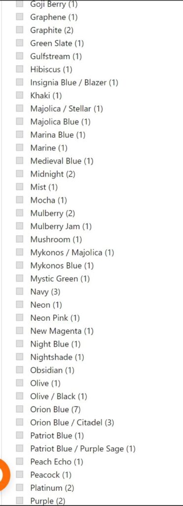
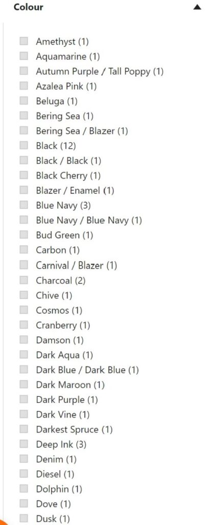
This is what the website looks like with really specific names for each colour and usually only one option per colour. The colours also are not organised in colour order so you just have to guess what work means what and hope that the colour you are looking for comes up.
I redesigned this to have much less options and look at bit more appealing as well rather than just a list of words.
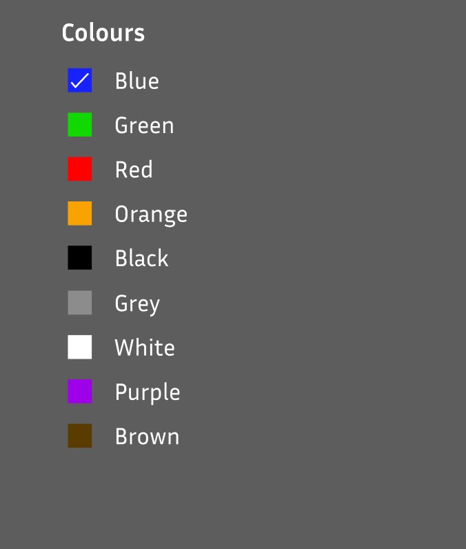
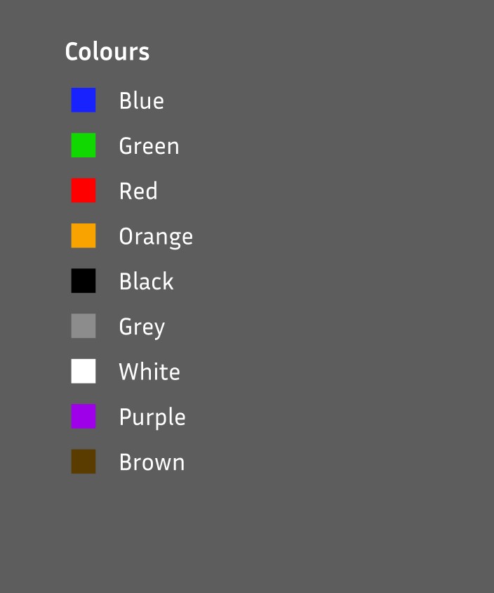
I redesigned this so that there are names for the colours that people would recognise and if they didn’t you could see the colour next to the name and then can make a judgement on what colour item you want to see.
When you click on the boxes a tick still shows up to show that the item has been selected and this then lets the users know that those colours will show up in their search.
Top of page
I also redesigned the top of the websites page including how they displayed their logo, their navigation bar and the icons they use.

First I removed the bronze award that was right next to the logo as it did not fit in with the rest of the design and I moved it down to the bottom of the webpage so that it was still on the website.

I then redesigned the icons as some were misleading with what they meant. For example the contact icon I changed to be “contact” on the navigation bar instead of what looks like a location pin drop. I did this because when you click on it you have the options to contact them and there isn’t much about location. Therefore, including the word made it a lot clearer. I also changed the basket icon as they had changed it to a rucksack which made it slightly less clear as to what it was. I then made both icons bigger so they were more visible.
I also changed the navigation bar so that all of the text was slightly larger as in the original it was quite difficult to see. I also removed a few options like accessories as I thought that this could go in the options for women, men or kids depending on who is looking. I did this because in the user tests I asked a few people to look for a pair of gloves and there first thought was to go to women’s which didn’t have this item. So they then had to come back out of that and look elsewhere for where they might find them. The word accessories also confused a few as they weren’t sure whether gloves would be under this so putting under different sections could make this easier.
Evaluation
This project was really interesting and I feel like I learnt a lot from it. To begin with I had a slight understanding on how to evaluate a website and how to create a user flow and now I feel a bit more confident in my skills with them.
I learnt that when evaluating a website there are certain points, like Don Normans seven principles, that you should look for. I found these incredibly interesting because I had never thought about things like a signifiers and feedback as I had just looked over them before without paying much attention to them. However, I struggled to understand a few of them. For example, I found the idea of a conceptual model quite difficult to understand so had to do quite a lot of research into it to try and understand it. I understand it better now however it is something that I will definitely have to keep looking for more information on it.
Something else that I struggled with was the user flows. I first created a different user flow to the one shown above but this was not correct and didn’t show a users experience very well.
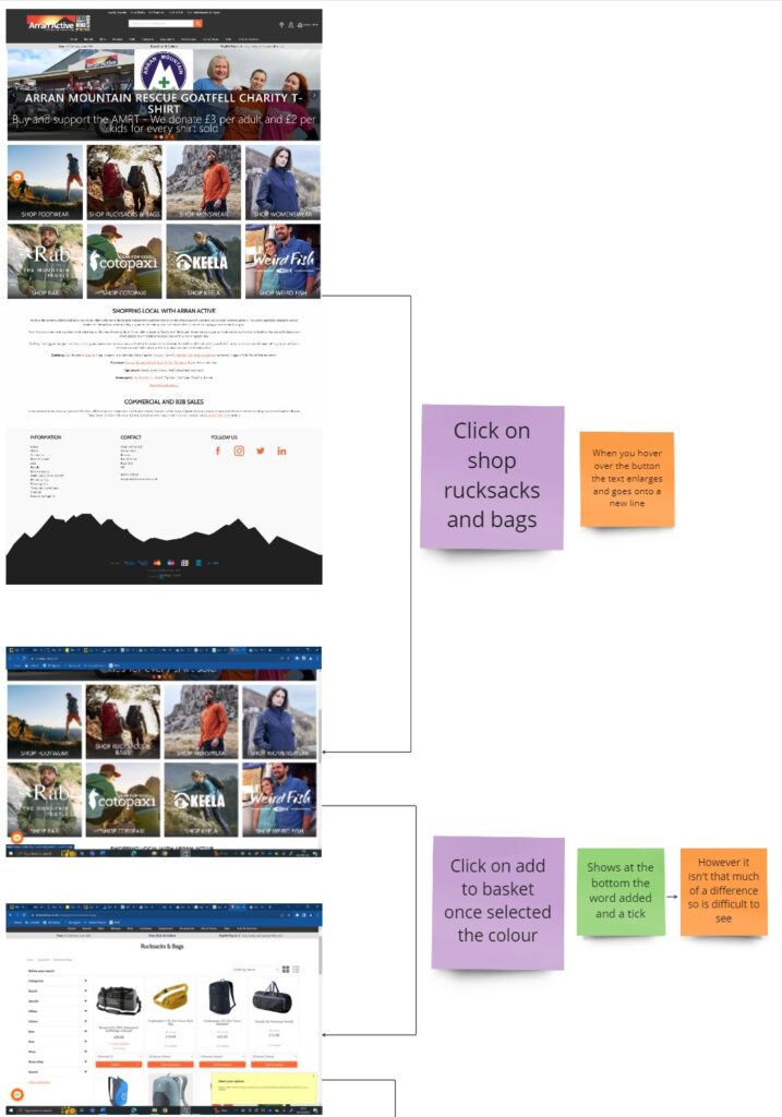
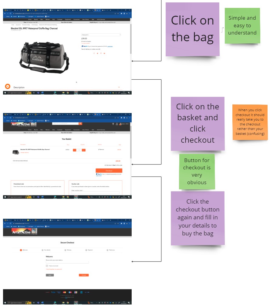
I built on from this user flow and created a better one with more detail which is the one used above.
I really enjoyed the usability tests as it was enjoyable to talk to people and watch how they interacted with the website compared to how I did. When I did this again I will ask more open ended questions to get more detailed answers on how the person is feeling and what they might of been struggling with.