For the wireframes I first looked at my competitor apps to see how they structured the app.

A lot of the apps were structured in a similar way with all of them having similar pages. I took inspiration from this because if a lot of them followed the same structure of ideas it must mean that it works or that it is needed in the app.
My first ideas
For my first wireframe I designed a black and white wireframe.
I thought about what the different processes are that I will need to include and decided on:
- Opening page/ welcome page
- Front pages for students
- Front pages for tutors
- Finding a tutor process for a student
- The tutor process for a tutor
- Homework for student
I considered the idea of having a menu but eventually decided that blocks at the bottom worked best for the app itself as it was easy to include on every page.
They way I structured the app was quite spaced out so that it was easy to see the important information and get from one place to another. It was also structured neatly so that it showed it was professional and didn’t make users doubt that it was useful but also not boring.
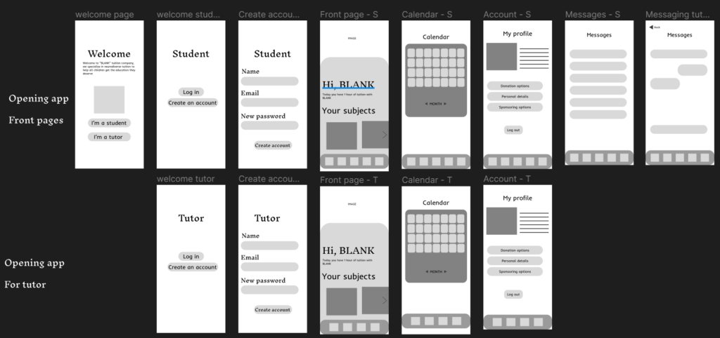

This design worked so I then decided to move on to adding colour.
Coloured wireframes
For the colours I first looked at what colours are used inside a classroom.
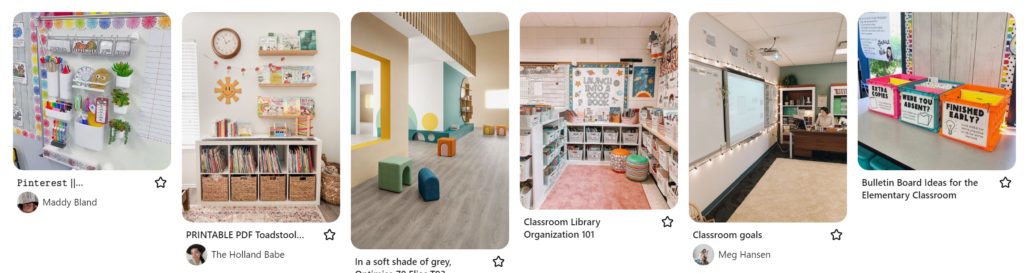
All of the classrooms seemed to use really bright colours so I designed a colour scheme based on this.

These colours are what you would see in a school but also on schools websites, and tutoring apps. I also chose these colours because they stand out and will grab peoples attention.


This was the end idea. I wanted to have different colours for the tutors side and the students side of the app because they are two completely different processes. However, where they overlap there is another joint colour as this more represents the app.
With images
I then added images and gifs into the design so that it looked more and more completed.


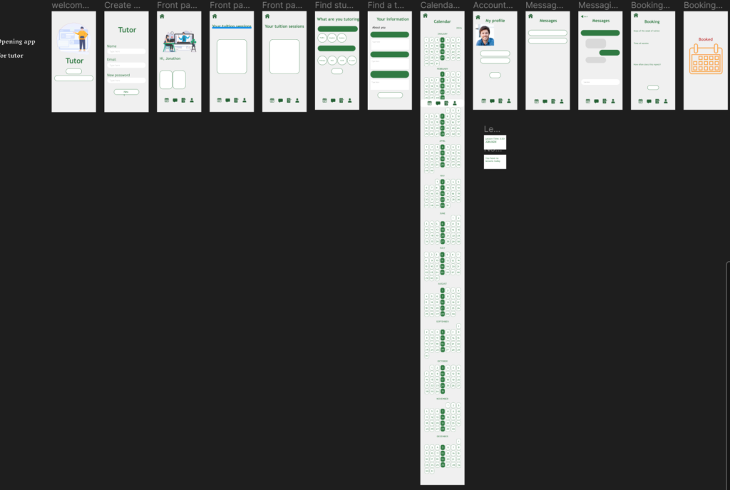
First I designed the calendars for both sides which pop up when you click on each date and the filled in dates are ones that have something happening on them.
I also changed the colour schemes slightly. I made all of the colours slightly darker because I checked the contrast between the colours, background and text and these colours passed. I wanted the design to be as accessible as possible so it was very important that the colours were visible to everyone and didn’t cause any confusion.
I also decided on the app name at this point, which is Ace, so the main colour is red to suit the idea of playing cards.
I decided on the name Ace because it relates to being able to Ace your exams.
I also added a donation and sponsorship flow for both students and tutors. This is because parents might be helping students use the app and be able to donate or sponsor through the app, or students might want to be sponsored and tutors might want to donate or sponsor. This part of the app was very important because it allowed those who need it to get free educational help where they might not normally be able to get it.
I also added the idea of booking a session when a student finds a tutor so that they can meet them online and get to know them before starting to pay for sessions.