Improvements to be made:
- Typography on buttons that send you to different pages is too small
- social media posts arn’t linked
- wavey box is a bit close to the text
- boxes are not in line
- ticket button is too big
- little grape at the bottom of the page isn’t touching the bottom
I told the group about my user test findings so that we could develop the designs to be even better. This ended up in us all going through the designs and made the slight changes that were needed. Due to me only designing the FAQ page I needed to ensure whoever designed the pages that needed changing were appropriate.
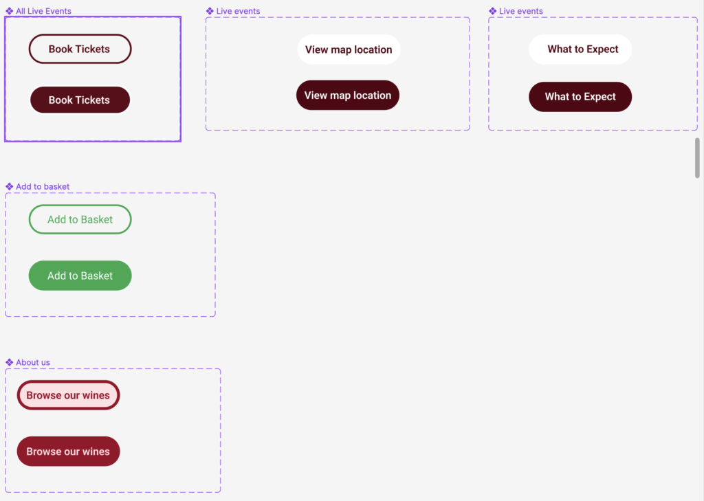
These were the buttons that we changed to make them a better size, as some buttons were to small and some were to big.
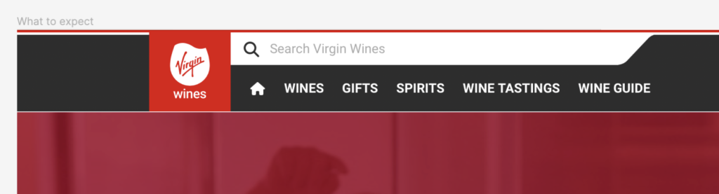
Some corrections that needed making were simple bits like correcting this white gap under the Virgin Wines header. This was really easy to fix, I just cropped the header and then enlarged the image to meet it making it look far better when on the website. I did the same thing with the bottom of the page, as we had a grape that wasn’t sitting across the bottom and had a white gap.
