
This part of the project is entirely about the design of our website for Virgin Wines. Even though I did most of my stuff in the research bit, I helped Hashry with the prototype and made some adjustments in the meanwhile to make the website look more fluent and without any incongruence.
Sketches
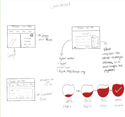
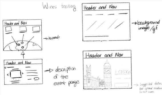
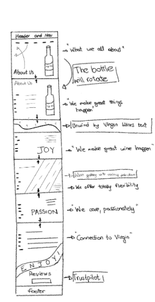
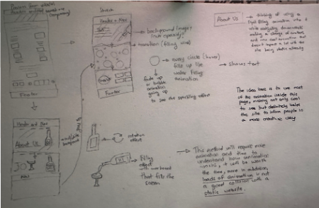
These initial sketches helped me and the team to get some initial ideas, some of these ideas were taken into consideration like the implementation of a bottle and use the Bourne as a help to realize our prototype. Some of these sketches came out with some animation ideas, but then when I thought to that making it alive, it came out to be not as easy as I expected so I threw out the idea. The idea for these animation is to use the “Parallax Method” but with the skills I’ve gained till now, I have still loads to learn and going from an a beginner’s skill to an advance is really a bad move.
This is what the initial “About Us” homepage was going to look like if I followed my process:
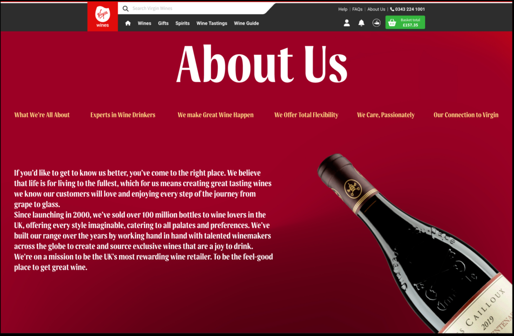
Even though empty I was trying my best to zoom in and out the bottle of wine but without success.
Ticket summary
This card is meant to summarise the events with just one click, loads of people tend not to read a massive paragraph and so this might help people to seek the most needed information possible to gather around in one place.
This idea it was taken from Hashry, it was meant to be a sort of a fixed text box helping the user to buy the ticket with just one click rather than scrolling down till the end. This idea though, came to be really a bit empty so I asked if I can help them and this is what I came up with.
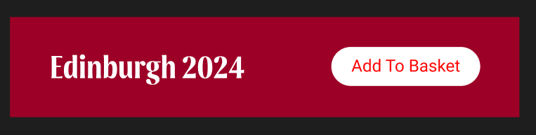
Hashry’s version
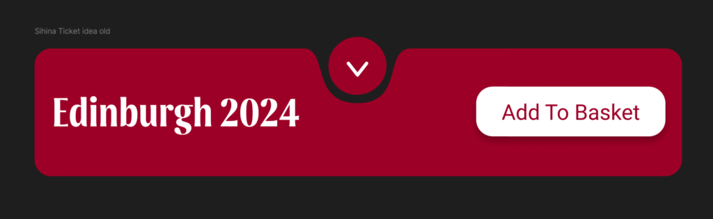
My idea version 1.0
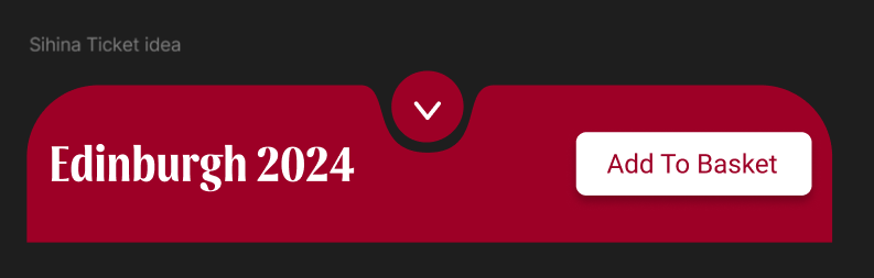
My idea version 1.1
The idea here to to play around with shapes, so I searched around and found this course on Udemy, which helped me gather a bit of experience inside the software
But I knew that something was missing and certainly after seeing it now, the button on top of it was really useless, so I opted in using this as a summary card.
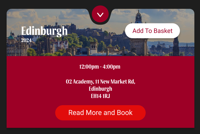
My idea version 1.2
In this version I added a new button and some aesthetics into it, a picture of the city background of the “Event’s place” and the address, though seems still really empty and with some experimentations I came up with these ideas:
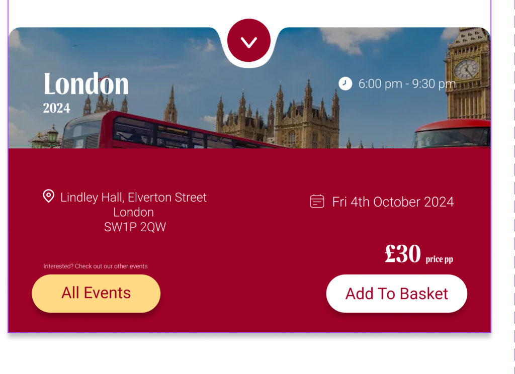
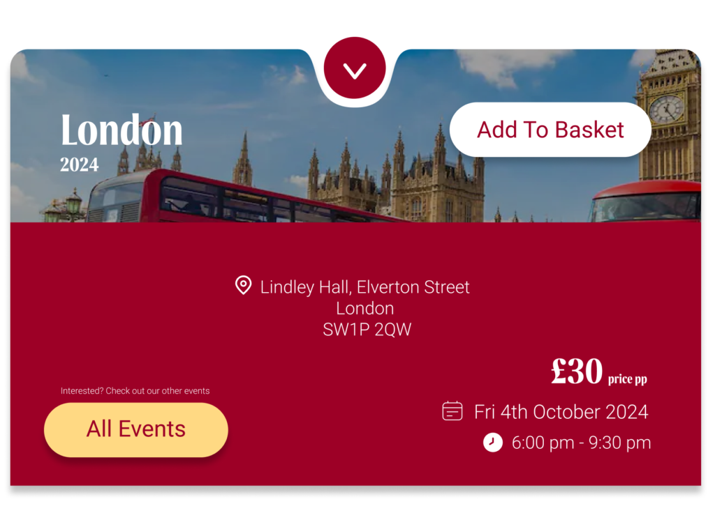
Text alignment was not good here so I changed the position multiple times
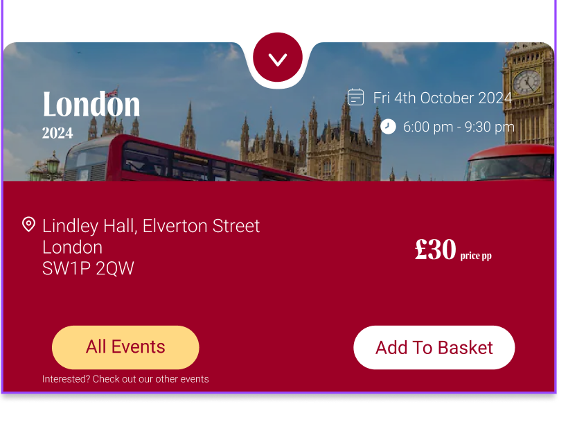
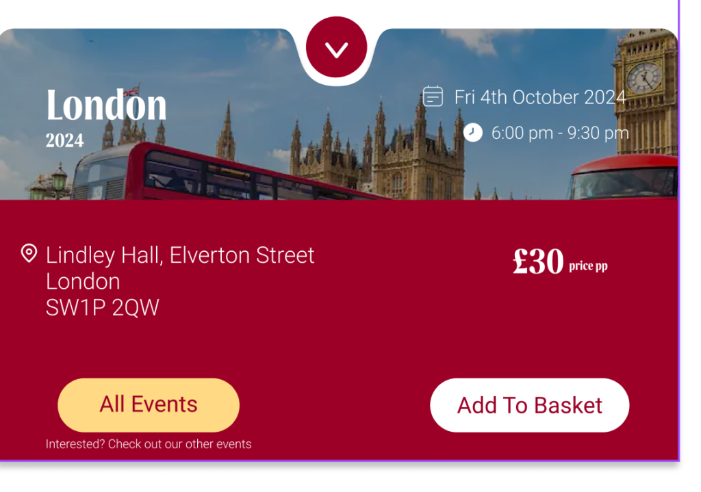
Here I tried to move the price in different position to see where it looked best
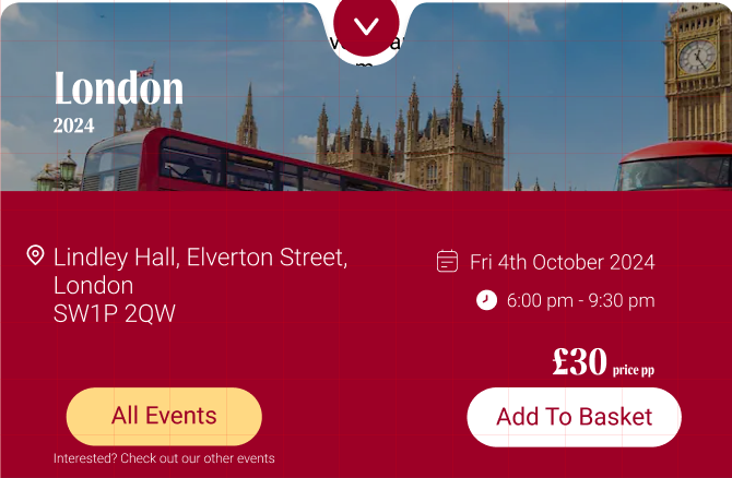
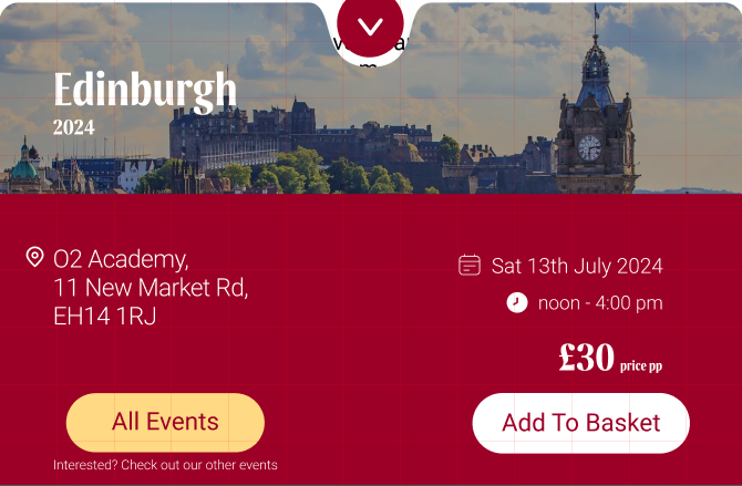
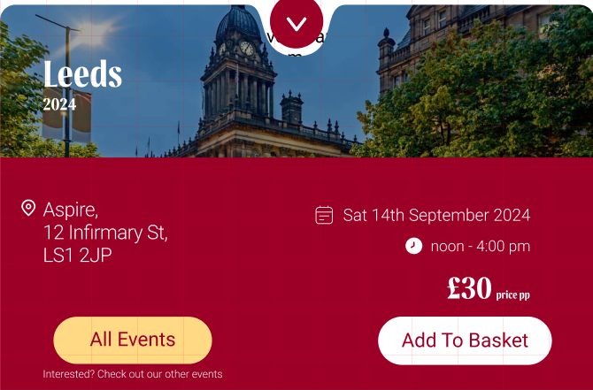
These cards are afterwards separated with each different cities. I really enjoyed to create this card, and certainly I could’ve done more into this part of the project but the others did a great job in expose their work and it was effective.
These are the cards with the 3 different Wine Event locations available right now:
Leave a Reply