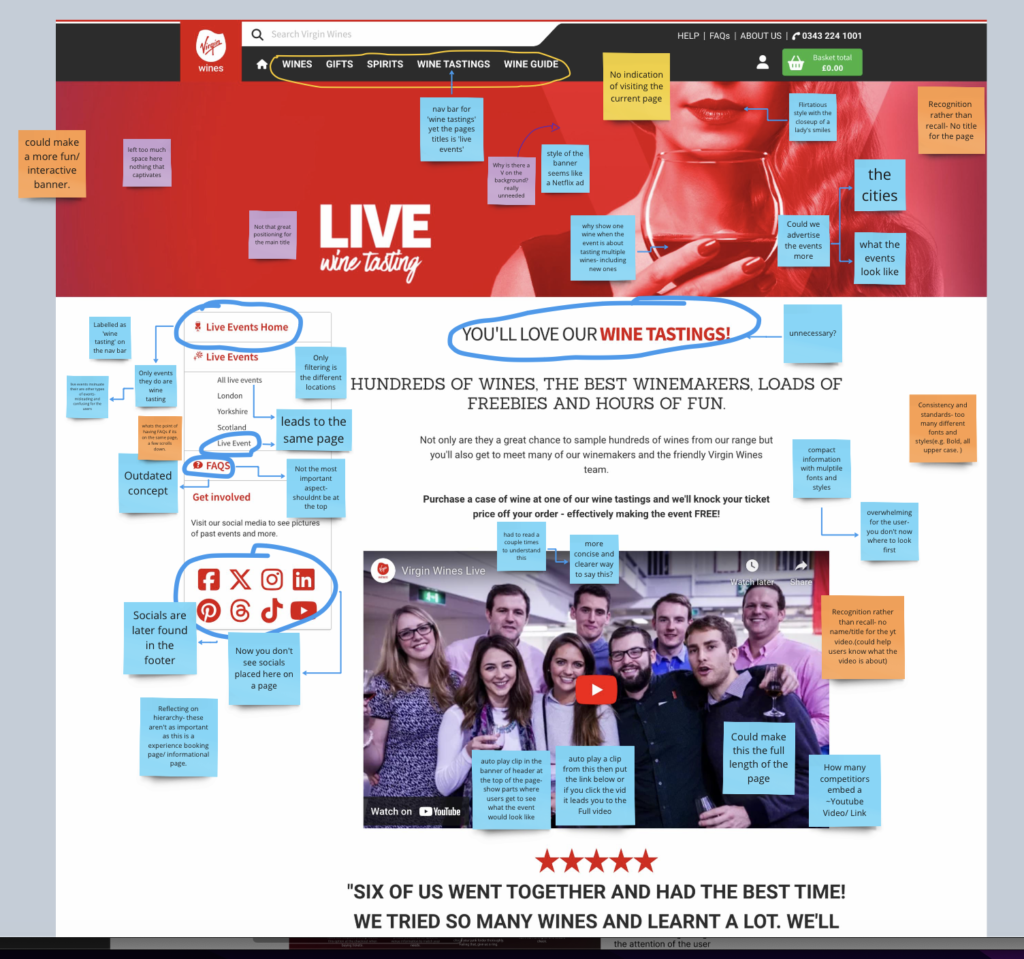
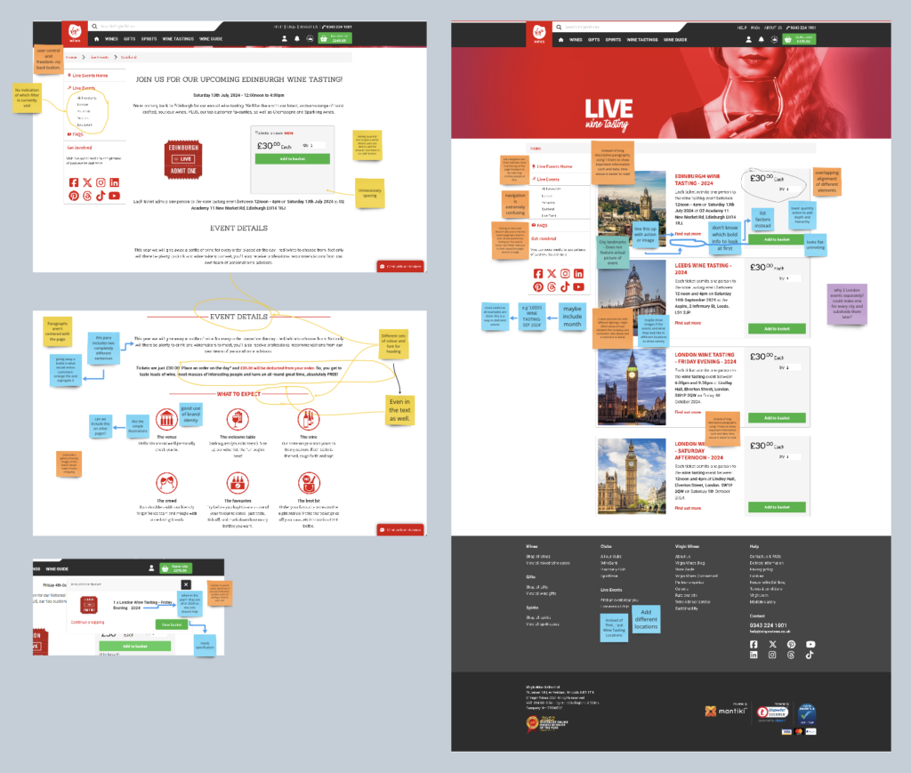
Firstly we recognised that the banner fails to effectively communicate the page’s primary purpose, potentially leading to confusion for users. The page name “Wine Tasting” redirects to “Live Events,” which could be misleading. Rather than highlighting the unique experiences of each event, the page predominantly emphasizes location. There appears to be a lack of design hierarchy, with elements seemingly placed without adherence to a cohesive design system. The information architecture needed reorganisation.


Although I had minimal involvement in the redesign of that particular section, I contributed to providing feedback within the studio and proposing solutions for the redesign. We delivered redesign of the website’s navigation for wine events to ensure it aligns seamlessly with brand’s identity. Incorporating elements from logo, such as the distinctive curve, and introducing illustrations evocative of wine culture, we aimed to create a memorable experience for users. Enlarging key words enhanced the retention of important event details, with a primary focus on simplifying the discovery and comprehension of upcoming events without overwhelming the user. Crucial information including location, date, time, and pricing was thoughtfully incorporated, alongside clear options for further engagement such as learning more or booking. Additionally, we integrated customer reviews to showcase their experiences and utilized vibrant colors for icons to enhance visual appeal and usability.
Leave a Reply