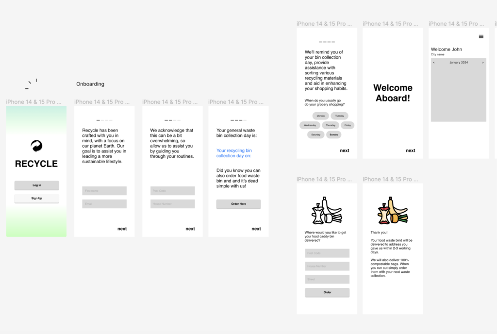
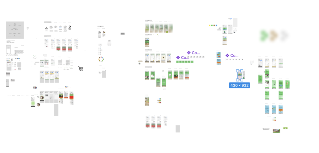
As soon as I completed carrying out my research and surveying people, I was ready to start developing an app prototype. This marked a period of significant evolution and intense iteration within my design process. In this stage, rapid changes happened as I tried to stick with one design aesthetic amidst new ideas coming in and revisions being done on the existing ones. It wasn’t just about creating ideas but rather figuring out a way of narrowing them down into a coherent design strategy. This is why at times it felt like trial and error because most times I had to abandon current concepts for new ones that were more promising.
One thing that became apparent during this iterative approach was that I needed to simplify my design. However, this realization came with its own set of challenges. Simplicity meant slimming the design down its bare essentials. However, it wasn’t as simple as it sounds like it should be. It required a sharp eye and the ability to critically evaluate every single aspect of the design in terms of its usefulness and impactfulness on others user experience for this project to succeed. Allowing myself to think about simplicity was hard since there were many hours spent developing things that in retrospect probably did not have much connection with what I wanted to achieve here – these things included different versions which did not make sense during their creation stages due too chaotic environment leading me literally unable “to feel” my foot again.
I digged deeper into studies on some popular designs around especially those known for having simply layouts that are easy for users navigate through them easily as well as use them optimally which has really been helpful in simplification or making better decision when designing something anew. Defining the key features of my app, I struggled endlessly trying to make up mind about what is unique about it among other closely related apps available today.A lot of features options only increased my uncertainty thus selecting those that would make my app stand out among others was quite difficult.
There was a turning point when I had an in-studio guidance which helped me to refine my ideas. It took collaborative discussions and feedback from others to help me sum up my concept down to what actually mattered most. This process narrowed my focus to only three essential features to be present in the app, as well as three color schemes that will dictate its visual identity. This approach gave direction for further development of REcycle design.
From survey analysis and research through prototyping phase of REcycle, I have come to understand that design is both complex and rewarding. The journey I made underscored the need for adaptability, simplicity, and focused directions. By narrowing down my prototypes into a few key features and selecting dominant colors for them, it enabled me travel through chaos of creativity and eventually came up with a prototype which really spoke to me as an artist. With this experience, it not only pushed forward “REcycle” design idea but also expanded my knowledge on design itself.
Leave a Reply