The presentation slides were easy to make. From last years UX presentations and from what I learned at Sync the City I knew that the slides had to be simple.
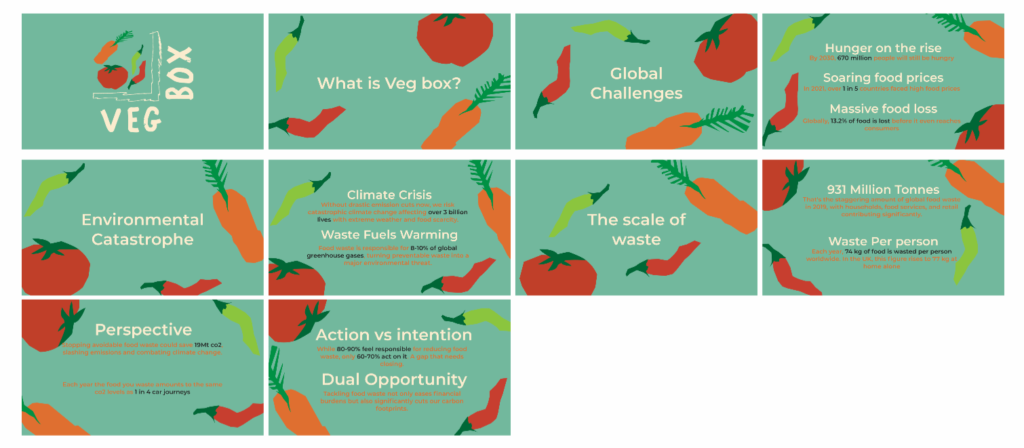
The first section follows a similar script to the promo video. A call to action. It was important to me to relate the problem to the individual. We can hear xyz figures and statistics all day without knowing how they affect anything. Well, I wanted to change that so I included a perspective slide where I explained the impact of waste from a single person.
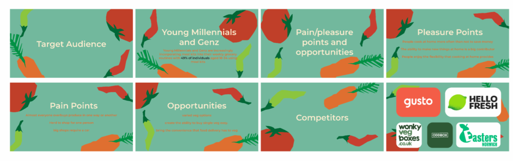
Next, I introduce who I’m aiming the App at and why with a quick overview of the competitors to show the board of directors the hole in the market.
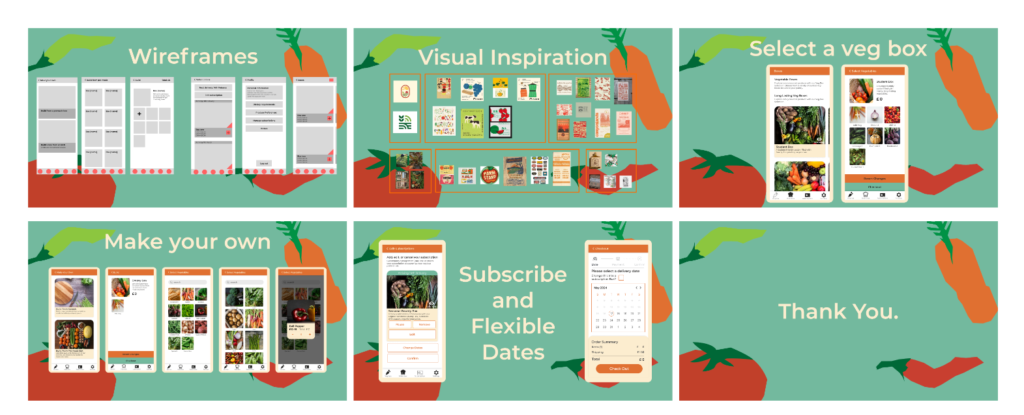
A small section at the end goes over the app to describe the solution. I was able to do this as I don’t have many flows that need to be shown off and the gravity of the issue is a better attention grabber than any UI could ever be.
This method of delivery across the board seemed to go well with the crit I had with Dave and Tom. Tehy liked the call to action, framing the perspective and also the lack of information. As some presentations were so packed with information it became an overload.
Leave a Reply