To start off project 6 I started with creating a promo video. This was a three-step process.
1. Paper ideation/story board
2. Figma style frames
3. Animatics
4. Fully animated after effects video
In this post, I will cover steps 1,2,3 as there wasn’t much that changed throughout this. These steps were pretty straightforward.
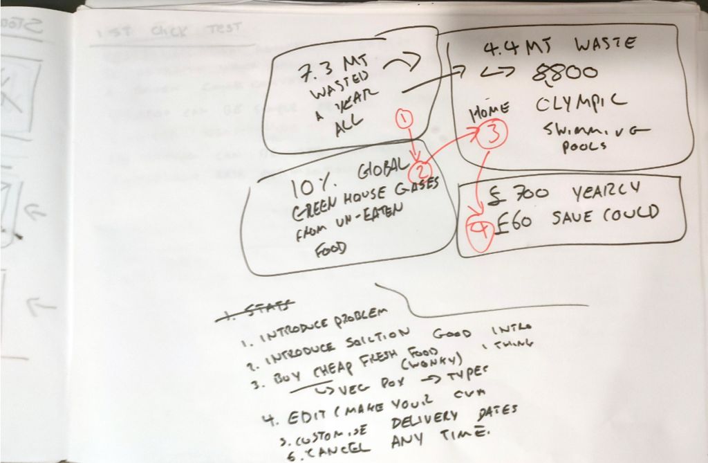
To get the message across to the consumer and board of directors I decided a very strong call to action was needed. This first image looks at what facts I wanted to use in the video and in what order for the most impact.
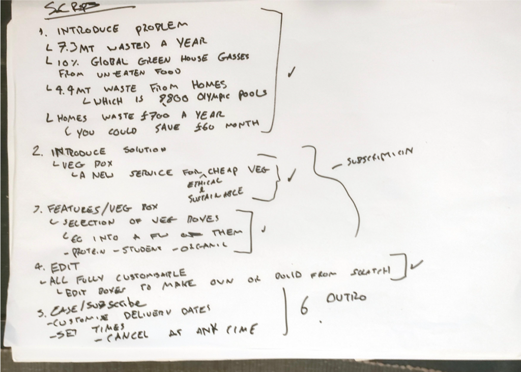
After choosing what facts I wanted I created a script to guide my storyboarding. As my app didn’t consist of many features I really wanted to put an emphasis on call to action and solution.
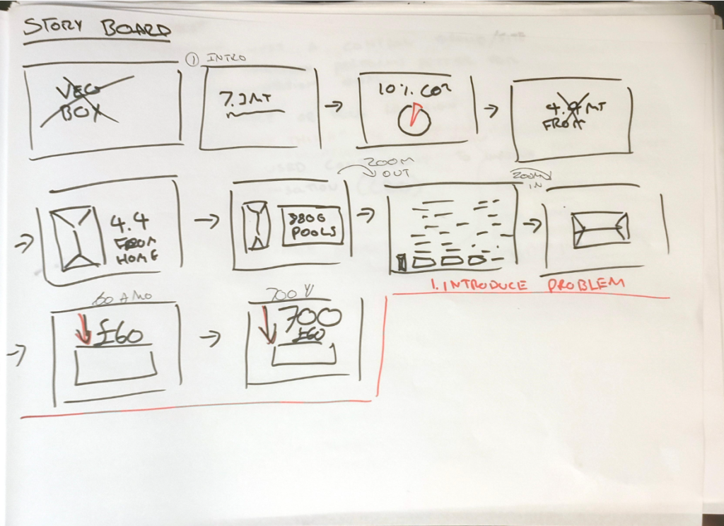
Whats the best way to convey urgency? Infographics! Luckily this is a skill I learned in the first year of uni. I also made sure because of time/skill constraints that I would keep infographics very simple.
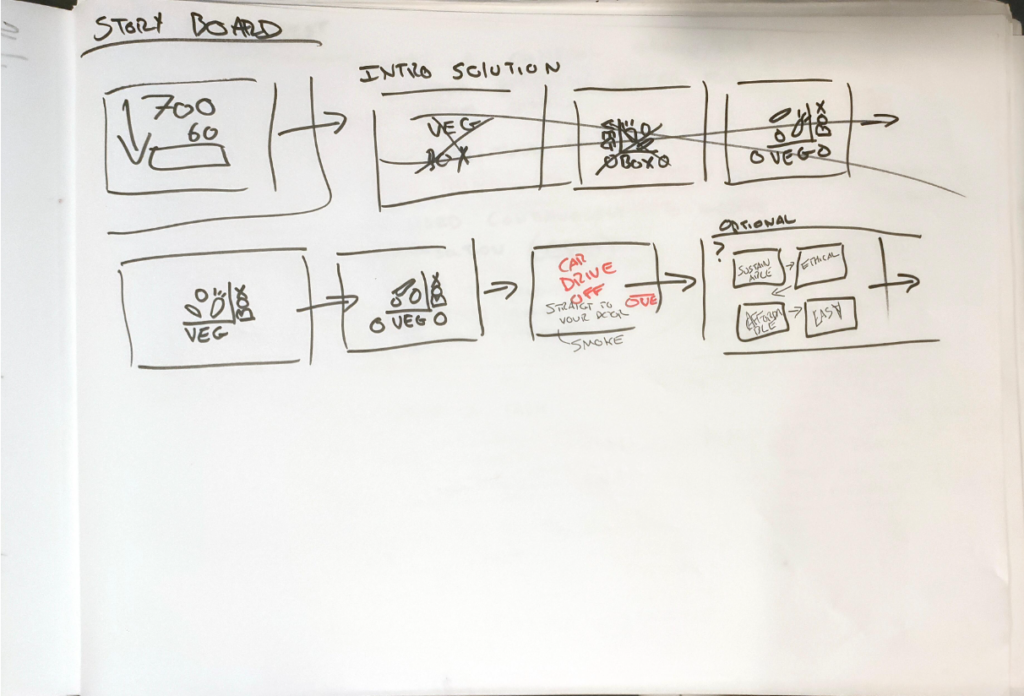
At this point I had an epiphany. My logo for Veg box looked almost like a car if you add two circles(wheels). So I did.
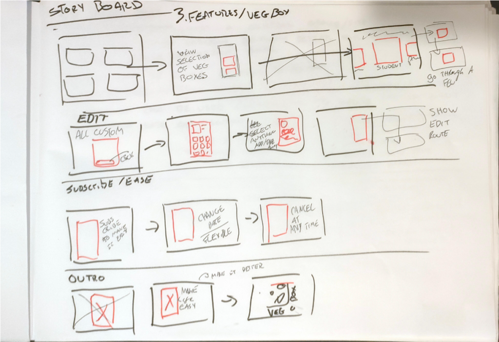
Here are the final storyboards. As I knew my skills in After Effects weren’t amazing I decided to make the UI showcase section very simple with just limited text and showing basic routes. I hoped that my call to action was strong enough that this solution to the problem was obvious to all viewers,
step 2/3 - style frames / animatic
The easiest way to make the style frames was on Figma for me as it already had all the assets on and I’ve become pretty competent with using the software.
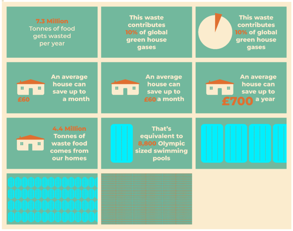
I think the cute and simple nature of theses infographics portrays the brands’ identity as a friendly option. The pool infographic I had presumed to be easy but this came to bite me later down which I will discuss in the step 4 post.
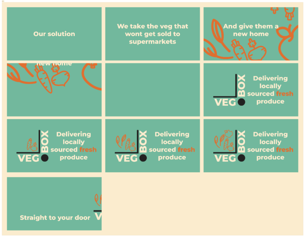
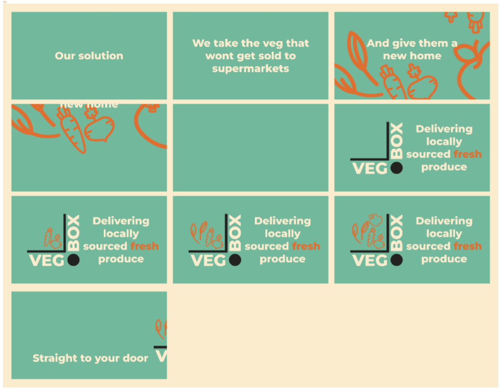
I liked the idea of the veg falling into the box as if it was being packed. This stage had the most iteration.
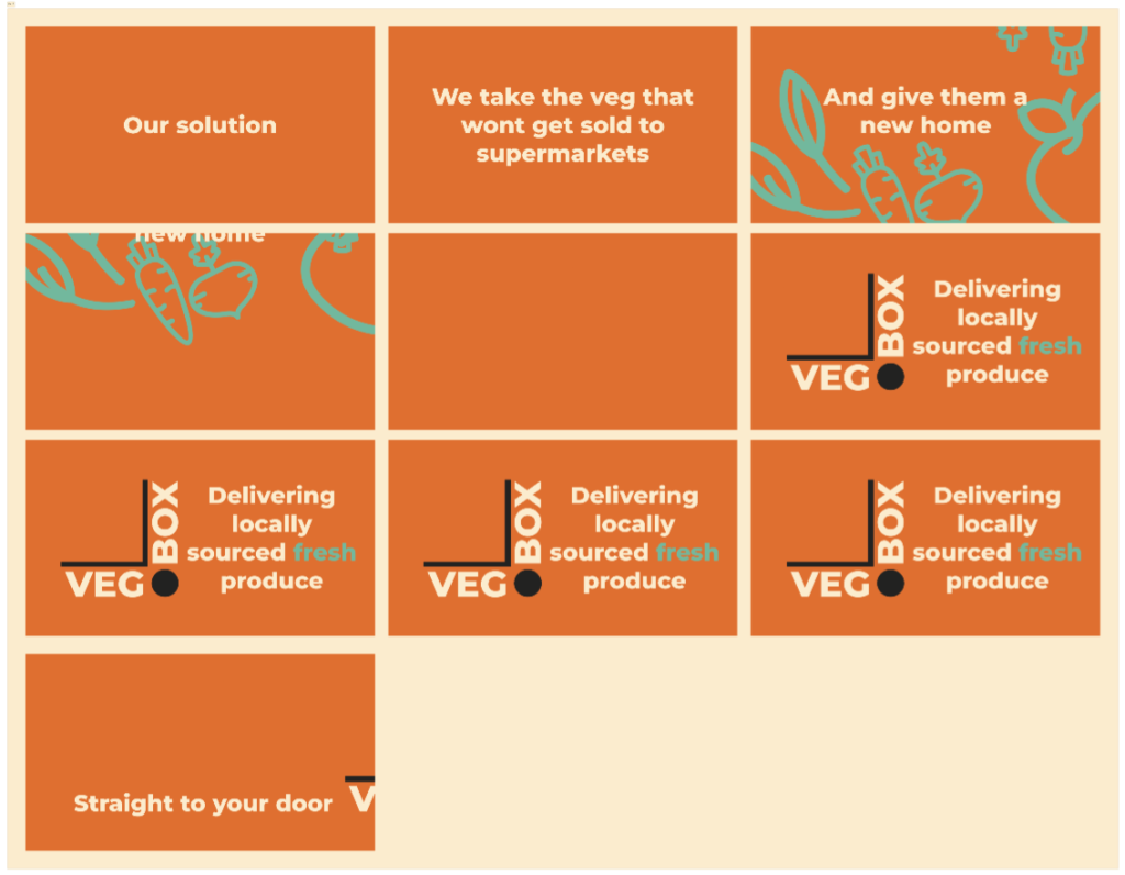
I tried using alternate colours to illustrate the change in tone. I decided against this as I felt it changed the identity too much. The teal helped calm the video.
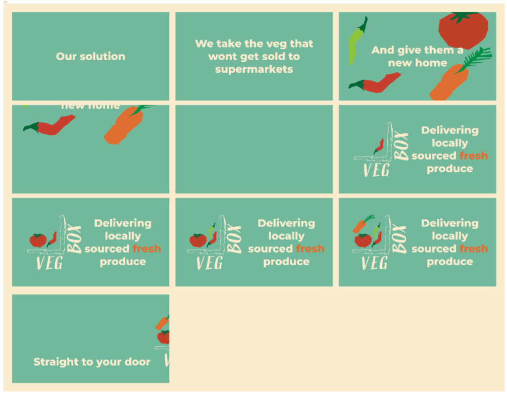
In the end I decided to fully develop a logo for the veg box brand from the one it was. It definitely changed the style however I believe for the better. The hand-drawn wonky vegetables make a much more organic feel. The text and lines on the logo were all hand-drawn to create a more personable feeling rather than a disconnected business logo.
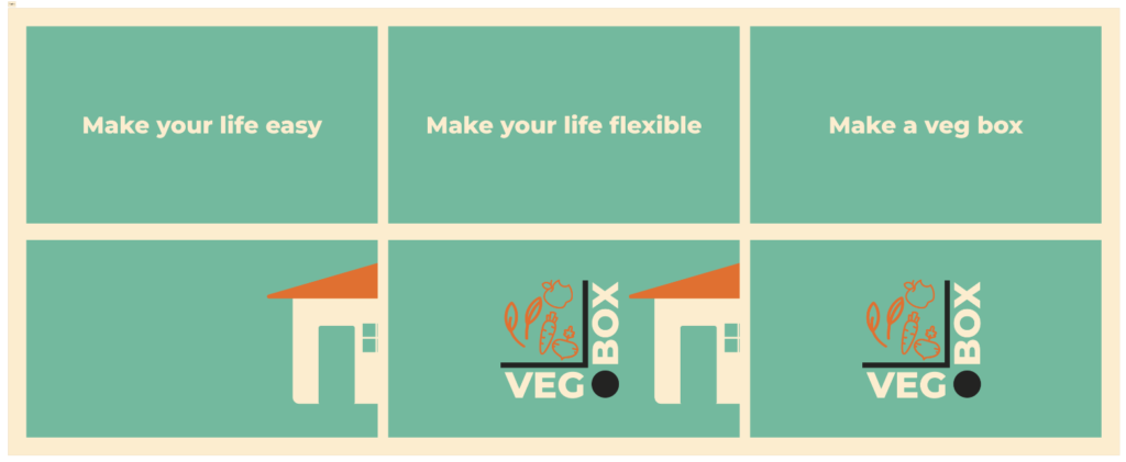
This is the rest of the style frames. I decided to keep out the UI sections as it was not the focus of my current goal. which was a call to action.
The Animatic
I wont post the animatic as it will essentially be repeating itself but it helped me time the song I had chosen well which was called the Big cleanup by Satoshi Takebe. I felt the name fit and the jazz gave the whole video an uplifting feeling.
Leave a Reply