This week I took Rob’s designs and implemented them for desktop and mobile. Rob wanted to move onto testing. I noticed that the new approach didn’t work as well on mobile and so I redefined and experimented with new layouts that could be applied from mobile to desktop. This led us down a more “ticket” style first section for the details page and information further down the page.
I started working more on making the events page look similar to Max’s about us as well.
We went back and forth between cards or no cards (as seen below). They work well on mobile but maybe less of them? So they work more coherently with about us? They do sort of look like checkout, but maybe there could be more of a tie in there.
As we continued to work on our designs, I thought about how beneficial it would be for us to review each other. So this week I set up an internal audits page where we all deposited our latest designs and did quick markups for areas that needed fixing. I’ll probably carry this on later so that I can do a millimeter by millimeter examination right before we present.
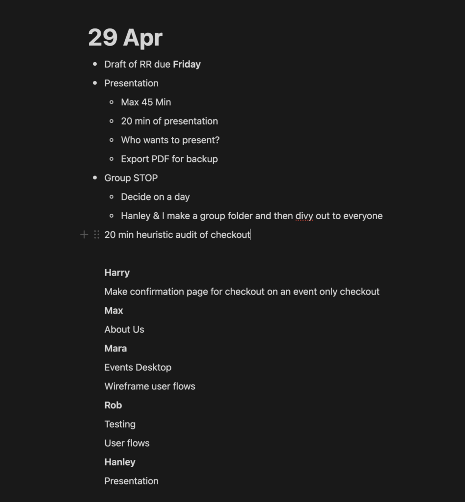
Group Touchbase
Links to figma work:
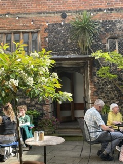
All of agreed that we needed to escape the studio for a bit, so we ventured to Merchant’s House for a coworking sesh which proved to be an ideal spot for some sun and bubbling ideas!
All Else
The Oh No type talk was wednesday and I have to say I felt quite… let down! It was different, sure, but as someone who has loved Oh No’s work for years, it was so self centered it was hard to get on board with. I wanted more nitty gritty around actually making the type than a 15 minute long explanation of each of his brothers…
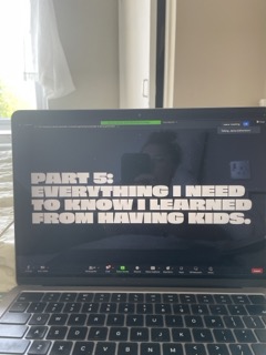
Ah yes, because this feels totally relatable for a bunch of 20 somethings
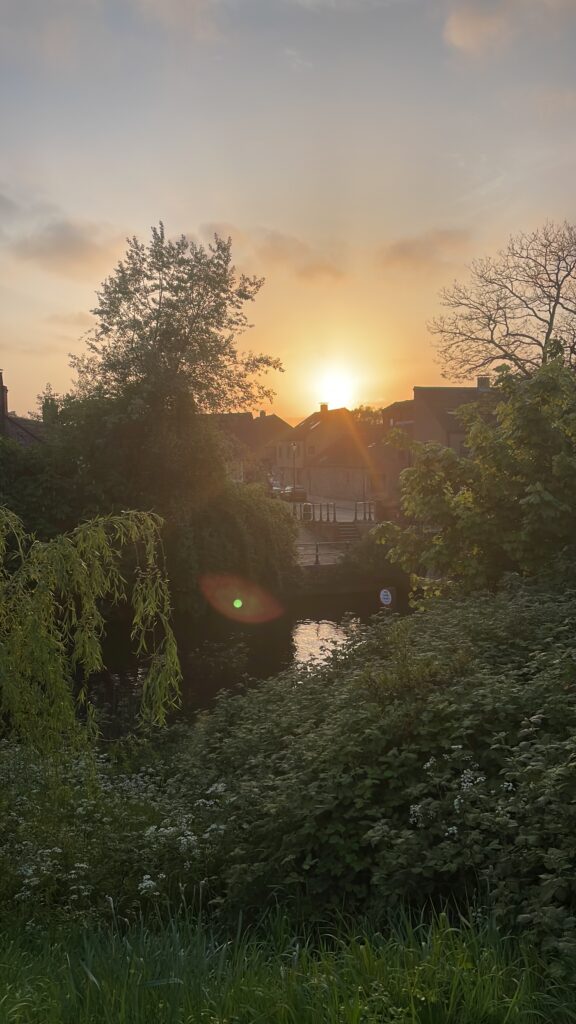
Instead I decided to look for inspiration from nature, processes of the world, my books, my thoughts, birds and the sun.
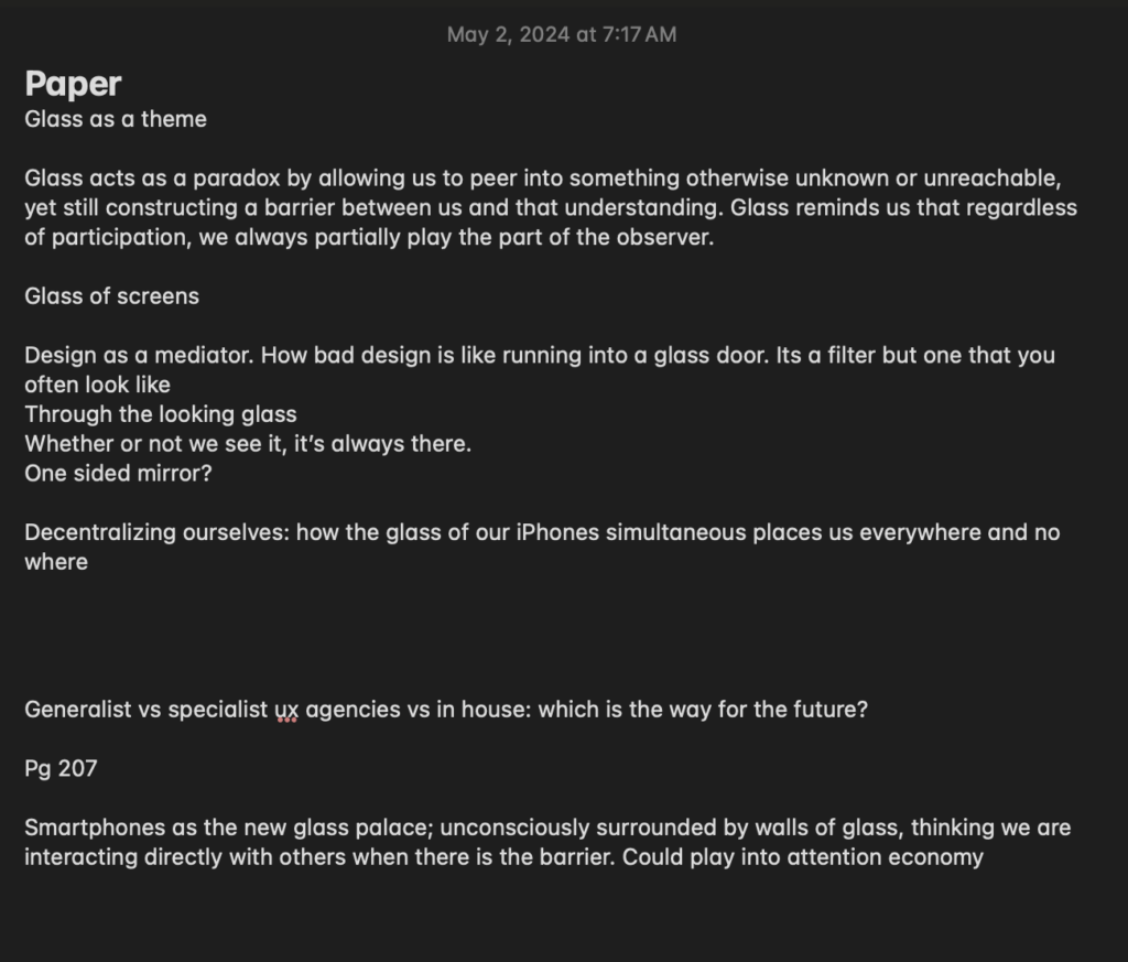
More paper thoughts…
Leave a Reply