\ Experience Website \
To create the experience of a punk event I looked at online magazines and physical magazines as examples of visual design. I settled on punk visuals as the science websites and mathematical imagery were not that engaging. They didn’t communicate well the event itself.
PUNK MAGAZINES

Most online magazines looked not quite what I expected them to. They were sleek and well-curated, the punk being only in the content and not much in the visuals. The only one that stood out was Punk Rocker because it was the most chaotic website you could encounter. Maybe that’s punk. Or maybe just mad. I did not want my website to turn neither of those things; sleek and neat, nor complete and utter chaos which is a headache to navigate.
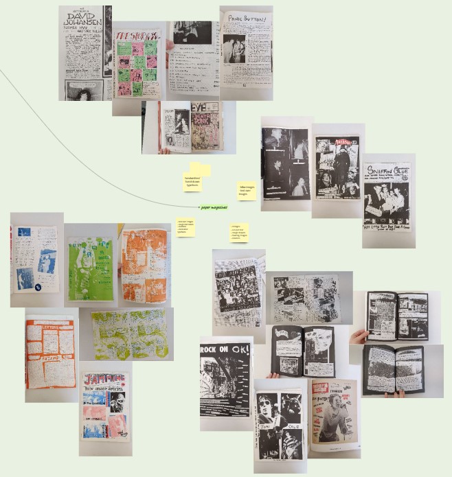
For branding inspiration I looked at physical magazines from the library. I took note of the typefaces and type hierarchy, of colour usage and photographs, as well as any other visuals which communicate the idea of punk.
UI BRANDING
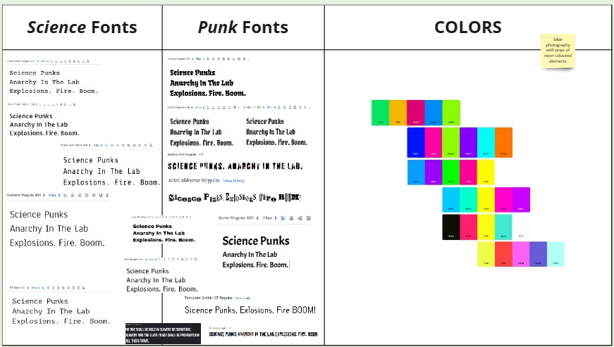
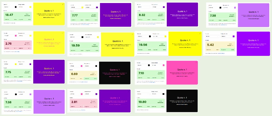
The challenge of this UI was to combine the linear and calculated science part with the loud and bright punk part. To express the character of punk I chose bright colours. But to have them work on screen I tested them using a contrast checker.

For the logo I leaned into the science part. Eventually, inspired by the periodic table, and the representation of scandium “Sc” and phosphorus “P”, I created the logo for science + punks.
miro link: Project 3 / Experience Website / Maggie