\ Evaluate and Iterate \
For Project 2 – Evaluate and Iterate we had to choose a website to analyse. I chose Boots, a health and beauty retailer.
In the below images the following traffic light system is used: red stickies = issues, orange = needed improvements, green = good design, blue = questionable elements, yellow = additional information.
The tasks for the first week:
- goal-oriented user behaviour flowchart (and heuristic markup)
- red routes sitemap and heuristic markup
- the application of the 7 fundamental design principles
- UI website iterations
Goal-oriented user behaviour
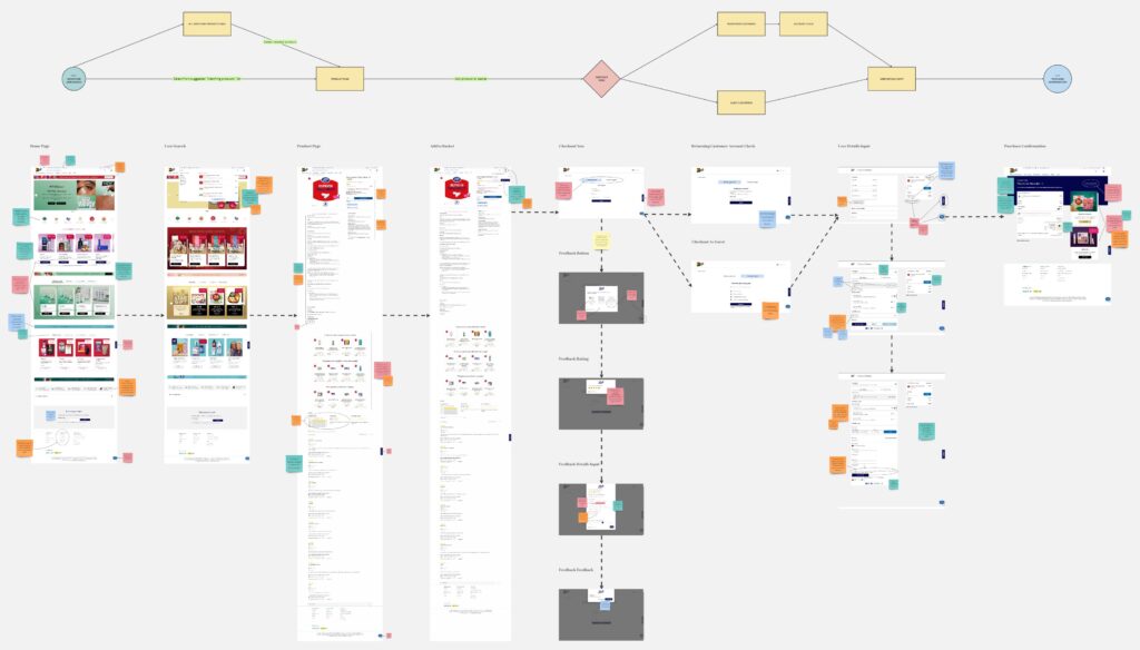
The process of a user buying a product off the Boots website. Even though UX wise the process is quite quick if the user knows what they are buying, UI wise the experience could be improved. The suggestions made could ease the currently visually overwhelming UI which holds too much information. The use of drop-down menus and keywords based suggestions on the product’s page could improve the experience.
Red Routes Sitemap

As Boots has a huge website and a wide array of services, it can be quite overwhelming to navigate. The website could benefit of better organisational structures as some pages are very big, or contain information that would not be used most of the time (e.g. product description when buying a known to the user product). The process of searching in the search-bar for a product, informing oneself about it, and then buying, is easy. But scrolling the seemingly endless suggested products page could limit potential customers. Additionally, access to the Boots Pharmacy should be quicker than it currently is.
The 7 Design Principles
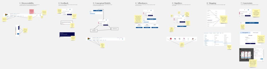
The website makes good use of the seven fundamental design principles. These elements guide and help the user throughout the website, whether they be easily identifiable coloured and labelled buttons (e.g. “Add to basket”; “Checkout now”) or instinctive organisational systems (e.g. in which department a potential product might be found) and temporal contiguous pages (e.g. product -> basket -> checkout), or useful system feedbacks (e.g. confirmation of adding a product to the basket; confirmation of purchase).
UI website Iterations
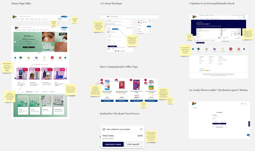
Some of the suggested UI changes regard the discoverability of buttons and purchase process mapping. The “Log in/register” button on the home page and the “Continue Shopping” button on the purchase confirmation page could have a better placement and be visually attractive. Other suggested changes, like the user details placement on the purchase confirmation page, the “Checkout as guest” option, and “Pay with Gift Card” option could help the user find the needed information faster and easier. Suggested offer tags changes, could help better communicate the different available offers.
miro link: Project 2 / Evaluate & Iterate / Maggie