\ Experience Website \
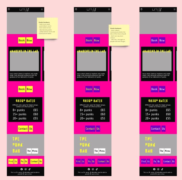
By combining science + punks, I did not want the website to turn neither too sleek nor too anarchic. So, I relied on colour as the link to punk and used a boxy structured layout to kinda relate the science part.
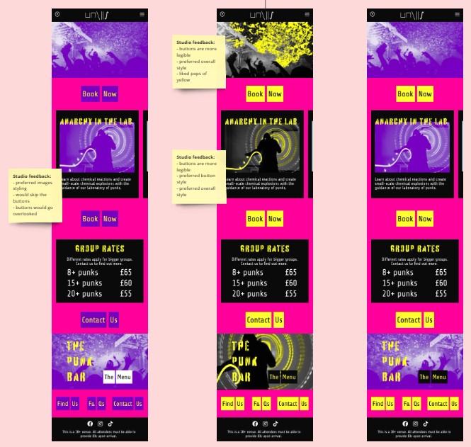
As I was not too sure about the colours, along the way I sought informal studio feedback from people on different courses. Eventually, I settled on the common agreed upon opinions about the photography and buttons.
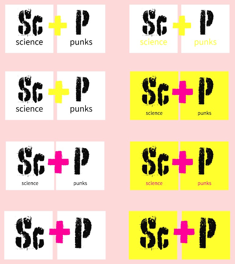
For the logo and buttons I took inspiration from the periodic table and how chemical compounds are written. The odd look of the buttons aims at punk whilst still keeping the subtle link to science. I wish I made the Sc part of the logo more rectangular, that way it would better fit with the asymmetric shaped buttons.
miro link: Project 3 / Experience Website / Maggie