Website patterns
For the beginning of this workshop we looked at different patterns with designing a website and which ones might be more useful than others.
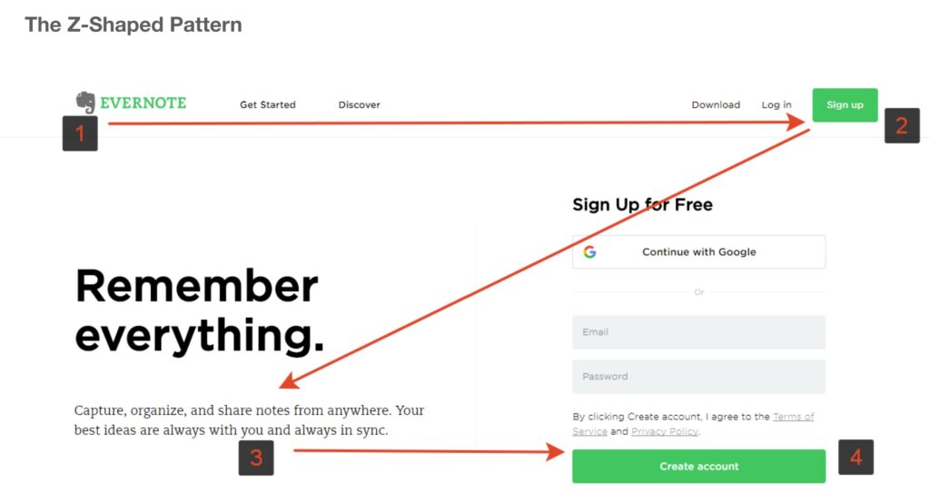
Z-shaped pattern
F-shaped pattern
- Nielsen Norman
- Using heat maps they could see that people looked in an f-shape
- Users won’t read your text thoroughly in a word-by-word manner. Exhaustive reading is rare, especially when prospective customers are conducting their initial research to compile a shortlist of vendors. Yes, some people will read more, but most won’t.
- The first two paragraphs must state the most important information. There’s some hope that users will actually read this material, though they’ll probably read more of the first paragraph than the second
- Start subheads, paragraphs, and bullet points with information-carrying words that users will notice when scanning down the left side of your content in the final stem of their F-behavior.
Layer cake pattern
- Consists of fixations made mostly on the page’s headings and subheadings, with deliberate occasional fixations on the (body) text in between.
- In an eyetracking heatmap or gaze plot, this pattern looks roughly like a set of horizontal stripes and blank spaces between them, resembling a layer cake (with cake on a level, then frosting, then cake, and so on).
Other patterns
- Spotted pattern consists of skipping big chunks of text and scanning as if looking for something specific, such as a link, digits, a particular word or a set of words with a distinctive shape (such as an address or signature).
- Marking pattern involves keeping the eyes focused in one place as the mouse scrolls or finger swipes the page, like a dancer fixates on an object to keep balance as she twirls.
Marking happens more on mobile than on desktop. - Bypassing pattern occurs when people deliberately skip the first words of the line when multiple lines of text in a list start all with the same word(s).
- Commitment pattern consists of fixating on almost everything on the page. If people are highly motivated and interested in content, they will read all the text in a paragraph or even an entire page. (Don’t count on this to happen frequently, though. Assume that most users will be scanning.)
Avoid f-shape pattern
Home page
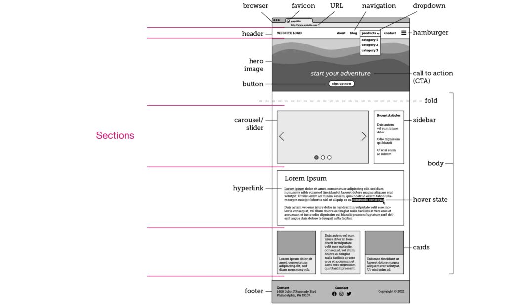
- As the main gateway to a website, a homepage acts as an introduction to that business’s brand, product, services, values, who and what it’s for, who to contact,you name it.
- It’s meant to set a “first impression,” encompass all that a company has to offer, and direct visitors to learn more throughout different sections of the site.
- The first few seconds you spend on a new website or web page are critical.
- The Home page has to accommodate, for example:
- Site identity and mission
- Site hierarchy & navigation
- Search
- Teases
- Content promos
- Feature promos
- Timely content
- Deals
- Shortcuts
- Registration
Navigation
- navigation bar ‘nab bar’
- Utility navigation
- Structural navigation
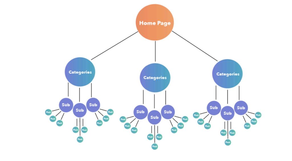
- Contextual navigation
- – Online links are blue
- Drop down menus
- – can be awful – have too many options
- Contextual menu
- – right click
- Fly out menu
- – when menus fly out from a menu
- Mega menu
- Sequential menu
- Accordion menu/ sub menu (progressive disclosure)
- Breadcrumbs
- a clickable hierarchy helps you see where you are and retrace your steps
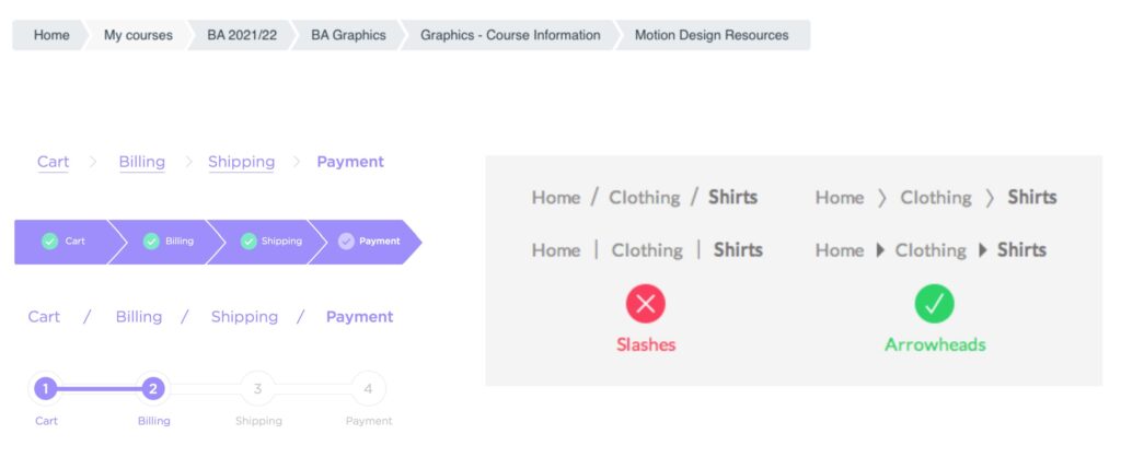
- Pagination
- navigation between a sequence of pages of content
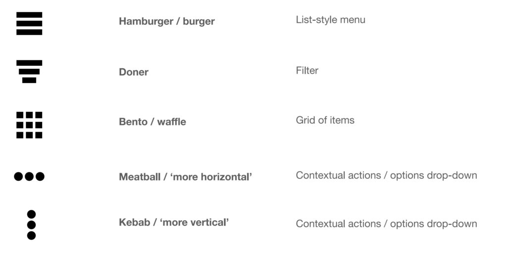
Menu icons