Black and white wireframe

I did low fidelity wireframes first. For this I first looked at how websites usually construct themselves. I noticed that the front pages had a lot of images and very little text so I tried to mirror this. I found out that other websites do this because it doesn’t overwhelm the user when they first get onto the website and allows them to see what the experience is for themselves first.
I then looked at designing the more wordy pages but looked at how I could still try and keep text to a minimum. For the experience page I decided I would add a little bit of text about the different experiences and then one image of the experience to go along with what is being said. I did this so that there is a visual and also a little bit of information so that users are not overwhelmed with too much text and so don’t have to read too much. The image also gives the user a better knowledge of what the experience they are going into will look like.
For the booking process I wanted the experience to be simple so I decided it could be over two pages so that it collects the information that is needed but also not take a really long time which could bore users.
The learn more page has a bit more text on it because if users go that far is suggests that they are looking for more information about the experience and will therefore want to read more. I have attempted to lay the text out slightly spaced though so that it still isn’t too much all at once.
Coloured wireframes

When I added colour I kept closely to the idea I had thought about earlier. The colours I have included are bright and earth like colours to keep to the themes of adventure and gaming. This keeps to those themes because adventure is filled with natural colours like green, brown, blue and orange whereas gaming includes very bright neon colours. So I used bright natural colours to suit both themes. I made the background dark and the text light because when I looked at other gaming websites and games this seemed to be a common theme.
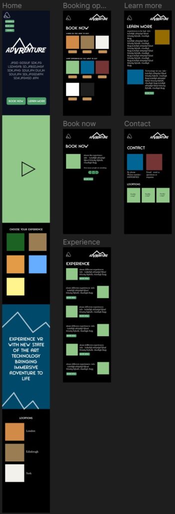
When first looking at designing for the mobile I considered portions and how I would cut up the content on each page so that it still felt similar to the desktop design but not the same as this would be too small to look at. To do this I changed a few things from 3 columns down to 1 so that the pages were longer but were more readable and easier to understand.
Adding images
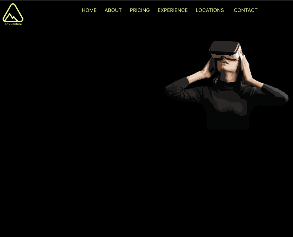
This was my first attempt before I learned more about wireframes. For my first attempt I tried to keep to the idea of bright colours and also include a big image. I quickly moved away from this first idea because it didn’t work with the rest of the designs I had planned. The image also did not look correct in place with the rest of the images I was going to use.
I then looked at designing in a bit more detail and sticking to the wireframes I had originally created.
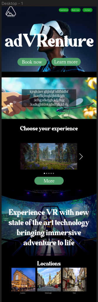
The image at the top of the page really suited the colour scheme that was used and also allowed users to immediately see what the experience involved.
First, when I chose the text I was looking for something that went well with the images however I felt as if the font I originally chose for the titles didn’t have anything to do with adventure so I eventually changed it after this wireframe.
I also included a carousel of images for each experience, however this didn’t particularly work with the rest of the design because it wasn’t obvious that it could be clicked on and therefore raised some issues as it was not obvious what it was there for.
For the button design I used a bright green colour so they stood out. I then rounded the corners to give them a softer feel but later changed this as it did not suit the adventure theme.