
Ask for design for desktop and mobile
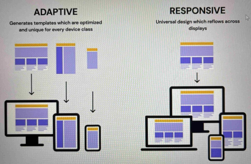
Adaptive designs
Breakpoint
The viewport (screen)-width or in pixels at which an adaptive website design switches to a different size.
These are set by the designer, and controlled in the code by css media queries
Most website builders will handle this for you to some extent
Best practices around which pixels dimensions to use for breakpoints change over time, and are dependent on a range of factors.
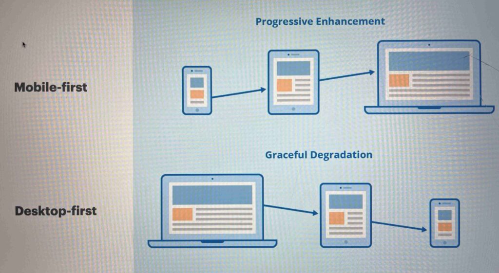
Webflow currently, takes a desktop first approach
Mobile first
A design strategy that focuses on starting with a mobile design and then scaling the design up to tablet and desktop.
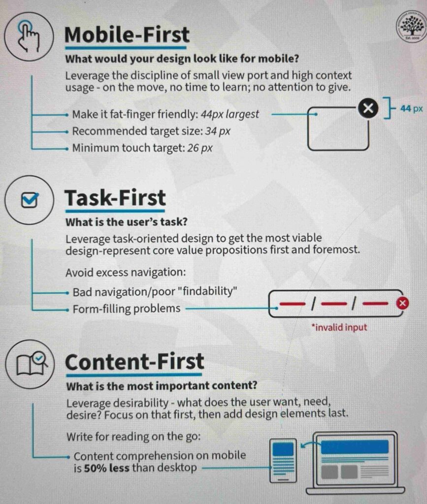
It forces the designer to, for example:
- prioritise user tasks, navigation, visual hierarchy and content
- consider a user that is on-the go
- use wide tap targets (at least 44px)
- not rely on desktop hover effects
Publishing websites
- Can’t publish from Figma
- But can design on Figma and publish on webflow and framer